“Don’t Judge a Book by Its Cover” is a proverb whose simple existence proves the fact impressionable souls will do so without fail. This monthly column focuses on the film industry’s willingness to capitalize on this truth, releasing one-sheets to serve as not representations of what audiences are to expect, but as propaganda to fill seats. Oftentimes they fail miserably.
—
I have to credit the Alamo Drafthouse and Mondotees for slowly turning the industry around to the appeal of limited edition prints and excessive series. You’re spending an insane amount of marketing dollars anyway, so why not create something collectible? Sure, people will take an oversize generic sheet about to be thrown away by their local theatre or videostore, but you can’t rely on fangirls to actually shell out cash for anything other than Edward and Jacob.
It’s no surprise then that two of the films below see a similar treatment to the guerilla rollout ParaNorman saw a couple months ago. Whether they’re as creative/relevant as my favorite animated film of the year’s series was is in the eye of the beholder. But I don’t think any will disapprove of the attempt to try something more than Photoshoping a couple heads in the sky before calling it art.
In fact, the only surprise this November is how many lovely posters are in circulation. The awards season is upon us and the level of artistry is up to the task. Hell, even this unexplainably bizarre piece for The Details (limited November 2nd) (poster) has merit for making it damn near impossible to forget.
Which movies need their stars to sell them?
 |
 |
 |
 |
It’s always great to see what films need their stars front and center and which don’t. I know it’s a bit of a cop-out to lump animated films into the latter, but I’m going to anyway. I’ve seen some cartoon sheets with an actor’s name bigger than the title, so they aren’t quite immune to the phenomenon.
 |
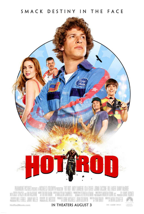 |
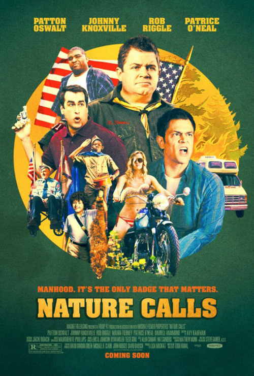
First on the docket is Nature Calls (limited November 9th) with Patton Oswalt, Johnny Knoxville, and Rob Riggle—a trio of humorous side characters about to apparently lead their own film. Why not therefore copy a couple other funny guys’ vehicles to keep the circular trend of collaged bodies intact? At least Caddyshack‘s deliberately lassoed troupe had relevance to the work, though.
Without a golf hole to trap its leads, the new film goes the route of Hot Rod by simply getting everyone together against a geometric orb of color so as not to simply float on the page. I like the painterly quality to the character depictions and the minimalist flames and trees in the background, but does it do anything besides show us who are involved? Oswalt’s wardrobe and the tagline’s mention of a “badge” has me believing its some sort of Boy Scout outing gone wrong, but I honestly can’t look at him anymore and not think grown up ‘Success Kid’.
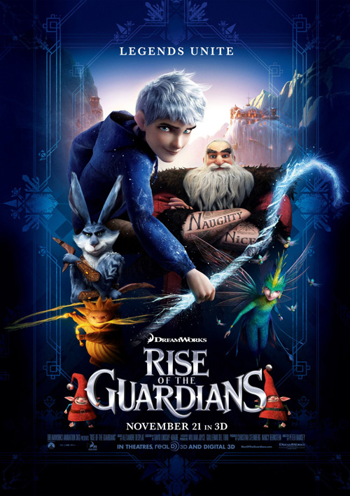 |
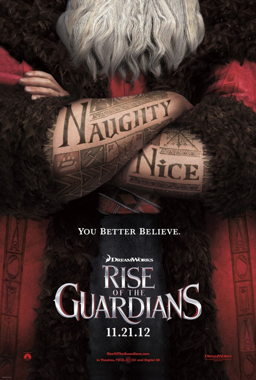
Counter that with the teaser—admittedly another cop-out because firms enjoy taking more risks on these—for Rise of the Guardians (open November 21st) and you’ll see my point. How great is this imagery? BLT Communications, LLC has out done itself as far as knowing exactly what an audience needs to comprehend their message. The words “Naughty” and “Nice” coupled with the white beard—no matter how dirty—screams Santa Claus without the necessity of a head.
I’m not quite sold on the logo with its sharp edges and metallic finish, but the tattoo work looking straight out of some monk’s illuminated text is fantastic. The firm can’t keep up appearances for long, however, as their official poster decides to depict as many legends as they can. An overload of imagery with as little about the plot as the tease, one can’t help but be disappointed by the lack of originality.
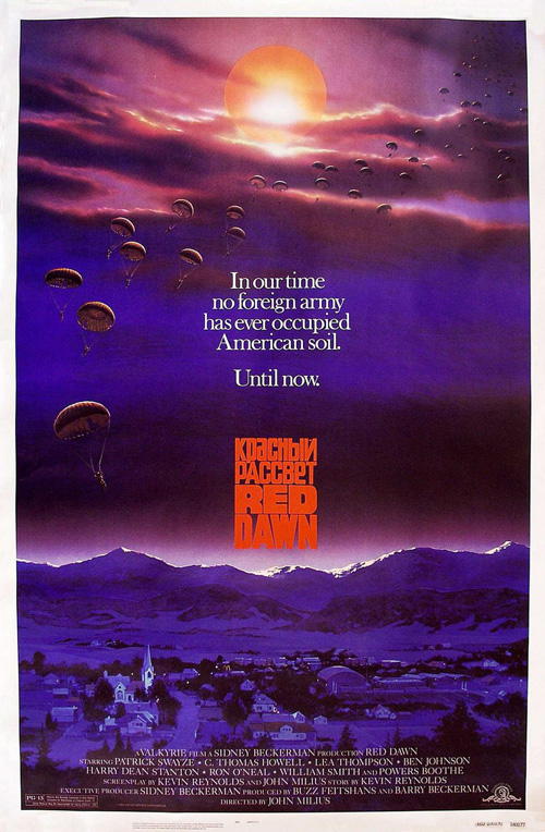 |
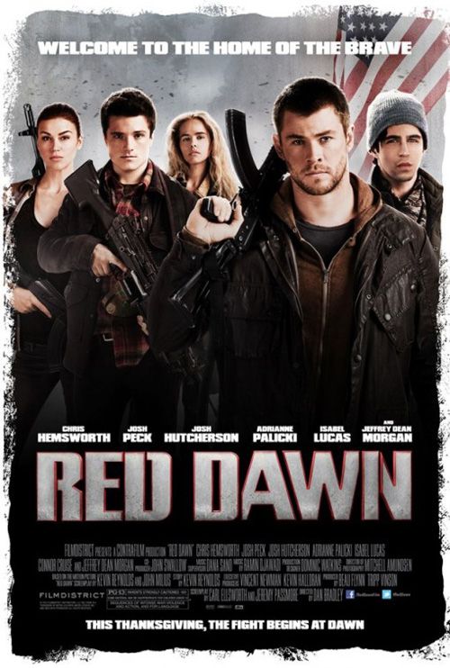
At least it’s better than the utterly uninspiring Red Dawn (open November 21st) also by BLT. The studio already had to neuter their film after backlash from China for using their nation as our new Cold War opponent—they do own us, so giving into their demands can be excused. But we’re really going to just plaster our cast on a gray background with guns? Even the American flag is barely more than an afterthought.
I get that Thor (Chris Hemsworth) and Peeta (Josh Hutcherson) are sexier than John Alvin‘s parachuting Communists, but come on! That 1984 sheet is gorgeously serene and terrifying all at once. Add in the thick font of the title—not to mention the Russian characters—below the red sun and you have a winner. It may have been three years before Dirty Dancing, but I think Patrick Swayze could have merited center stage. Kudos to Intralink Film Graphic Design for going another direction.
 |
 |
 |
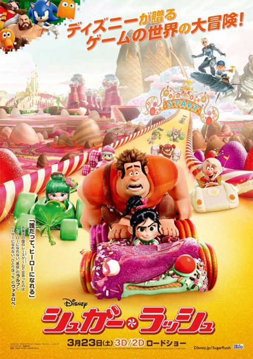 |
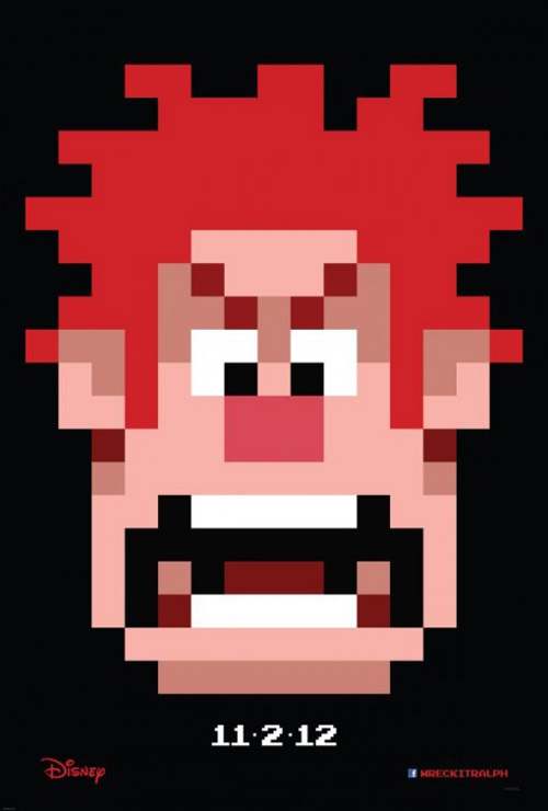
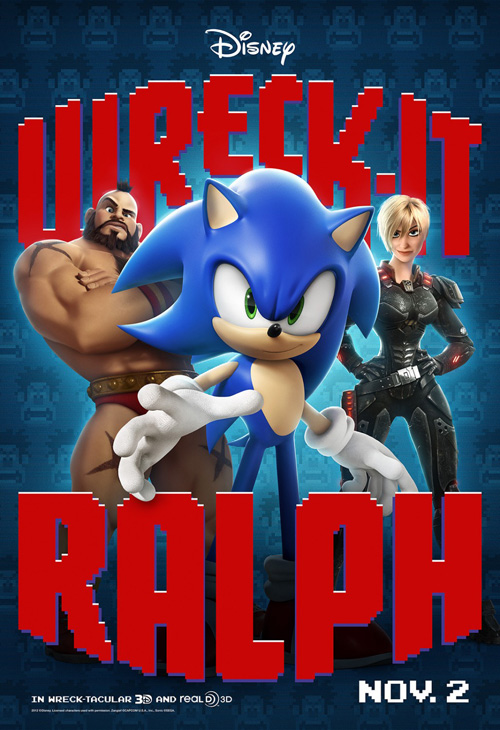
Where Wreck-It Ralph (open November 2nd) is concerned, it’s tough to say whether the tease gets filed under abstract or celebrity. Yes, that angry face is the titular Ralph, but it’s also pixelated and broken down to stand-in for the film’s aesthetic more than sell a character. When I first saw this sheet I was floored by the possibility of a full 8-bit feature work.
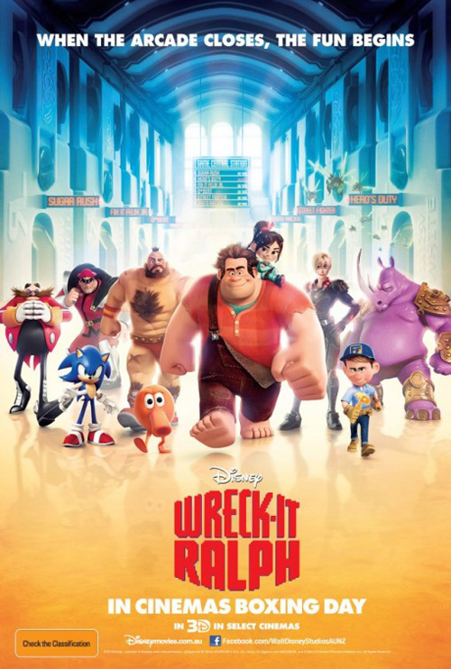
Alas, such a dream doesn’t come to fruition and doesn’t end up needing to since the movie is amazing nonetheless. So seeing BLT’s domestic and FIVE33‘s international posters going for the recognition factor was assumed. I guess the licensing coup Disney acquired from Capcom and its staple of videogame icons was huge and it shows. Although most of the ‘real’ characters are in the movie less than ten minutes each, using Sonic the Hedgehog and M. Bison to sell tickets is definitely a strategy you’d be stupid not to utilize.
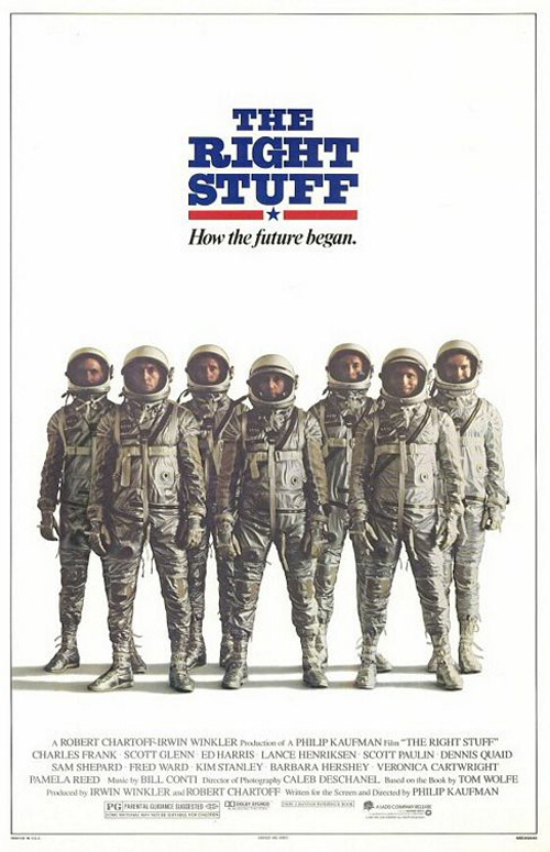
I’m just glad they retained some pixilation for the logotype, even if the Right Stuff homage and Candyland meets Mario Kart scenes are so smoothly rendered.
What do you do with an icon?
 |
 |
 |
 |
 |
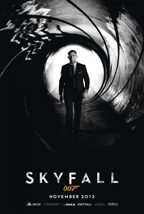 |
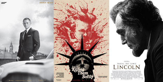
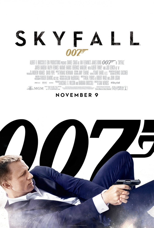
I kind of love this poster for Skyfall (open November 9th). Do you honestly need more than the iconographic 007 with a gun to know Bond is back? Mimicking it with Daniel Craig laying in action, weapon drawn is therefore a stroke of genius. Dust and dirt is kicked up, the title treatment at the top isn’t allowed to be solid black, and only the gold of the 007 below it screams out against the dark cool palette.
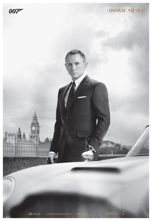
Pair this with the ultra smooth IMAX sheet and you’ve got minimalist class. The soft focus removes all permanence to the image making you feel a blink of the eye could cause Bond to disappear. And the best part? Skyfall isn’t even mentioned besides a small Twitter hashtag at the bottom.
Compared to them, Empire Design‘s iconic gun barrel motif seems cheap and overdone despite my short research uncovering no other use of it before in poster form. Sure, every Bond shows this image in its credits sequence, but not yet has it been utilized in print form. Only took fifty years to give it a go.
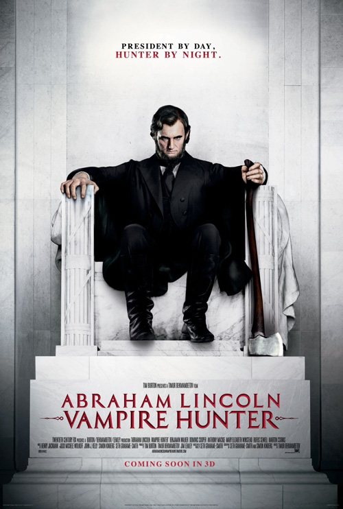 |
For Lincoln (limited November 9th, wide the 16th), the only real widespread iconography association is his Memorial in DC. Unfortunately—or perhaps not—The Refinery already used it for Abraham Lincoln: Vampire Hunter earlier this year. The sky was the limit then on creating something new, familiar, or all of the above.
The result is an Oscar-worthy transformation depicting Daniel Day Lewis in the president’s well-documented hairstyle and wrinkled skin. The pain of separating a nation against slavery weighs heavy on his face and the stark contrast of black against white only drives the point home more despite never truly saying it aloud. I do wonder what a solid color for the title would have done, however, as the shimmer here leaves something to be desired.
 |
 |
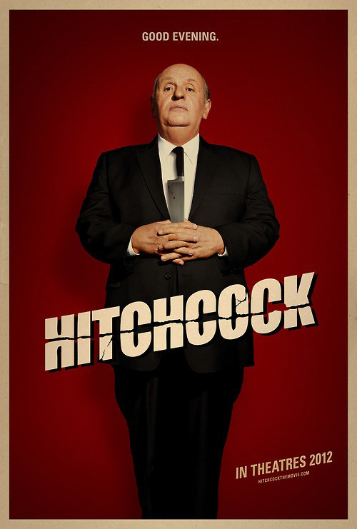
From there we go back to Great Britain and check out another renowned actor attempting to embody a legend. It appears Bemis Balkind decided there was no reason to fool around since Anthony Hopkins‘ Hitchcock (limited November 23rd) was too good to be cluttered. Only an homage to Psycho in its distressed font—the handiwork of the magnificent graphic designer Saul Bass, who some say used his eye for form to cut the infamous shower scene for Hitch—and a humorously placed knife as tie join him.
Not to be limited, a second advert was also made to give a little extra information. Danny Huston and James D’Arcy are relegated to the fringes, yet I only really feel sorry for Toni Collette considering she’s the only female not taking the spotlight. Nope, bombshells Scarlett Johansson and Jessica Biel finally come out of the shadows to accompany the perpetually beautiful Helen Mirren. Once more using Bass’s iconic imagery with his shattered glass boxes, I would have loved an all-graphic sheet as well.
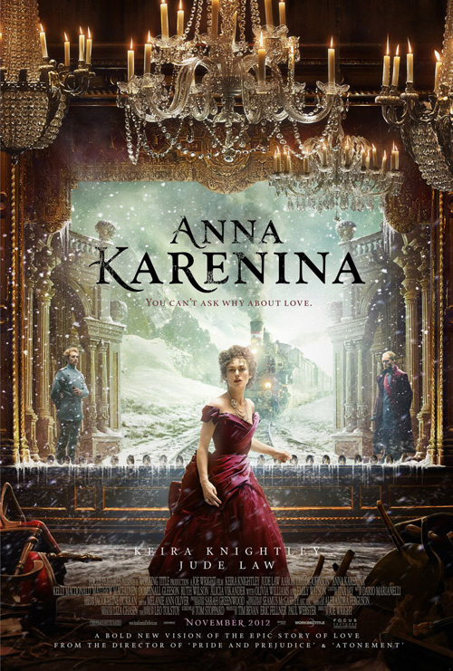 |
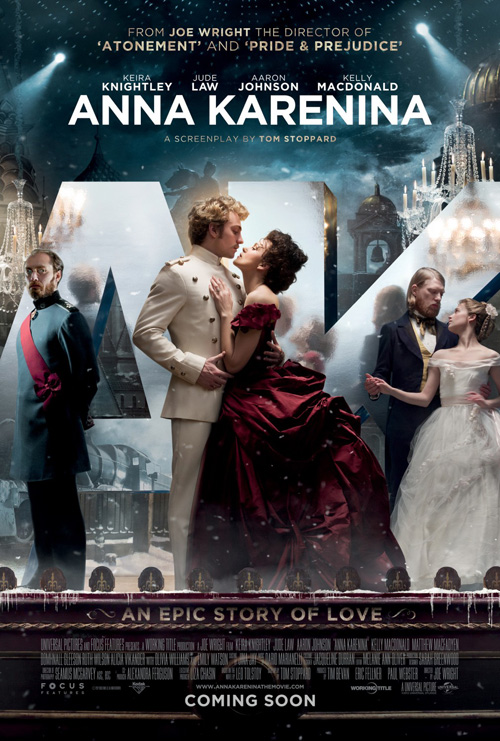
Rounding out this icon section, Anna Karenina (limited November 16th) doesn’t quite have a visual representation to work from because the book itself is the legend. What Creative Partnership therefore does is utilize the amazing theatrical artifice blatantly used by director Joe Wright in the film. We have the stage below, spotlights above, a montage of backdrops, and depictions of love shared and rebuked. And amidst the period garb, ornate chandeliers, and giant sans serif “AK” blows a snow caught between reality and the show.
No question, there is a lot going on in this layout and yet I’m not ashamed to admit its perfection. I know I harp on and on about minimalism and stripping work down to its barest of essentials, but having had the luxury of seeing the film at TIFF allows me to acknowledge just how well it captures the essence in its chaos.
P+A is successful in this as well, but with less scope. Theirs takes a direct page from the film by showing the full auditorium stage it’s performed on with a blizzard. The somber looks of both men and the positioning of the oncoming train towards Keira Knightley shows the destruction to come, but it’s just too neat. The title font is a gem, though. I’ll give them a victory over Creative Partnership for that one.
It’s all about the composition
 |
 |
 |
 |
 |
 |
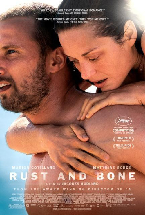
You don’t have to go far to comprehend my meaning as Rust and Bone (limited November 23rd) shows how an innocuous image can turn powerful by what’s around it. Despite being cropped the same, the American version of The Rageman‘s sheet loses all impact. So Matthias Schoenaerts is giving Marion Cotillard a piggyback ride. Who cares? He’s determined to keep going, she’s scared of letting go, and it’s sunny out.
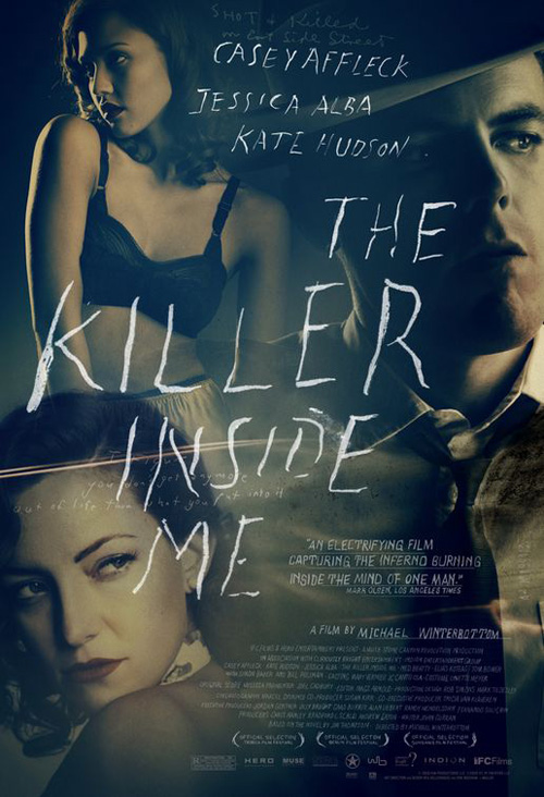
Now let’s compare it to the French entry and its scratched typography a la Kellerhouse, Inc.‘s The Killer Inside Me—only even more scrawled. These letters are engraved in and the photo itself is weathered and blemished. The emotional resonance transforms completely and a sense of escaping towards safety crosses my mind. This is no longer a loving couple out for a stroll. These two are engaged in something that goes deep below the surface to uncover their souls.
On a side note, it is funny that impawards.com—a stellar database of posters—has an unfinished American release. Schoenaerts is so long that you can see a hyphen and no other letters past the first “e” and the line about director Jacques Audiard barely even begins to show the title of his last film A Prophet.
Deciding against photography altogether, the one-sheet for The Central Park Five (limited November 23rd) gives us a very attractive graphic representation of the scales tipping between the city and its victims. You’ve got the black and white depiction alluding to the racial profiling key to the documentary’s subject and the messy, strained artwork showing the unsteady balance between truth and lie.
The slant of the scale creates a perfect space of negative space for the title’s strong stamp of one word per line, the gray adding another layer against the otherwise colorless high contrast. Justice is on trial and the advert projects just that with as little superfluity as possible.
 |
 |
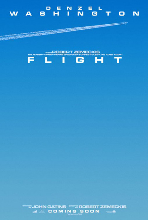
BLT uses a mix of both these design forms for Flight (open November 2nd). An image of a flying plane streaking through the sky small and far away shows exactly what is necessary. You don’t need a close-up of the craft—we’ve all seen an airplane before. Instead it’s the scale and the futility of being alone so far from the ground. The wide expanse of blue sky can only begin to express the void of uncertainty below you once trouble begins. There’s also something very captivating about the title’s wide kerning and its ability to still appear strong despite the gaps.
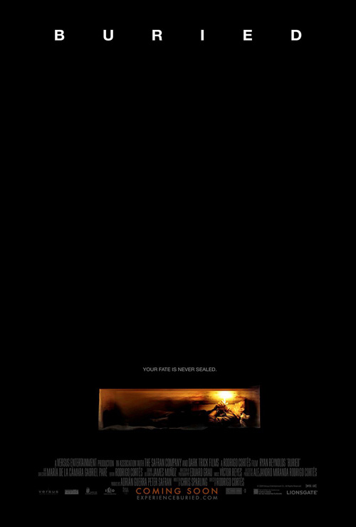
Much like Ignition Print‘s work on Buried, the insane amount of negative space is overpowering in its sense of dread. Whether in the sky or beneath the earth, the isolation is deafening and the suspense mounts like no portrait of Denzel Washington could. The sad truth is that the actor’s rainy face probably represents the film more than the plane since it doesn’t take long before the crash at the center of the plot takes an unfortunate backseat to the Denzel show.
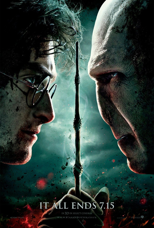 |
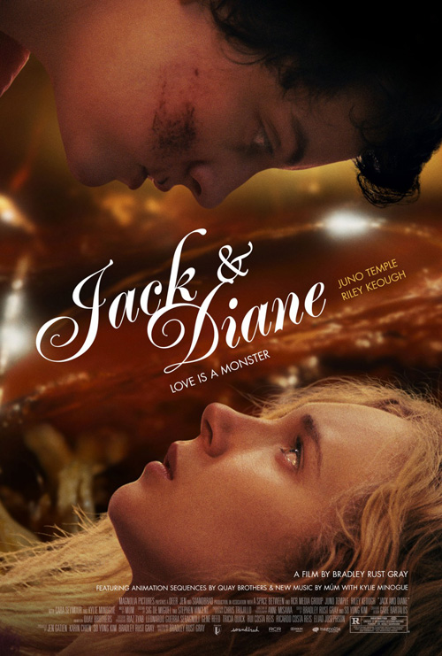
As for Jack & Diane (limited November 2nd), I have no idea what the film is about yet find Gravillis Inc.‘s work on the poster mesmerizing. It’s off-kilter framing resembles WORKS ADV‘s Harry Potter and the Deathly Hallows 2 yet without giving you your bearings. Is Juno Temple lying down as Riley Keough descends? Is it an image of them standing yet tilted for added effect?
Seeing that there is animation included by the Quay Brothers, I’m almost disappointed not to be getting an example of their usually creeping work. However, I’m not sure anything they could have done would unseat this as its winning poster. There are a lot of unanswered questions in the gap between the actors and the script font’s flowing serifs at the middle only add to the incongruity of the whole. It’s just unsettling enough to grab my attention.
If it ain’t broke … fix it?
 |
 |
 |
 |
 |
 |
 |
 |
 |
 |
 |
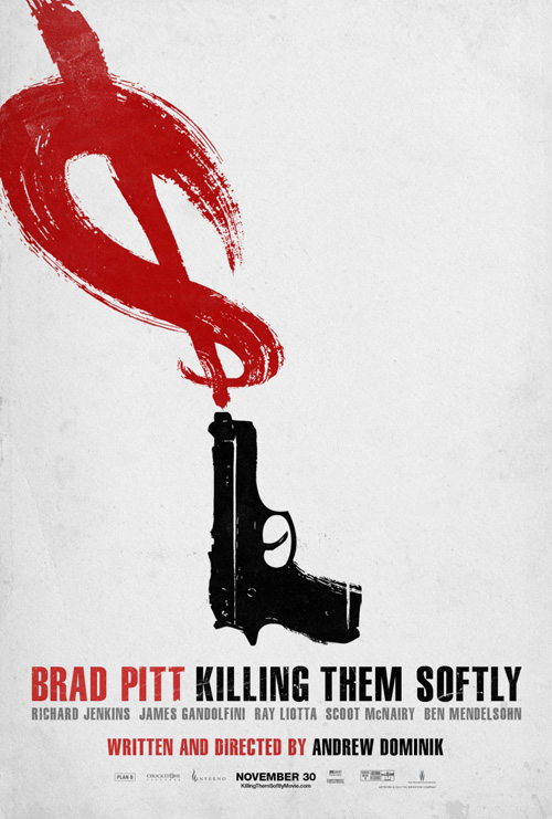 |
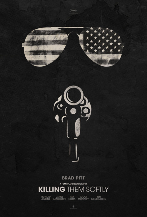
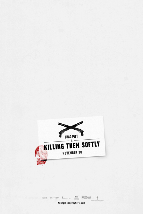
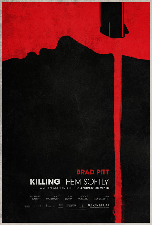
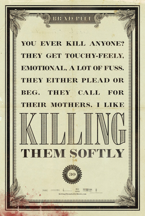
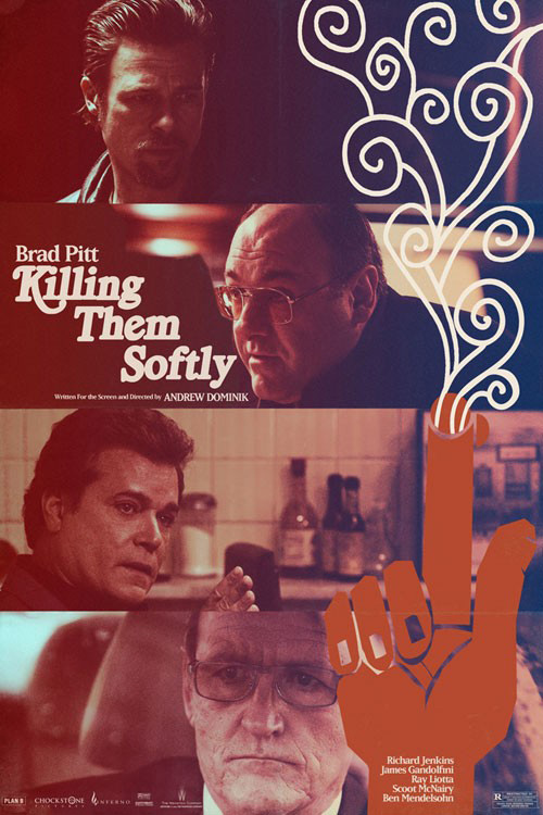
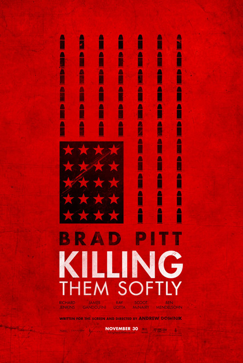
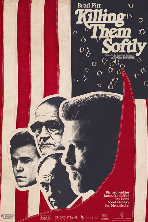
The first poster for Killing Them Softly (open November 30th) by Gravillis Inc. is a stunner in its simplicity. Patriotic sunglasses and a gun—the NRA would be so proud. It’s an interesting move to not put star Brad Pitt on the work and a brilliant jumping off point for the myriad entries in what’s become a sprawling, diverse collection.
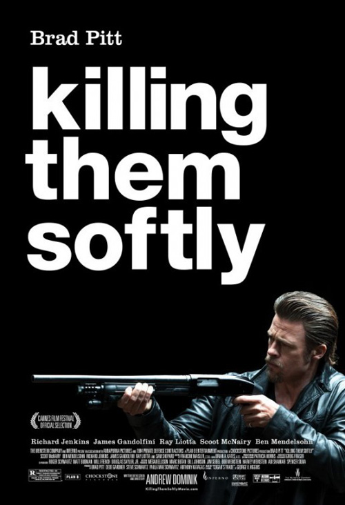
Number two plays on the same iconography with the gun’s chamber integrating the flag. Both would be in a class amongst themselves at your local multiplex, so unsurprisingly the Weinsteins decided to get a bit more conventional with a simple white title treatment over Pitt as he’s swallowed by a black abyss and a very generic totem of actors most recently released. These two will sell the Pitt fans that will probably be a bit dazed by what’s sure to be a deliberate mood piece if director Andrew Dominik‘s previous Assassination of Jesse James is any indication.
So the rest of the group become more aesthetic art than consumer targeting as I don’t see any of them being hung in the theatre over the previous two. I’m not sure who is behind the entries with the old school, bubbly thick title font, but Gravillis was in charge of the others. Number five is probably my favorite as the business card shows we’re dealing with a gun for hire and the bloody print explains his precision. Six is cool due to its 70s-era feel as well and there is just something visceral about number seven that I can’t shake.
Tear ’em and run
 |
 |
 |
 |
 |
 |
 |
 |
 |
 |
 |
 |
 |
 |
 |
 |
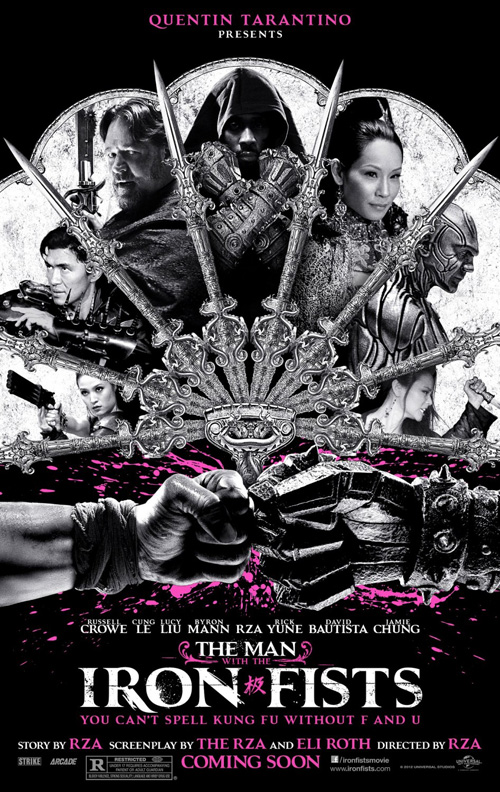
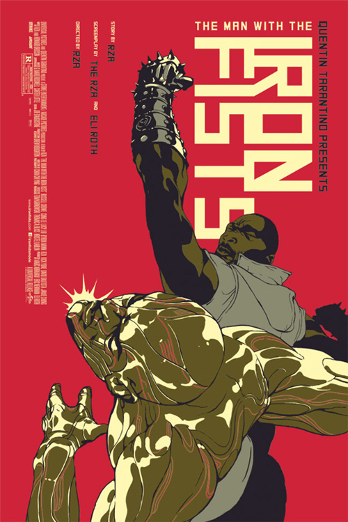
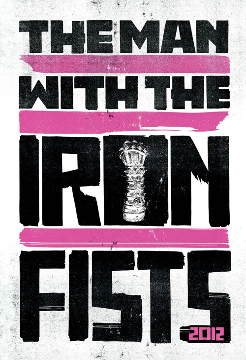
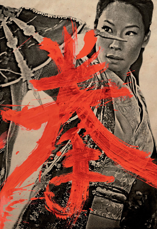
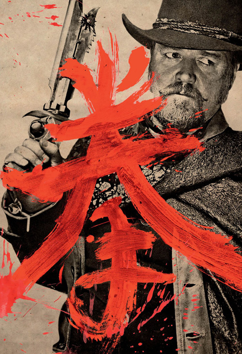
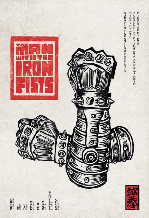
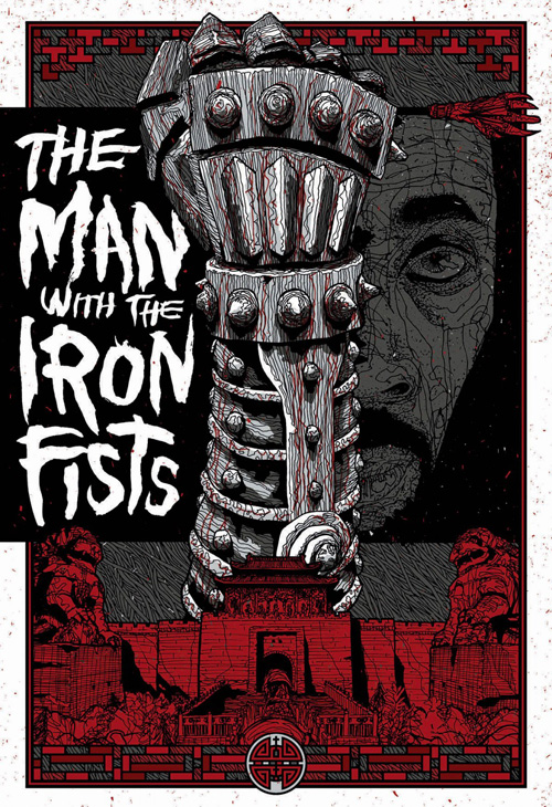
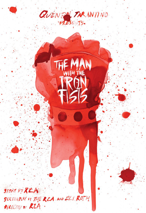
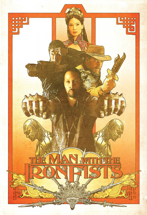
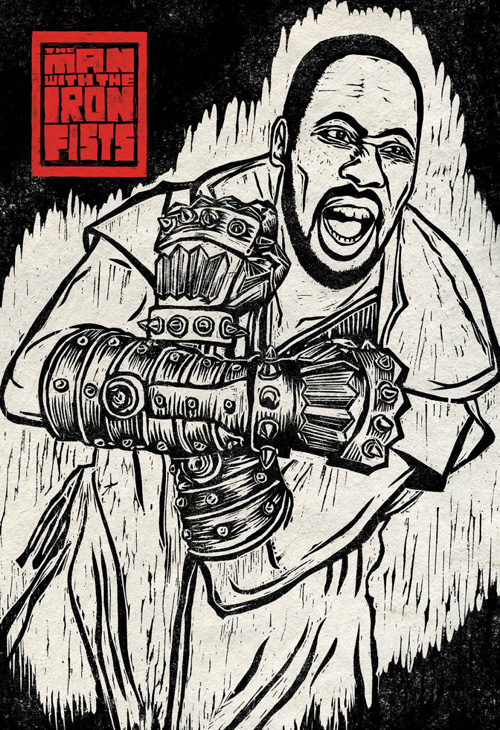
I’m still not sure what to think about RZA‘s directorial debut The Man with the Iron Fists (open November 2nd). Here’s this former Wu Tang Clan rapper taking a dip in the world of cinema with a ton of very well placed friends to lead the way. The dude is supposed to be an insane Kung Fu fanatic and the trailers do look like crazy fun despite shoddy effects and over-the-top characters. But isn’t it a bit wrong to see someone with no real experience in the biz get the marketing dollars he has?
I guess there is a built-in fan base of millions—between Wu Tang fans, Kung Fu action fans, and the likes of people like me wanting to know if it’s a train wreck or awesome—so the money isn’t ill spent. And Ignition Print did go all out on the promotion; you have to give them props for that.
The actual one-sheet (shown first above) is pretty conventional with its oriental fan motif, collage of actors, and titular fist. Meh.
In my opinion number two (done by Tomer Hanuka for Mondotees as a limited collectible) is the best. The stylized drawing is slick, the eccentric typeface nicely bleeds letters into each other, and the colors give a nice Soviet-era Constructivist feel.
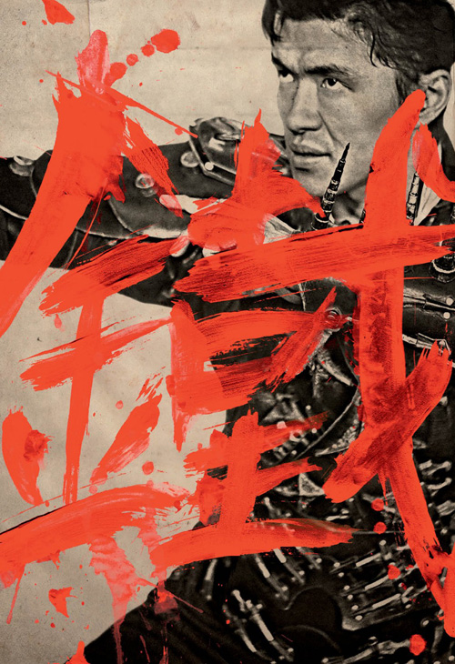
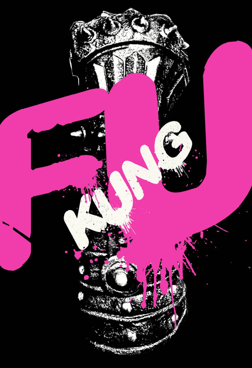
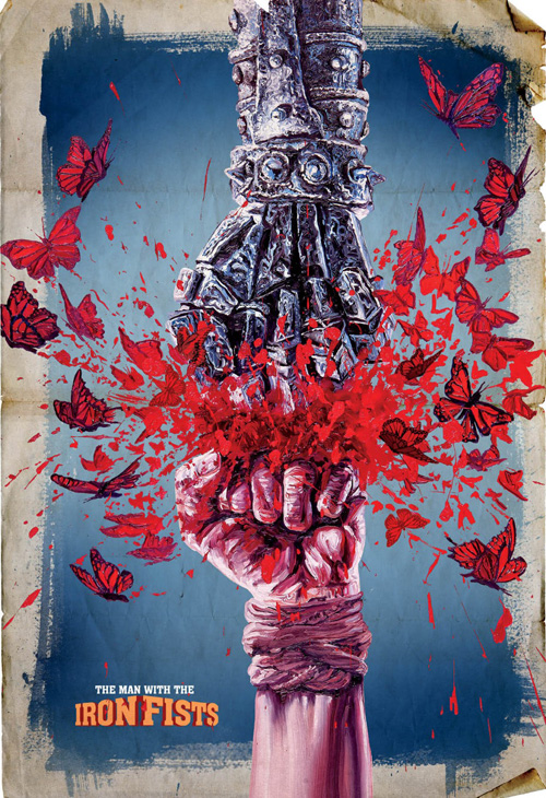
But whether or not I like the others (14 of the 16 shown) is beside the point. I really only love the character posters because of the graffiti nature and stripped palette. The others show the iron fist in multiple iterations and really don’t do much for me in terms of attractiveness—that’s just my tastes, though. What’s awesome is that they are only available as limited tear-offs around select cities. You’re seriously supposed to go up to them on exterior walls and take them down for your collection. Now that’s some pretty cool outside of the box thinking.
What is your favorite November release poster? What could have used a rework?

