“Don’t Judge a Book by Its Cover” is a proverb whose simple existence proves the fact impressionable souls will do so without fail. This monthly column focuses on the film industry’s willingness to capitalize on this truth, releasing one-sheets to serve as not representations of what audiences are to expect, but as propaganda to fill seats. Oftentimes they fail miserably.
—
Summer continues chugging along with the America and/or Earth threatened by destruction at every turn. Whether comic book adaptations, zombie wars, terrorist assaults or a giant pit opening up to the fiery depths of hell, get ready for a lot of Wilhelm screams.
Even the independent releases bring darkness with young assassins, vampires, psychological horror, and—gasp—spoiled teenage brats. With a couple buddy comedies rounding out the slate to add more popcorn fun in an otherwise drama-heavy month, there does appear to be a little something for the whole family. Well, except the kids who must wait until Disney/Pixar’s newest drops at the end of week three. At least that’s good news for May’s enjoyable Epic to grow some legs.
America needs saving
 |
 |
 |
 |
When the idea of our country needing a savior crops up, who better to make things okay than Channing Tatum and Superman? Right?
 |
 |
 |
 |
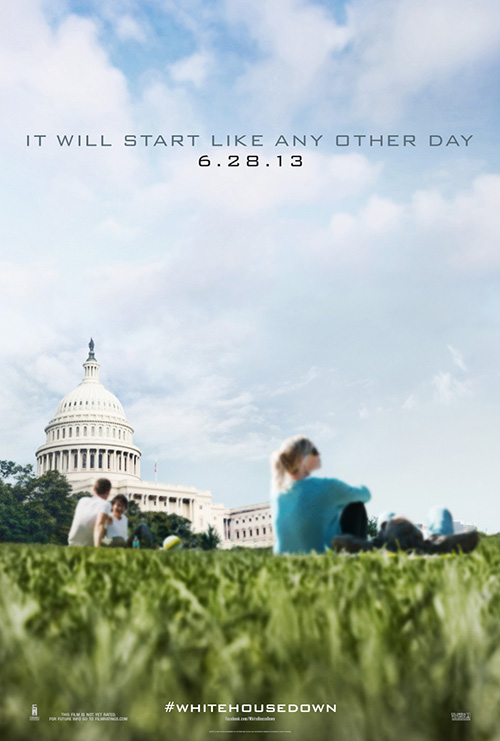
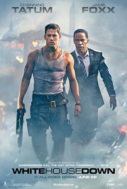
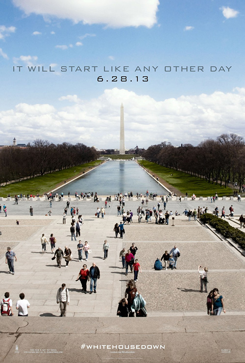
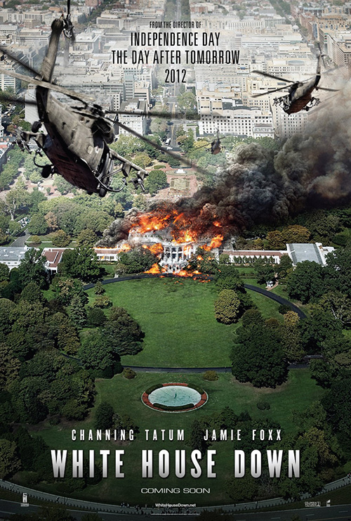
For White House Down (open June 28), director Roland Emmerich has found his first leading man that actually looks ready to do some damage. Yeah, I know Will Smith saved the day in ID4, but let’s face it—he didn’t have the beefed up physique we know from Ali. No, instead the German master of destruction has used Hank Azaria, a boyish Jake Gyllenhaal, and John Cusack to fill the bill. Now there’s a trio of badasses if I’ve ever seen one.
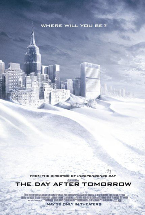
While Emmerich upgraded the machismo, however, the studio appears fine sticking with retread artistic styles. Bemis Balkind’s entries with the Capital Building and Washington Monument can’t help but recall Art Machine, A Trailer Park Company’s frozen landmarks from The Day After Tomorrow and BLT Communications, LLC’s attempt to add dynamic visuals from an overhead of the White House burning looks eerily similar to their own spaceship looming sheet for Independence Day in reverse.
I don’t know how this campaign could have been freshened up, but I will say Concept Arts’ smoky Tatum next to President Jamie Foxx isn’t the answer. Maybe the fact Columbia Pictures felt they needed to use work from three different design firms is the most telling detail. I guess they didn’t know what to do either.
 |
 |
 |
 |
 |
 |
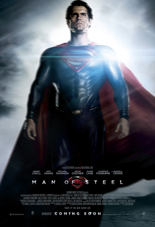
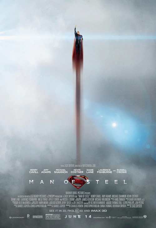
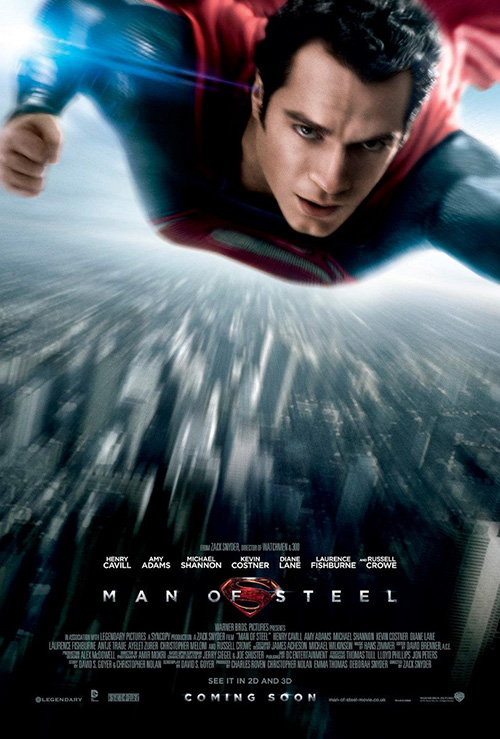
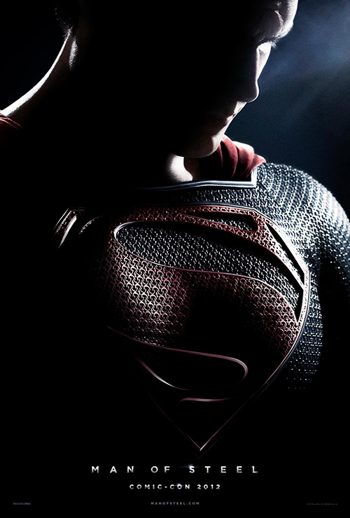
Man of Steel (open June 14) on-the-other-hand knew exactly what it wanted—for better or worse. Both WORKS ADV (who designed the one on the left with Henry Cavill standing tall) and P+A (the zooming smudge of red on the right) must have been told by Warner Brothers to use a hazy gray sky and as much motion blur as their computers could handle. A bit too polished and manipulated, at least there’s a consistency of tone.
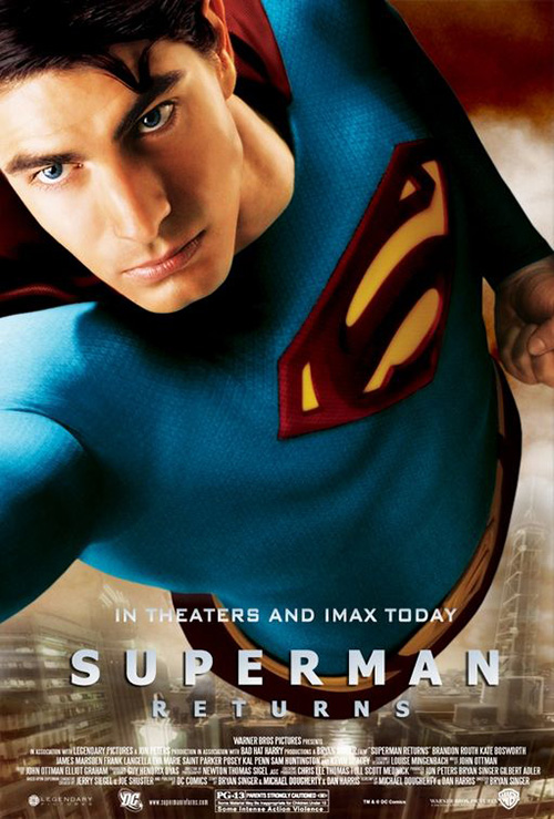
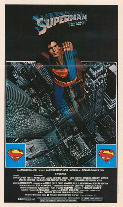
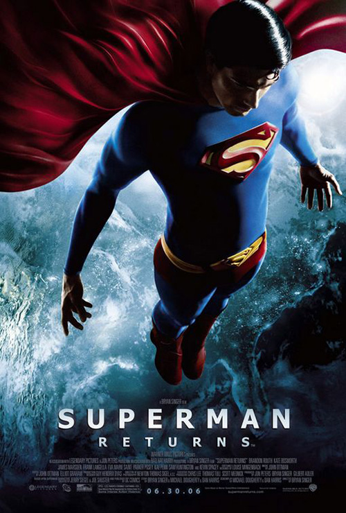
Looking like J.J. Abrams shot them during down time on Star Trek Into Darkness to afford adding extra lens glare aside, the firms did at least give us an upgrade from the franchise’s last installment Superman Returns. As you can see in the comparisons at right, while the old school blue served as connective tissue to an ill-fated attempt at shoving the film into Christopher Reeve’s already existing canon, the cartoony feel leaves much to be desired when juxtaposed against Christopher Nolan’s DC image of despair.
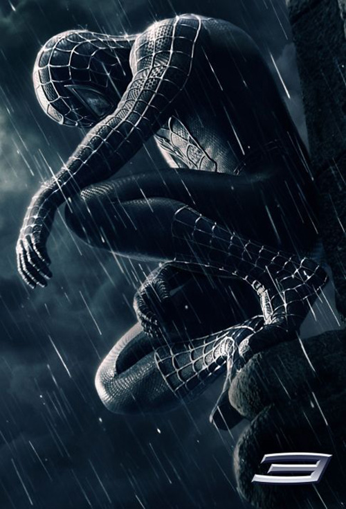
Add a little Spider-Man 3 texture and one could almost forget Brandon Routh ever donned the tights. Which is too bad since I thought he did a pretty good job despite the movie’s many shortcomings.
In the business of characters
 |
 |
 |
 |
A lot of firms these days are very high on the practice of selling a film through the famously pretty people acting within it. While not a hard concept to comprehend and surely appreciated by the celebrity elite’s in constant need of assuaging vanity, it doesn’t mean you can’t also be inventive despite the maneuver’s inherent ease.
 |
 |
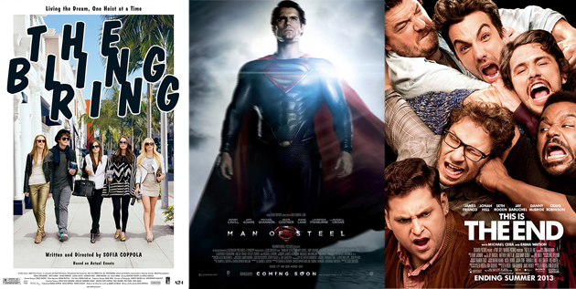
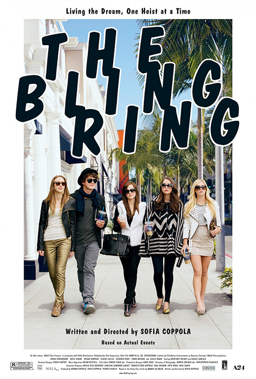
The camp P+A falls into with The Bling Ring (limited June 14) is tough to call. I love how they decided not to put all the weight on star Emily Watson’s shoulders but wonder if the image chosen is simply too bland. The quintet of extra-large sunglass wearing aristocratic youths strolling down the street like they own it just can’t help conjuring images of their older counterparts from Sex in the City.
With that said, I’m strangely fascinated by the typesetting choice. Not only does the title font’s Marker Felt-esque look give it character beyond the usual thick sans serifs of the world, but the extreme kerning pushing a huge space between each letter is unsettlingly enough to not lose my attention. The conversely decreased leading causes vertical overlap and the pattern created is an attractive one.
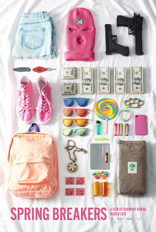
If I had a glaring negative it would be the second sheet’s brilliance. These characters can be visually distilled to their glasses and yet we still know exactly how spoiled rotten the owners are. Similar to Spring Breakers’ assortment of goodies, a design that successfully lets our imagination do the heavy lifting can’t be beat.
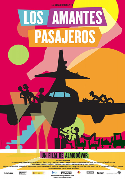 |
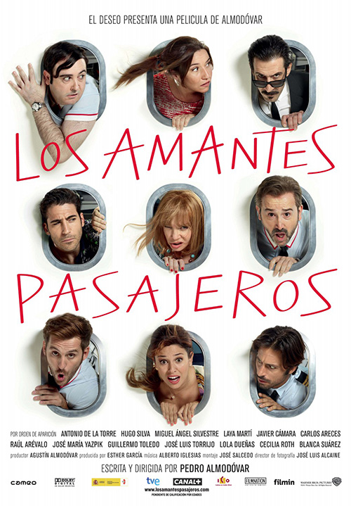
Now what if you could combine these styles together? Blending the abstract with portraiture to portray something wholly new is kind of an ideal to strive for. Congrats go to whoever designed the newest sheet for I’m so Excited (limited June 28) because they’ve achieved just such a union.
The original poster built from jaggedly geometric color fields is fun and boisterous, but it has nothing on the faux airplane window motif here. Not only does it allow nine very expressive actors to ham it up for the camera, it also lets a nice sense of depth manifest while wind swept hair alludes to horizontal motion. Some are excited, some quizzical, and others scared—a circus of comedians at their best.
Add the thin, hand-scrawled, and inconsistent sized text and we receive a piece full of complexity that appears anything but. I’m excited enough from the tone projected and the inclusion of two great Spanish actors in Carlos Areces and Lola Dueñas that the absence of Pedro Almodóvar regulars Antonio Banderas and Penélope Cruz only makes me believe the film can stand on its own merits.
 |
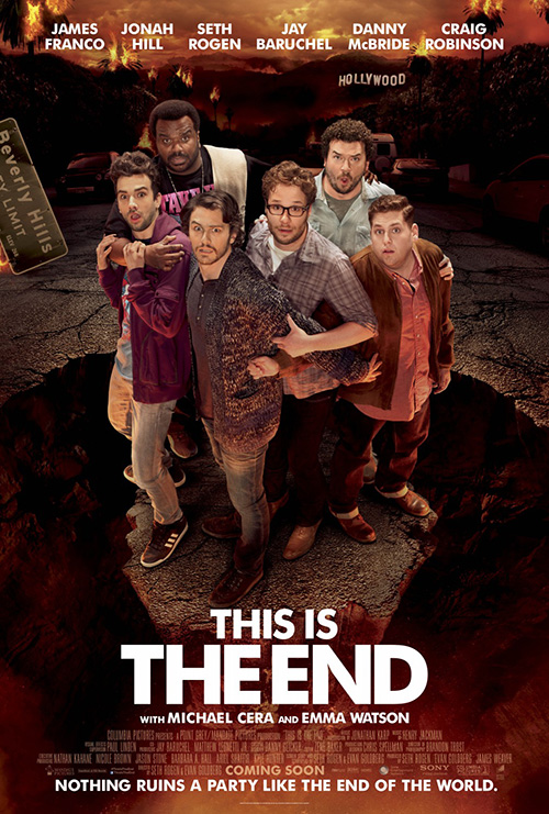 |
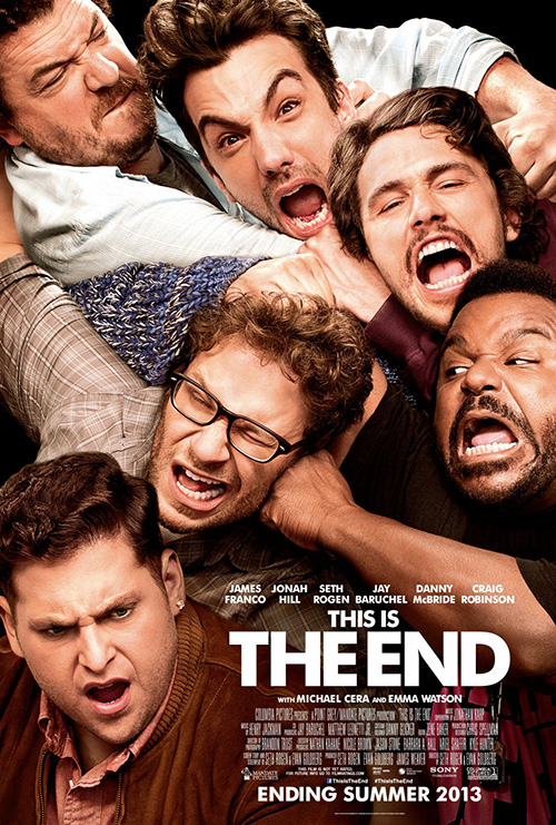
For some films, however, the rule of less is more doesn’t apply. Seth Rogen and Evan Goldberg’s This is the End (open June 12) is a perfect example with its inclusion of so many big personalities proving to be its greatest appeal. Rogen, James Franco, Jonah Hill, Jay Baruchel, Danny McBride, and Craig Robinson are playing themselves in an apocalyptic, big budget comedy—you better squeeze them all on the poster.
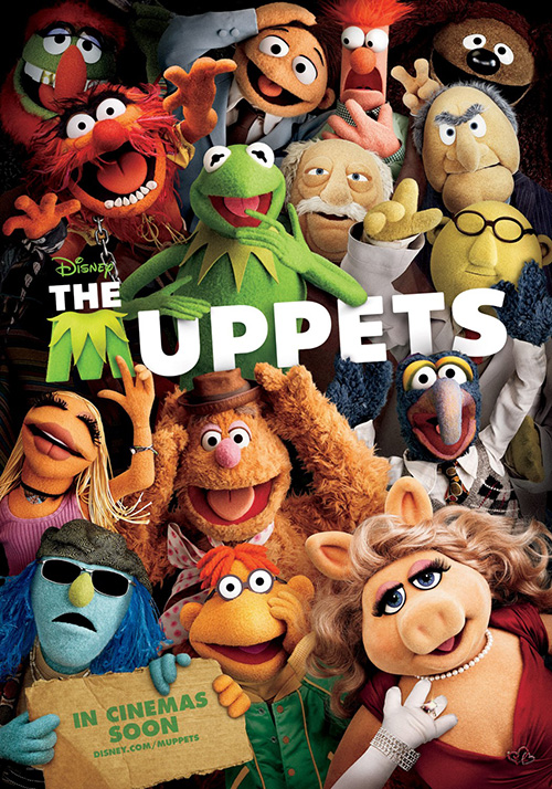
Well, squeeze is exactly what Bemis Balkind did, putting the enraged gang at each other’s throats. Made funnier because the concept is often used in children’s films like The Muppets or The Smurfs, the only thing that could have made this image better is if their faces were also smashed against the camera lens.
Honestly, who needs to see them Photoshopped against the wasteland of a burning Hollywood when the destruction of each other can metaphorically explain the chaos of their situation? I just hope what we’re seeing is an actual photograph and not the work of an artist painting everyone together. Thinking these six guys posed for this in a small confined space just makes it more hilarious.
 |
 |
 |
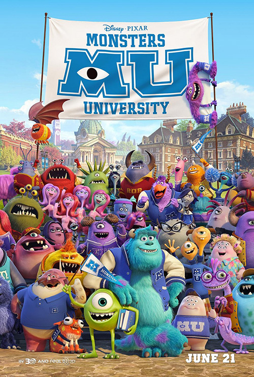
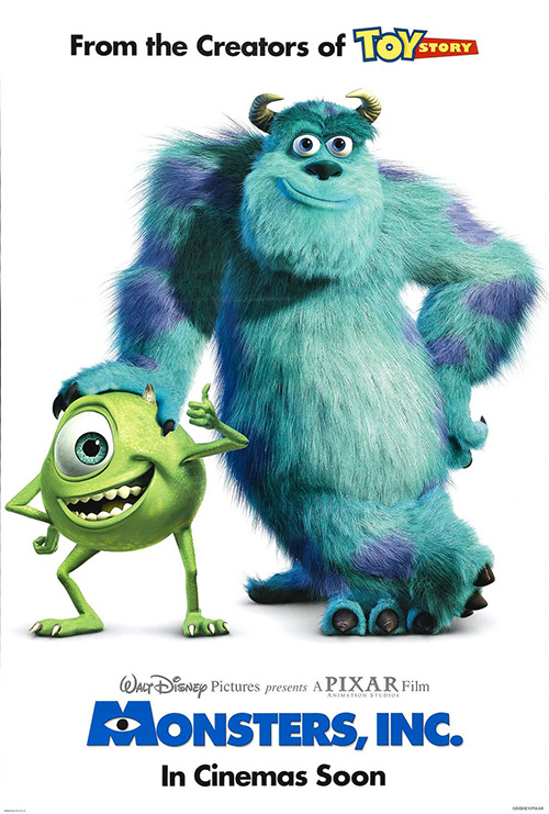
And speaking of kids’ movies, Monsters University (open June 21) does it too by cramming as many potential sources of toy revenue—I mean cutely surreal characters—as they can. Yes, BLT also made one with Mike and Sully against a white background to recall Monsters Inc. before it, but the more is more policy is what the youngsters need to be amazed.
Alternately, while Five33‘s setting up of a scene with the big blue fella on a top bunk is humorous as the monsterfication of the room adds appeal—see The Right Stuff poster—the plush doll in letter jackets possibilities of the class picture sheet is tough to ignore. Sully still gets to pose with his signature lean on Mike, there’s a ton of faces to memorize so you can pick them out in the film, and it retains the mystery surrounding the movie’s true conflict. Or at least it better be because I’ll be sorely disappointed if there isn’t more to this than the leads graduating college.
Two peas in a pod
 |
 |
 |
 |
 |
 |
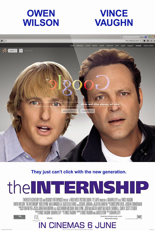 |
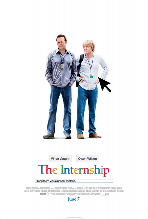
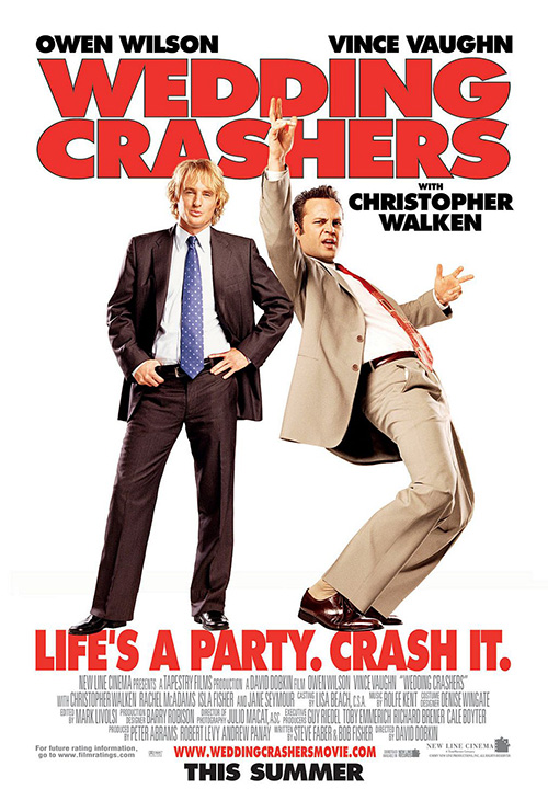
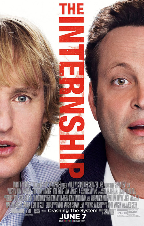
It’s kind of hard to believe that it’s taken this long for a Wedding Crashers reunion between Vince Vaughn and Owen Wilson, but the day has finally come in the form of a comedy set within Google. And even though it appears Fox enjoys the lame rubberstamp look Gravillis Inc. utilizes on top of Wilson’s duckie face for their current stretch run towards The Internship’s (open June 7) release, there are a couple other firms who sought to be a bit more creative.
This is Google after all, so why not go beyond the normal actors on white we’ve already seen previously in this post as well as Dawn Patrol’s sheet for the aforementioned Crashers? ARSONAL does a great, subtle job of recreating the search engine’s homepage in a minimalistic way by adding the company’s colors and font to the title as well as placing the tagline in the open field bar. Add in the cursor arrow and you almost ignore the weirdly postured and expressive faces of the actors.
Even Art Machine took the time to have some fun, albeit in a much bigger and less effective way. Making it seem as though we’re looking from inside the computer out at these two recently unemployed gents, the clarity of their faces against the faded components on the glass should obviously be the other way around. And while I somewhat despise the distressed font from Gravillis, whatever is happening here is atrocious.
 |
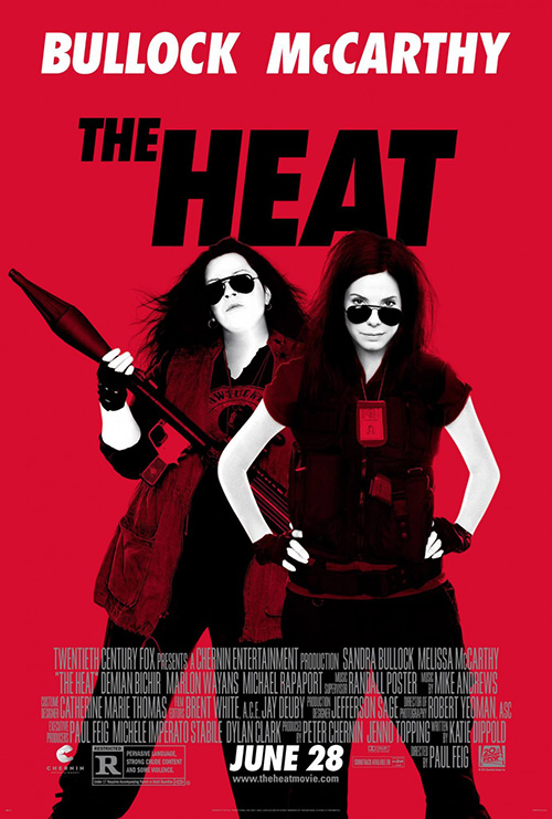
Who really expects something profoundly unique from a buddy comedy with Vaughn and Wilson, though? For that matter, who’d think we’d get it with Melissa McCarthy and Sandra Bullock either? Definitely not me. But somehow ARSONAL does enough to keep it interesting again with The Heat (open June 28).
Very reminiscent of the fourth season DVD artwork for HBO’s Entourage, the high contrast black and white on red is striking from a distance at your local multiplex. Rather than just place the stripped down photography atop the background’s neon field, however, ARSONAL appears to use the multiply Photoshop filter to allow the black to seep into the red. Bumping up the skin’s brightness to make the leads look as if they’re glowing only grabs your attention more as their no-nonsense attitude stares you right in the face.
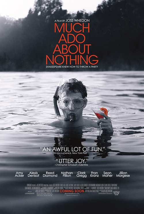 |
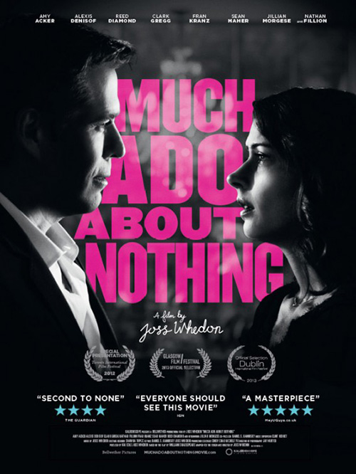
When it comes to Joss Whedon’s William Shakespeare adaptation Much Ado About Nothing (limited June 7), however, I’m not sure I can say Oink Creative did enough. The high contrast black and white with hot pink titling sadly makes the masking job seem worse than it is as the contours of Amy Acker and Alexis Denisof’s faces almost look like they’re outlined in black. It’s faux style that just doesn’t work for me besides getting Fred and Wesley back together for the first time since Angel.
No, it’s Ignition Print’s utilization of the original tease photo with Fran Kranz snorkeling that excels. The orange coloring is much brighter and easier to discern than the pink and I love the fact they tinted the martini glass as well. It’s a comical still that plays in perfectly with the tagline while also retaining an air of mystery in as far as how faithful to the source material Whedon went.
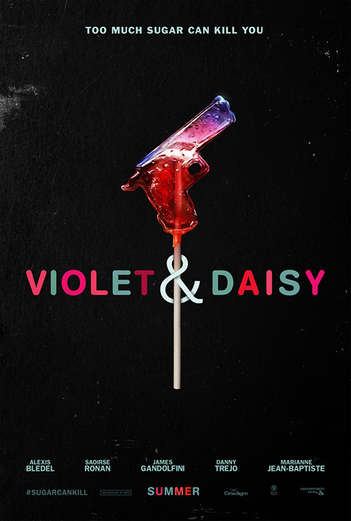 |
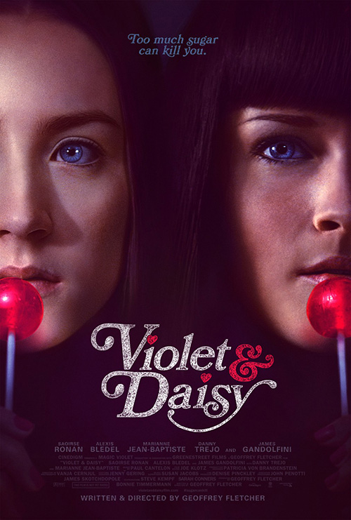
But no matter how much I enjoy seeing the aforementioned rogue demon hunter and his escaped-from-a-hell-dimension physicist beau back in a Joss production, the month’s award for best pair goes to Saoirse Ronan and Alexis Bledel. Gravillis Inc. has outdone themselves on Violet & Daisy (limited June) with a pulpy filter, perfect font and coloring, and palpable sense of danger. The juxtaposition of those piercing blue eyes and brusquely closed lips against the slight whimsy of lollipops is chilling.
Even their original tease is amazingly creative with the gun sucker distilling down the contrasting themes of teenage girls and murder at play. You can’t help but have your curiosity piqued in your desire to discover whether the film will be dramatically violent or eccentrically farcical or both. It definitely could go either way and the simplicity of these designs let that ambiguity remain.
Darkness falls
 |
 |
 |
 |
This leaves us with the darker subject matter June is holding up its sleeves. Zombies, vampires, the insane, and violent criminals are providing the inspiration and the design firms are having some fun. For the most part at least.
 |
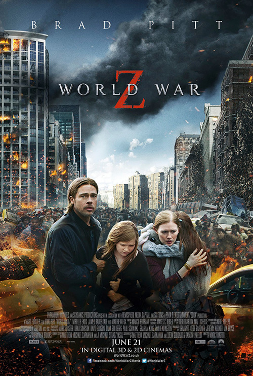 |
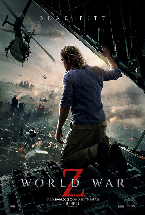
Somehow BLT Communications, LLC has found a way to make the most laughable moment of World War Z’s (open June 21) trailer into a stunning piece of artwork. Another work utilizing the stripped down monotone with color highlight, it’s ever-growing pile of carnage and feral desire displays the scope we can expect to find in the highly publicized and rumored mess of a movie.
I could do without the comic book aesthetic 3D title text in gradient shimmer, but otherwise the poster is quite clean. Our eye goes straight to the red “Z” and up towards the mass of inhumanity climbing itself to an about-to-be-capsized helicopter. Simple, efficient, contextually relevant, and everything the campaign’s over-Photoshopped portraiture can’t come close to copying.
The fire in both one-sheets is cartoony at best, the motion blurred hoards of zombies(?)/survivors(?) is lost in a sea of flat color, and the actors are awkwardly positioned in the most unrealistic ways. Does Brad Pitt’s daughter have a tummy ache? Are they not worried about running for their lives? Is someone lying dead at their feet and therefore blocking their progress physically and emotionally while diverting their attention? Who knows?
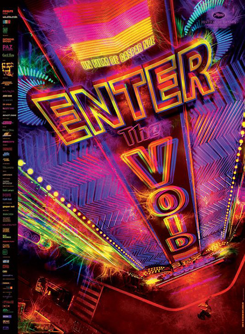 |
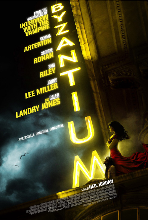
What is blatantly clear, however, is that they simply don’t know how to create the type of foreboding atmosphere the artists behind Byzantium’s (limited June 28) sheet can. Ronan and Gemma Arterton may be a bit too painterly in their checkout line romance novel cover sort of way, but I do love the neon sign title. Not as crazy, electric, or extreme as Enter the Void, the power of its bright glow against the menacing black sky still grabs your attention.
It’s easy to look past the unfortunate reality of its perspective being way off—the vertical sign appears parallel to the underside of the roof’s overhang despite both being perpendicular to the ledge our leads are resting upon—because of the mood created. The film is about vamps, after all. Embody that danger of the unknown and embrace its impossibility with some impossible architecture.
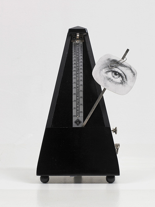 |
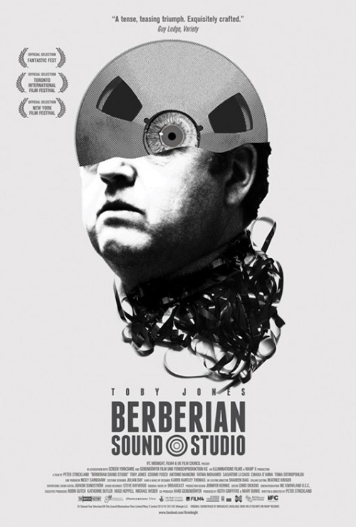
June needs more imagination and non-photo work anyway to try and give the advert for Berberian Sound Studio (limited June 14) some company. Reminiscent of a surrealistic collage of materials a la Man Ray (at right is his Indestructible Object), the rough Avant Garde texture is all that’s necessary to set it apart from glossy companions at the movie theater.
A psychological thriller linked to the warped mind of its lead character played by Toby Jones, it’s no surprise the artists would invite us inside. With a film reel and scary eyeball filling the space where his brain should be, we can anticipate the blurring of reality and dream to come. Add the twisted and knotted film spewing forth from his neck and we can assume it won’t be fun and games. There just aren’t enough down and dirty, interpretive advertisements anymore. Maybe the mainstream masses wouldn’t be so averse to thinking if we forced them to do so more than once every couple months.
With that said, thinking doesn’t always mean figuring out the symbolism inside abstract imagery as much as wondering what isn’t on display. This is the quality cold open has given The Purge (open June 7) in spades.
It’s dark enough to make you lean in and catch the detail, sinister enough to feel frightened at the prospect of what those dead eyes are calculating, and creepy enough to forgive your turning away. The tag says it all, “One Night a Year, All Crime is Legal.” While that could easily mean some reprieve for neighborhood kids to let off some steam, this poster tells its true definition. We’re talking rape, murder, and other unmentionable/unbelievable crimes at work and just looking at that face will make you want to run like the innocent victims in the film hoping to survive until morning.
What is your favorite June release poster? What could have used a rework?

