Dailies is a round-up of essential film writing, news bits, videos, and other highlights from across the Internet. If you’d like to submit a piece for consideration, get in touch with us in the comments below or on Twitter at @TheFilmStage.
After reading our in-depth interview, see Roger Deakins share his 15 favorite documentaries at Nonfics:
Few artists in the history of the medium have done more to create this synergy than Roger Deakins. A man of sublime taste in the projects he chooses and impeccable craft in the visions he provides, the 12-time Oscar-nominated director of photography has granted audiences images as indelible as any in film history. From his longstanding work with the Coen brothers through to his most recent work with Denis Villeneuve, Deakins has pushed the boundaries of both analogue and digital photography in ways both pioneering and poetic. He’s a giant in his field, one who got his start, as many of the best have done, in the world of documentary (mostly with shorts, but also one of the first features he shot is Curtis Clark‘s Blue Suede Shoes).
Watch a video essay on the Greek tragedy structure of Chinatown:
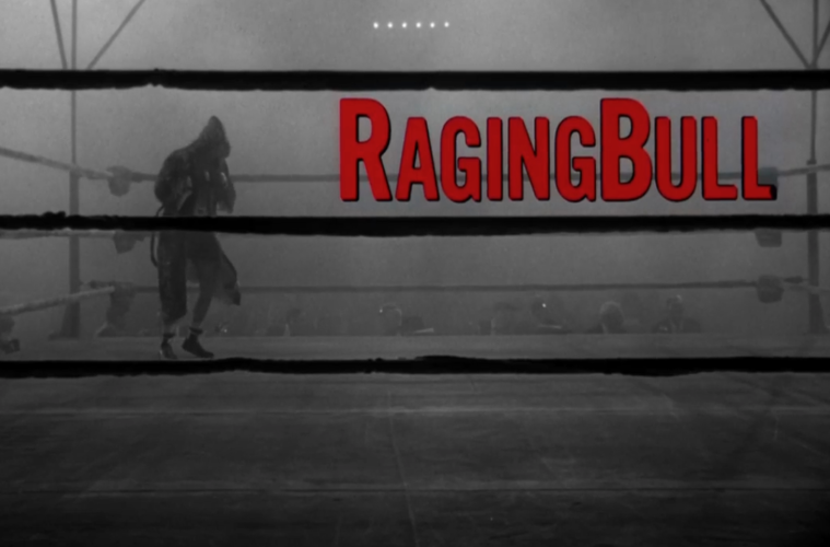
The Art of the Title breaks down the opening of Raging Bull with title designer Dan Perri:
Michael Chapman shot it at 48 frames per second, so it was in slow motion. I wound up copying the scenes that the titles were over. It was basically the character warming up in the ring and each shot was overcranked, but when I duped that I double-framed it again so it was now at 96 frames a second, so it was even slower than the original photography. I copied from a fine grain on to coloured stock and tested it. Often when you put black-and-white images on coloured stock it gets a warm or a cool cast. It’s either kind of yellowish or it’s kinda blueish. But I did a lot of what’s called colour timing. We timed it through the whole process of colour timing until I got a dead black-and-white. It was not blueish or yellowish. It looked as good as real black and white.
Watch the full NYFF Q&A for Robert Zemeckis‘ The Walk (our review):
Movie Mezzanine‘s Jamie Christley reflects on Stanley Kubrick‘s Killer’s Kiss at 60:
The budding Kubrick aficionado can’t be blamed for letting an indefinite bout of procrastination stand between them and a first viewing of Killer’s Kiss. Everything about it, from its 67-minute running time to its reputation as a small, slight effort, to its vaguely off-putting title, screams “optional” and, indeed, when finally viewed, it doesn’t disappoint carefully managed expectations. When its aimless first 10 or so minutes give way to something resembling a plot, it becomes clear that Kubrick is less concerned with a compelling story than exhibiting characters in distress within a specific milieu.
Watch the full NYFF Q&A for Guy Maddin‘s The Forbidden Room (our review):
Bruce Beresford tells Criterion his 10 favorite titles:
I’ve never been a huge fan of David Lean’s epics and think the modest British films he did in the 1940s are superior. I also wouldn’t have thought he had a glimmer of humor, but [Hobson’s Choice] is witty, and the actors (even Charles Laughton) have been directed with insight.

