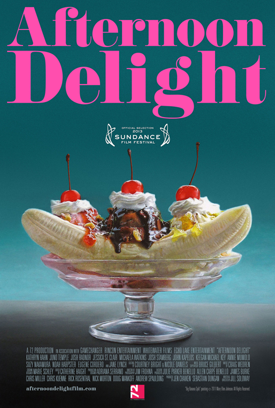
A new year means a whole new approach to movie posters, and if two recently-released designs reveal anything, it’s that 2013 is veering toward the sparse.
From the upcoming festival scene comes Afternoon Delight, a Sundance selection that stars Juno Temple as a stripper who’s hired by a couple (played by Josh Radnor and Kathryn Hahn) to work as their live-in nanny. The story reads like a more titillating version of last year’s indie sleeper Nobody Walks; coincidentally, both are even set in the hip California community of Silver Lake. This work does little to complement plot details, but it does make some pretty sweet promises.
Directed by and starring Jill Soloway, Afternoon Delight debuts at Sundance on January 21st. See the poster below (via THR):
From mainstream cinema comes The Internship, a comedy starring Vince Vaughn and Owen Wilson as two unemployed salesman who decide to intern at a large tech company. I doubt this new outing will deviate much from Vaughn and Wilson’s extensive list of raunchy films, but the supporting cast – which includes the always funny John Goodman, Rose Byrne, and Daily Show correspondent, Aasif Mandvi – gives it some potential. The teaser poster only offers its two leading men, as well as plenty of white space and some Google-inspired graphics.
See that and a synopsis below (via Collider):
Synopsis:
Billy (Vince Vaughn) and Nick (Owen Wilson) are salesmen whose careers have been torpedoed by the digital world. Trying to prove they are not obsolete, they defy the odds by talking their way into a coveted internship at Google, along with a battalion of brilliant college students. But, gaining entrance to this utopia is only half the battle. Now they must compete with a group of the nation’s most elite, tech-savvy geniuses to prove that necessity really is the mother of re-invention
Directed by Shawn Levy, The Internship also features Dylan O’Brien, Max Minghella, Jessica Szohr, Eric Andre, and a cameo by Olympic swimmer Missy Franklin, for some reason. The film opens on June 7th.
What do you think of the less-is-more approach in the posters? Do you think it helps or hurts the films they’re promoting?


