It’s often the case that cinematographers are worth an interview no matter their film or director. Rodrigo Prieto, on the other hand, presents a larger canvas. He’s collaborated with Martin Scorsese on four features (a run that began with The Wolf of Wall Street and most recently brought Killers of the Flower Moon) while earning the trust of Terrence Malick, Spike Lee, Ang Lee, Oliver Stone, music-video director Taylor Swift, and Greta Gerwig, for whom Barbie duties have made him DP of 2023’s highest-grossing film.
Safe to suggest Prieto’s had an enormous influence on modern cinema, making nearly inevitable his presenting Killers and Barbie at this year’s EnergaCAMERIMAGE. Seated in the festival center’s cavernous conference room, we discussed his decade-long tenure with Scorsese, its latest incarnation, that incarnation’s many forms, and his feature-directing debut.
The Film Stage: We talked here four years ago, for The Irishman, and you told me about doing multiple grades for that film. There was an HDR that was in theaters, plus a Dolby Vision. Now we’re here for Killers, which I saw in IMAX at the Lincoln Square in New York, and it was interesting. I think part of why I wanted to see it that way is because, first, I sort of like the novelty of seeing a new Scorsese on opening day on one of the world’s biggest screens. But I’d also read a bit about it being handled with a certain IMAX finishing process. It’s playing on DCP upstairs right now; then it’ll be streaming on Apple, I assume, in Dolby Vision. I’m curious how it’s been working on different masters from IMAX to DCP to Apple.
Rodrigo Prieto: Well, I think my favorite version of the film is Dolby Vision. And the main reason for that is that it has the deepest, purest black, and more detail, also, in the shadows and the highlights. The film has some pretty dark scenes or dark moments––let’s say “dark backgrounds”––and so on a regular DCP that’s actually not pure black. And that’s [Laughs] a little frustrating to me, but it’s just the nature of it. But our basic color-grading, what we worked on, was the P3 DCP version––that’s the, you know, “main version” that we color-timed everything for and based all the different versions on that. And one thing that I’ve learned through the years of working with Marty and Thelma is that their edit process is extensive––it’s a long period of time––and they certainly know it. They get used to the dailies, which is what they’re editing.
So the color-timing is an interesting process because I had, sometimes, some idea, originally, of how I wanted the result to be that is not exactly what’s in the dailies. Because whoever was color-timing the dailies––especially, you know, working on film negative––can go anywhere, and you don’t have a pre-color-timing with a DIT. So I try to send very precise notes to the dailies color-timer, and if something’s off I try to redo it, if possible, because even… many sessions, Scorsese will go, “But what was it like originally?” And I’m like, “Originally? Nothing, because it was, you know, what a color-timer designed in one day. Maybe he had too much coffee or…” So it’s it’s a tricky process. But anyway: we finally get to what the film is and, you know, it’s finding a balance between what the dailies were and what my intention is––just finding it. So that’s the P3 version, right? The DCP.
Then we extrapolate and we do the different versions based on that. So they actually––more than I think with other filmmakers––kind of all match pretty closely. Sometimes there are new things that are only visible on the HDR version or the Dolby Vision that weren’t visible before. And particularly Thelma doesn’t like that; she wants to go back to what the DCP was. You know, sometimes you see clouds because there’s more detail in the highlights and she thinks the clouds look like it’s stormy. I’m like, “No! They’re just the clouds. Now we see them.” So it’s trying to find how to really utilize each version to its best, highest potential, but still try not to deviate from what the… let’s say now it becomes a new master, the P3 DCP version.
But IMAX: IMAX was tricky on this film because one issue with IMAX is the silver screens. And I pray that they change that and they start going to screens that are, you know, not silver. And one thing that happens is: wherever you are sitting in the cinema, the reflection of the light bulb will will be brighter on the screen. You don’t see the light bulb itself, but an area of the screen is brighter than the other. So if you’re sitting on the center, it falls off on the edges. But if you sit on the side, it falls off on the far side. So that became really tricky, making the color-timing for that version, because there were details that were lost in the fall off. But if we brighten that, then it became milky. So it was this thing where the IMAX version, actually, we had to make a little bit brighter than the regular DCP.
So it was a trade-off where, let’s say, the blacks maybe aren’t ideal compared to the DCP, but the size of it is… great. You know, so it’s a tradeoff. Sometimes you sacrifice something. So I think it’s worthwhile––it’s a great experience. Same with Barbie: that one wasn’t as much of an issue because of the fall-off. The movie is brighter overall, so it’s a great experience for IMAX. But it’s very tricky to follow all these different formats with the color-timing.
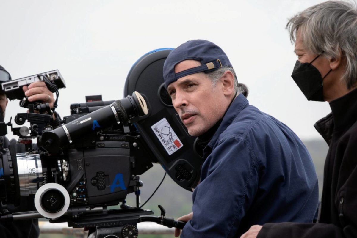
Rodrigo Prieto on the set of Killers of the Flower Moon
It’s a trade-off I knew I’d have to make, and even then the experience was largely free of issue. But I’m excited to see it in Dolby Vision on an OLED––I had the exact thought about the black levels.
Yes. Or on the Dolby Vision screen––that’s the best way.
I remember when I saw The Wolf of Wall Street ten years ago––and I say this as a compliment––I genuinely assumed it was a Robert Richardson project, because you had adapted to Scorsese’s style very well. But in the decade since, it feels like you guys have been forging something that’s a bit more your own.
Mmm-hmm.
Killers felt continuous with Silence and The Irishman. I know look-up tables are very important for your method, and here there was a lot of thought put into different processings between the Osage and the Hales. If you impose your own ideas on the image, what is Scorsese’s involvement specifically with look-up tables? What kind of conversations are being had there?
Well, a couple of them. Flower Moon was more of a process––a longer process, let’s say, than other films––because the script was changing and the perspective was changing. So the look, also, took longer to figure out. So we talked about many ideas, and we threw so many things at the wall and things that we discarded. But I think the first thing was: I brought to the table this idea of Autochrome, which was a kind-of continuation of what we did on The Irishman with Kodachrome and, you know, Ektachrome and photography––still photography. In this case it’s still photography from, you know, the ‘20s and the beginnings of color. So that’s where Autochrome came in. But also as an import from Europe. So when it’s just the, let’s say, descendants of the Europeans––the white people––I thought that we could represent them with an imported color from Europe, which would be Lumière Brothers’ Autochrome. So that was the concept.
I showed Scorsese many images in Autochrome and even some actual Autochromes. So he liked the idea, but I remembered that he was worried––because certain colors are desaturated, but it’s not a general desaturation. Some colors are more or less desaturated and some colors shift––like, reds shift towards orange a little bit, and the blues shift a little bit towards indigo, slightly. But there is a kind of a general desaturation, but in different colors. So he was worried about the costumes and the blankets of the Osage, and how that would look, So what we did was that the costumes… typically you wash them and rewash them and wash them many times so that the colors become less-bright and -saturated. In this case, we didn’t do that because, you know, Autochrome automatically took care of that. But he was involved in ideas that we… at some point we talked about the black-and-white newsreel stuff, and he started mentioning tone and tinting. In the beginning of black-and-white, some movies would be tinted.
So a scene that was supposed to be sunrise was red or a fire scene was red––things like that. And then there was this other technique which, you know, had both tinting and toning. So you had, like, two colors: the highlights were one color and the dark areas another color. So we started even testing that––not knowing for what, even. Also thinking about the beginnings of photography, I brought this idea: the first scene––you know, the burying of the pipe––I thought, “Why don’t we shoot it with pinhole? You know, a camera with a pinhole, no lens?” I tested that as well. We tested infrared for a moment. I thought, “Okay, it’s kind of a spiritual moment. Infrared is visible.” So there were all these concepts that we ended up discarding, because in the end we thought, “Okay, for the Osage, it’s all about the connection with nature and with the sun.”
So we decided––all those ceremonies, where there are no white people involved––to just go natural in terms of the look-up table. We shot on film negative, so it was simply a LUT that, you know, is for film negative and the way it would look on film prints. And then the last LUT we used was for the end scene, the radio show. That was an emulation of three-strip Technicolor, so that took a lot of research. And if anybody in the world knows three-strip Technicolor, it’s Scorsese. Right? He knows exactly how that looks.
And it looks amazing.
Thank you. It took a while. He used two-strip and three-strip Technicolor on The Aviator. So I knew he’d already done it, so I talked, also, to Rob Legato, who’d done that look-up table. We didn’t use that look-up table, but I started understanding the concept that he worked on, and then we did our own thing. We actually created––we started creating it, and now we developed it further––this software that’s called PPL, which is the initials of Prieto, Panzini (which is Philippe Panzini, who’s at Codex), and Lucas. PPL. And it’s a software to manage color that separates very clearly, as in the black-and-white image, each color. Literally like three-strip Technicolor, so you have three black-and-white images and you can change the brightness of each color and, you know, the presence of each color, the saturation of each color, or substitute a certain color with a different color. We used that software to create Autochrome, to create three-strip Technicolor––so it was a whole thing.
I had read an interview where you talked about collaborating on compositions with Scorsese: that he does a detailed shot list––“this is a close-up,” denoting when to move to a two-shot, etc.––and then you come in with a heavy eye for the composition itself. Is that more or less correct?
Yeah, yeah.
Where do some of your compositional instincts come from? Because I think there’s some really amazing ones in this film, but they also feel Scorsese-like.
Oh, yeah.
Maybe you’re seeking to emulate what a Scorsese film has looked like, but is there also an extent to which your own instincts just kind of lean towards that?
Well, for decades now I’ve admired Scorsese and loved his cinematic language, and how he uses the camera and composition. So there’s certainly something of that in my DNA already. But also just the projects we’ve done together, I’ve come to sense what he likes or doesn’t––you know, what he responds to. So I guess that’s why the compositions are “Scorsese-like.” Because I do present him shots that I’ve seen in the past, that he likes or he asks me to adjust in a certain way. So I already kind of know a little bit more––than when I started––what he’ll respond to.
But yes, exactly like you say: he’s very specific about the shots and the energy of the shots and the movement and the size. Sometimes he does diagrams––you know, like point A to point B––and then I present to him, with a viewfinder, “Is this what you dreamed of?” More so than before, he’ll like it. I think, from the beginning, there was a good batting average, but it’s gotten better. And I love that. I just love his sense of composition and the type of focal length he likes. It’s evolved to where I think I understand it better now.
Have you talked about doing The Wager together?
We’re talking about it. But it’s an abstraction right now. I don’t know what’s the next project; I don’t know. I haven’t seen a script or anything, so it’s kind of news for me that it’s The Wager. [Laughs] But I don’t know.
I think, among the general outside-looking-in reportage, it’s believed The Wager would be next. But I feel like half of my life I’ve expected one Scorsese movie to come out and then he does… I mean, he first talked about The Irishman in 2010. It seemed like it could be the next movie after Silence, and then it was The Wolf of Wall Street.
Yes. That’s exactly… I think that’s where it is now. Maybe he knows what’s next, but I don’t. [Laughs] We’ll see.
I’m a bit of a physical-media fetishist. I think it looks better than even the best streaming, and hopefully Apple doesn’t send a rabid dog to my house for saying that. Are there any hopes to do a physical-media release for Killers of the Flower Moon?
I don’t know! That’s a good question. I’ll ask that question. You know, I’ve been busy––I’ve also directed a film.
I saw that, yeah.
So that’s taking a lot of… I did have the chance to color-grade Killers of the Flower Moon and, you know, do that process. But then I had to jump into Barbie. Well, actually Barbie and then color-time Killers of the Flower Moon. But then I started my film. So: Barbie I can be physically present in the color-grading. Usually I’m very, very present. Every movie, I’ve done the color-grading. But because of this movie I had directed, I haven’t been so present. But it’s something I’m working on as we speak. Visual effects and sound––all that.
Yeah, I wanted to ask about that. I saw that you have Nico Aguilar as DP.
Yes.
I guess I’d like to know, generally, how it was directing a feature, and also working with this DP.
Well, we co-shot it. So we were both the DPs. Yeah, directing was not as… difficult as I expected. “Difficult.” I don’t know if that’s the word, but sure: there was a lot to do and it was a new experience. But I think, you know, so many years on set and seeing other directors work with the actors––and it’s something that I’ve observed; I’ve paid attention––I do love actors and working with them. So that part flowed in a good way. I felt very able to communicate with the actors what I had in my mind and to listen. And that was an important thing that I think I learned from Scorsese: the importance of bringing the actors into the creative fold of things and really listening to what they have to say and how they feel the characters should be. Or not, you know? And then, of course, if it doesn’t jive with what you’re trying to do, then you try to guide them in that direction.
But you can’t force an actor, right? It’s something I’ve learned. You can’t. It just doesn’t work. You know, they have to really be there and the vision has to be shared––that I learned. And so, with Nico, it was a great collaboration. First of all, he went to film school with my daughter Maria. So I saw his short films in film school and saw his talent, and then asked him to shoot some second units for The Glorias, Julie Taymor. And he was great. In fact, on Killers of the Flower Moon he did some additional photography. The shot of the moon––you know, the moonrise or moonset––he shot that and some other little bits and pieces. That’s when I thought, “Look, he’s matched some things that I have already lit. And he did some shots that matched that and it worked seamlessly. Nico can understand, you know, and match my thing.” So that was great support for me. If I could do the lighting––if I had the time––I would do it, and Nico wouldn’t have an ego to say, “Wait a minute, why are you…” It was very, very helpful.
Obviously you’ve had an enviable career.
[Laughs]
So I wonder if there’s any instinct to give this young cinematographer a big opportunity, while also getting their newcomer’s enthusiasm.
Yes, yes, yes. For sure. There’s always something to learn––not only for a young cinematographer, but for me as well. For sure. Nico’s experience has been different; he started in a world where it wasn’t film anymore. He has shot film, of course––on Killers he did, too––but mostly digital, and he understands technology very well. He would do lighting diagrams on his laptop that were very, you know, almost photorealistic. These tools are things that I don’t use, and so it was a very good learning experience to see his approach, and it was very efficient for him to use that. Then I would tweak it with him and say, “No, I think this should be here instead,” or whatever. And we talked it over, and then he took it to the gaffer and then––voilà––it would be on the stage. It was very, very helpful, I think, to kind of go back.
When do you think it’ll be ready?
It’s going to be a while. About six, seven months.
Are there any 35mm prints of Killers?
No.
Has there been discussion or ambition to do a 35 print?
Yes, I’m pretty sure there’s going to be one. There was, at some point, talk about the 70mm print. But I don’t think that might happen, and frankly I don’t see the use of it. Also because of the length of the film––the platters wouldn’t fit. But we shot on 35, so blowing it up to… I don’t know. I’m skeptical about a lot of that, frankly. But I’d love a 35mm print because also––like I say––we shot most of it on film negative. But the look-up table we used for the Osage scenes were, you know, the way it would look if it were printed on Vision Premier print stock. So that’s what we were going for. It is the prime way the film, I think, would look––on a film print, on a Vision Premier. I think that would be the best experience for it.
Maybe my favorite shot in the movie is one I haven’t seen a lot of people talk about. I think it’s a single shot; if not, it’s so fluid that it feels like one. It’s when De Niro is reprimanding DiCaprio at that outdoor fair of some kind. And it’s in a long shot.
Mmm-hmm…
Do you know what I mean? He grabs him by the ears.
Oh, yeah. Yeah. I know the moment, of course.
And it looks like it was shot through some kind of glass or with a diopter of some kind. My memory says it’s slightly diffuse.
It’s long-lens. Very long-lens.
Because we talked about your compositional sense coming to this film really heavily––in the script, then looking at Scorsese’s shot list, was there any analogous 1-to-1 with how they’d described the shot and how it came out? Were you reading that it was going to be a long shot?
I did know that was a shot that he wanted to do a long lens, following Ernest coming through all the people and getting to Hale, and then they go and find the place to kind of have their discussion. So that informed the way I approached the lighting. I knew that I couldn’t put a series of lights on stands, so basically we had an industrial crane in an empty lot that had a fake façade in front of it. This crane had hanging on it a truss that I think was about 40 feet by 30 feet with light bulbs strung on it. And that created this sort of warm ambiance for the whole thing, so I could shoot in any direction and not see the crane. I don’t remember the focal length, but I think it was a zoom lens with an extender. So it was probably anamorphic. It must have ended up being around the five- or six-hundred millimeter.
In any case, we didn’t know the route yet, but we knew that this was a concept. So, you know, on the day when we were prepping it––before nightfall––we started talking about where they’d go, where they’d hide, where we’d place a camera, and we explored. Could it be from here? Could be from here? Looking with viewfinders. And then DiCaprio was very helpful because we knew, just for the camera operator and the focus-puller, it’s a very hard shot, technically. So if he was just randomly going, it was going to be out-of-focus. So he came up with a path and he somehow… because it was full of people, we couldn’t mark it on the floor because people were dancing and moving. Leo somehow memorized––I don’t know how he did it––the path that he’d take to get to Hale, and Trevor Loomis, the focus-puller, nailed it on take one.
And I even clapped. I mean, it was just amazing that he got it. Because, also, it’s a very emotional moment; it’s the kind of thing you don’t want to fuck-up. I didn’t operate the camera on that. That was Scott Sakamoto, who was a master, master operator. So he nailed it, too. It was an exciting moment to find [Laughs] where the camera would be through stuff. It wasn’t diopter or anything, but we were shooting through, you know, people, but also poles and sometimes, with this extender, there were other shots that had a little bit of a, kind of, low-contrast feel to them, and that was just an effect of the lens and the extender and the glare from the lights and all that.
So I guess, maybe, that’s what got that feeling of sort of a diopter, but it wasn’t planned that way. I think we had another camera on an opposite side––I don’t remember if it was simultaneous; maybe not––another long lens where it was, you know, we had to put some boxes and figure out. They had to be hidden but seen. It was just finding that balance. It’s an interesting shot to point out because it was something special.
Killers of the Flower Moon is now in theaters.