“Don’t Judge a Book by Its Cover” is a proverb whose simple existence proves the fact impressionable souls will do so without fail. This monthly column focuses on the film industry’s willingness to capitalize on this truth, releasing one-sheets to serve as not representations of what audiences are to expect, but as propaganda to fill seats. Oftentimes they fail miserably.
—
I’m honestly not sure if it is possible to cram more movies in one 31-day period (five Fridays!). Let’s just say the dump month doldrums have ceased and we’ve moved into a season of blockbuster tentpoles and indie leftovers from 2012.
It’s unsurprising then that we have a pretty massive collection of winners, losers, and everything in between as far as marketing material is concerned. There are neon phosphorescent colors, hand-drawn doodles, and filters galore. The one thing we don’t have much of are cropped images from the movies themselves. Nope, March is all about photoshoot poses, Photoshop collages, and dare I say some much-needed creativity.
Lazy, good for nuthin …
 |
 |
 |
 |
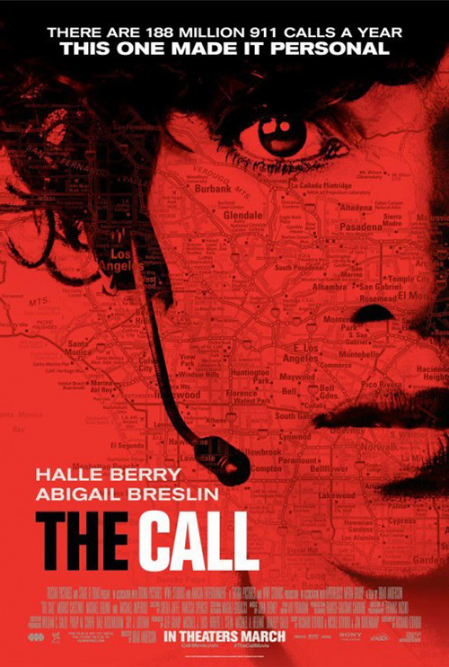
What was Ignition Print thinking when they designed the one-sheet for The Call (open March 15)? I know it’s a WWE production, but that doesn’t excuse you from applying some form of intrigue or ingenuity. This is literally a red field with a photo of Halle Berry and a map of the greater Los Angeles region each put through a Multiply filter in Photoshop over it. That’s it—five minutes and voila.
Can I think of something better myself? Maybe not. I mean the whole trailer is just Berry with her headphone talking to female victims trapped and unable to escape. Do you go horror by showing the predator slamming a car trunk closed on Abigail Breslin? Do you go minimalistic and abstract with a kicked out taillight on the interstate while Breslin’s hand sticks through? Hmm … that’s not bad.
I get that Berry is your meal ticket and you definitely don’t want to miss cashing in on her beautiful face. But if that’s true, show us a photo/film still/whatever. Show the tortured pain on her face as chaos occurs behind her. Don’t turn her into hair, eyes, and nostrils against red. It looks like a poster for a vampire flick.
 |
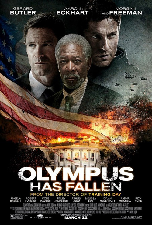 |
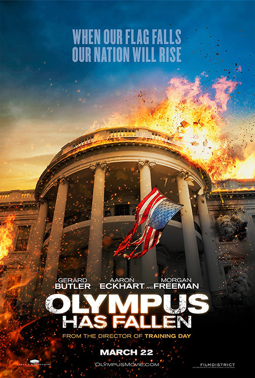
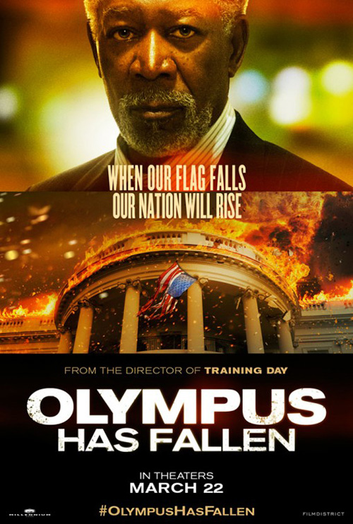
Does Iconisus L&Y – Visual Communication Systems fair better with Olympus Has Fallen (open March 22)? Not really. They do really love this image of a burning White House, though—so much so that they need it to be as big as their actors on every character sheets. We have Morgan Freeman to sell our product? Pssh, through a flaming Washington DC on their too. That’s what the public wants.
Maybe it’s not them. Maybe it’s Millennium Films and/or Film District because their second firm—The Refinery—used a similar image. Granted, theirs looks a little more like the shot from Independence Day right before the alien spacecraft blows it to smithereens, but whatever. There are flames, explosive material, floating heads, and an American flag that has seen better days.
God save the President? Honestly, what does this artwork say about the film? Not much.
 |
 |
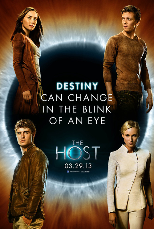 |
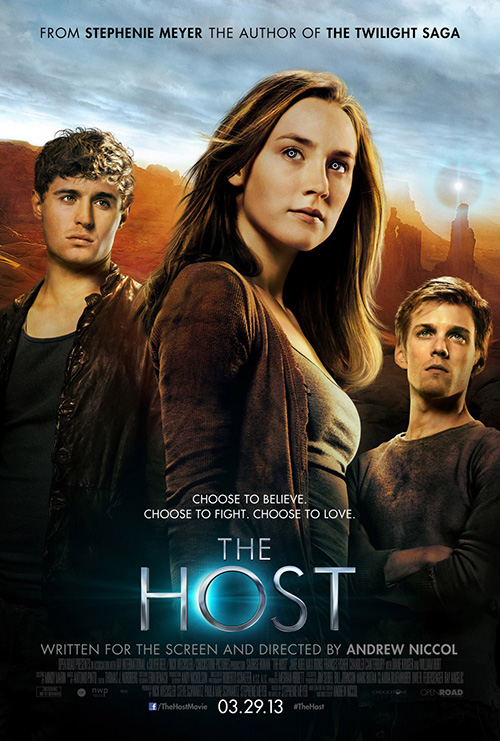
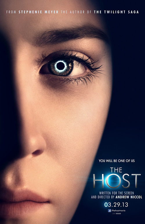
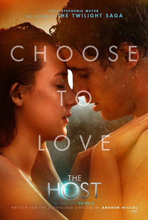
How about The Cimarron Group’s The Host (open March 29)? I mean we have the millions in revenue of Stephenie Meyer to live up to here. Don’t disappoint.
I see emotionless pensive stares, Martian terrain, and glowing irises … Oh and Meyer’s impressive clout subverted by science fiction maestro Andrew Niccol’s name as having written and directed it for the screen. It’s an interestingly long and large credit considering the source material’s origins will guarantee box office success anyway. Either Open Road has crazy faith in the adaptation resonating higher than mainstream best-seller drivel or it’s so bad they need to at least touch both writers’ demographics for an opening weekend push.
Ignition’s teaser is better with an air of mystery; BLT Communications, LLC‘s is contemporary visual cliché incarnate with an in-close crop and superimposed sans serif; and Ignition’s hybrid character montage is godawful. Way to rip off Heroes with that one. Three studios each creating mediocre at best advertising.
 |
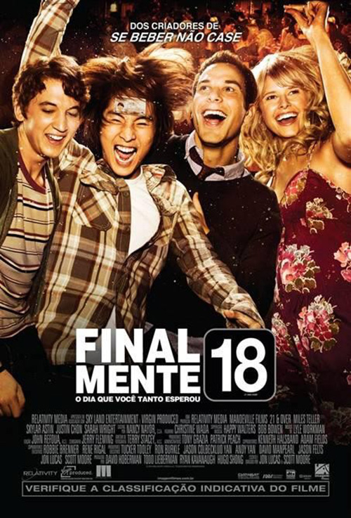 |
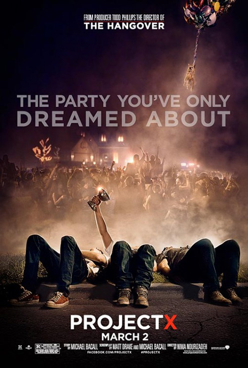
And no, Bemis Balkind can’t save this section with 21 & Over (open March 1). I can’t help seeing the sheet for Project X when looking at it. Not only do they appear to be almost identical in tone and purpose, the high profile connection to The Hangover at the top of each definitely bonds their debauchery together.
Look at that dude on the police car wearing a bra and a teddy bear. Man, he is sooooo hilarious.
It may be total nitpicking, but I cannot stand how much bigger the “21” is compared to the “& Over”. At least the foreign advert shows the actors involved despite its completely lame orchestration making it more teeth whitening commercial than expression of fun.
Flooding the market
 |
 |
 |
 |
More is more, right? It’s not about having a huge property’s name to drive interest in a film, you have to cover the streets in posters. You have your teaser, your regular one-sheet, your character posters, and whatever other ‘high art’ manifestation created for pre-release events or online contests. Hey, not everyone has cable and these studios have marketing budgets to burn.
 |
 |
 |
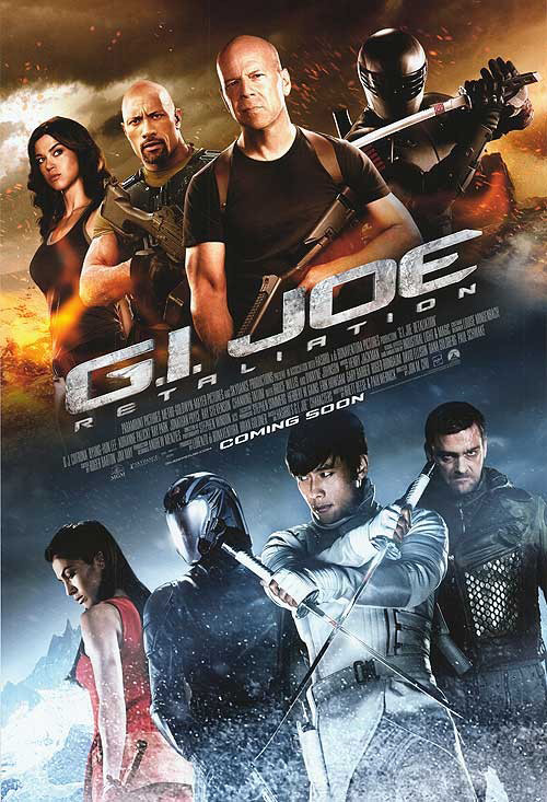
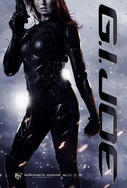
First up is G.I. Joe: Retaliation (open March 29) from BLT Communications. Release delay aside, nothing can stop people from coming to the theater in droves for this hot property. So why even bother coming up with a new campaign to differentiate it from its predecessor?
BLT utilizes the exact same layout for its main sheet and retains the rather intriguing cranial crop of its characters. There are a ton of actors (pretty faces) in both iterations so you can’t blame the studio for wanting as many on the poster as possible—good guys on one half, bad on the other.
I do really like what they’ve done with the individual showcases despite their flames motif. Whereas Rise of the Cobra had everyone in black leather suits to keep things cold and sterile, the new batch for Retaliation adds some color. Dwayne Johnson’s is my favorite with his mammoth frame filling the entire page to bleed off each side. The design also doesn’t cut as much of the head off as it did in 2009—I guess we’ll call that an improvement too.
 |
 |
 |
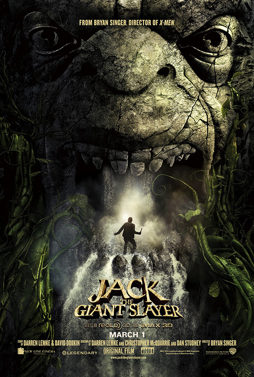
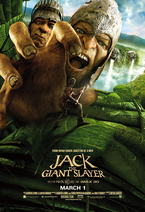
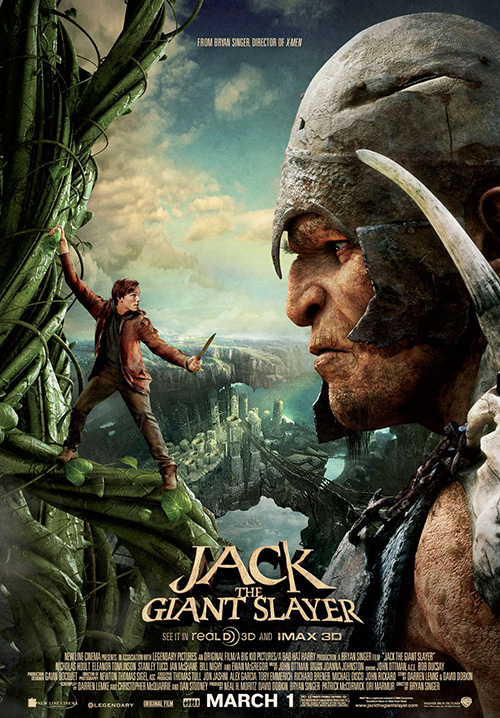
For Jack the Giant Slayer (open March 1), cold open has decided to simply put the computer graphics on display. With four different variations, star Nicholas Hoult’s face is made visible in only half while co-star Eleanor Tomlinson is lucky to even be included in one. No, Warner Bros. is banking on their giants to drive all the traffic.
You can’t really blame them, though, since director Bryan Singer’s name isn’t what it used to be after X-Men 2 and Hoult is anything but household. So cold open shows scale, scarily violent screams, and its Monty Python-esque logotype in hopes people feel nostalgia for the old bedtime story and want to check out what new technology can do in bringing it to life. I’m just not sure the adventure quality that should be selling it necessarily comes out.
 |
 |
 |
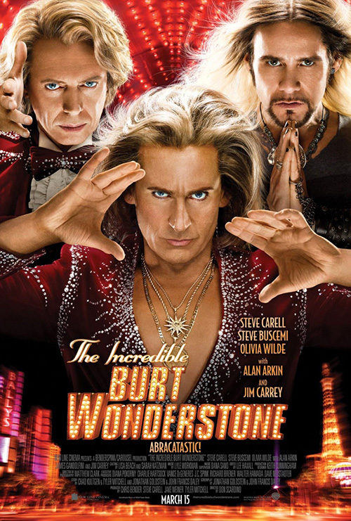
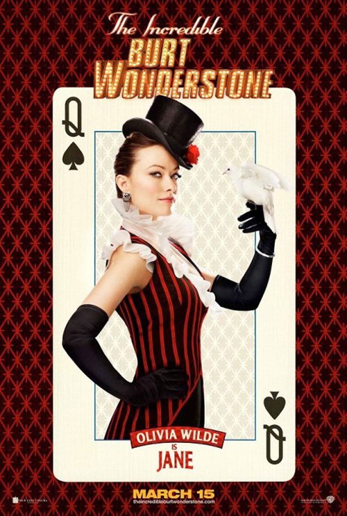
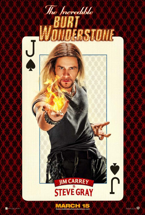
ARSONAL, on the other hand, knows it has some big names for the comedy The Incredible Burt Wonderstone (open March 15) and isn’t afraid to use them. Yes, the main advert with Steve Carell, Steve Buscemi, and Jim Carrey on it is kind of creepy in its Siegfried and Roy aesthetic, but it still hits the right marks. The light bulb font is gorgeous in its slight blur making it appear luminescent.
The character sheets are lamer with each actor receiving their own playing card. Olivia Wilde joins the gang here with a pigeon (Carrey gets fire, Carell an orb, and Buscemi a deck of cards), but can’t do anything to make her sheet any less static than the boys. They work great in theaters as a three-dimensional cube display, but fail to instill interest on their own. WORKS ADV does a little more to make their entries more fluid yet the cheesy factor is exponentially increased to turn the whole into an even worse result.
 |
 |
 |
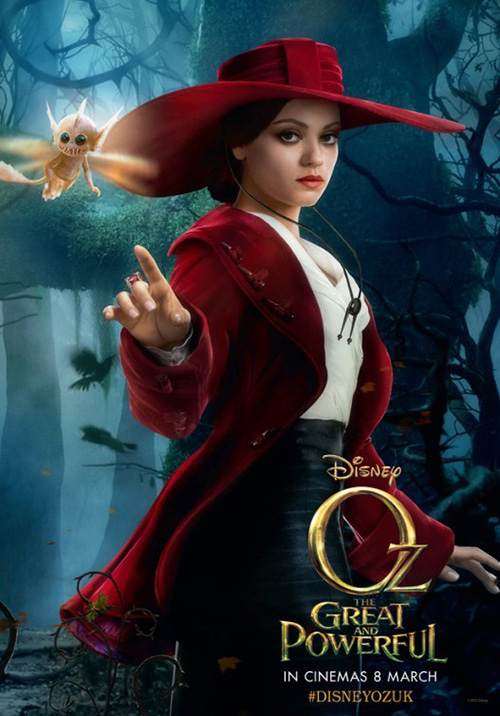 |
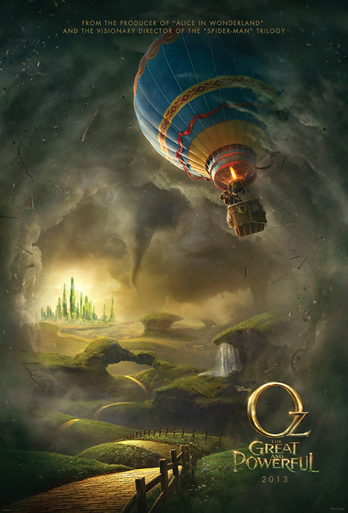
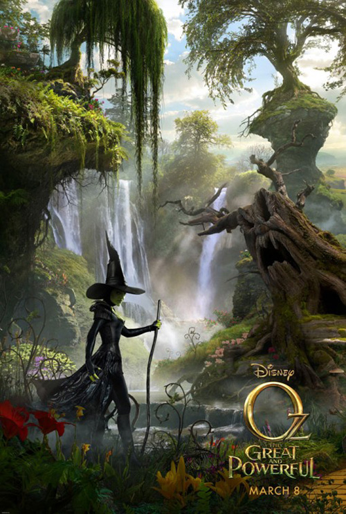
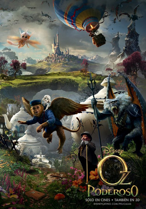
For Oz the Great and Powerful (open March 8), BLT combines a bit of what’s happening in Jack and Burt with a display of beautifully animated worlds and a push of its acting talent.
To me, the best are the two with as few humans as possible. The darkness of the tornado as the wizard’s hot air balloon is caught in its wake is brilliantly atmospheric and the greenery and waterfalls behind the Wicked Witch is a fantastically odd juxtaposition of light color and pitch-black evil. All the weird critters of the third’s depiction of Oz alternatively cause it to fail due to the clutter.
Another of Oz and the Yellow Brick Road finds itself marginally better with a distinct delineation between world and character, but it’s need for excess with the castle, tornado, and forestry together kills it. Add to it the rather cartoony one-sheets of each witch and wizard and you have destroyed all the magic those earlier two teases instilled. Much like the film of which it’s riding the coattails of—Alice and Wonderland—the end result simply looks like a bunch of superfluous ideas and artistry ultimately unable to mask the movie’s mediocrity.
The animation gallery
 |
 |
 |
 |
Despite only two animated kids movies being released this month, there are interestingly five animated posters. This is a fact that’s close to my heart because I love posters that go beyond mere imagery and celebrity to shine light on the subject, mood, etc. I don’t, however, mind a good family friendly advert either.
 |
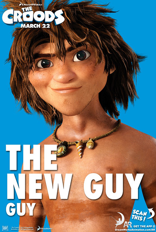 |
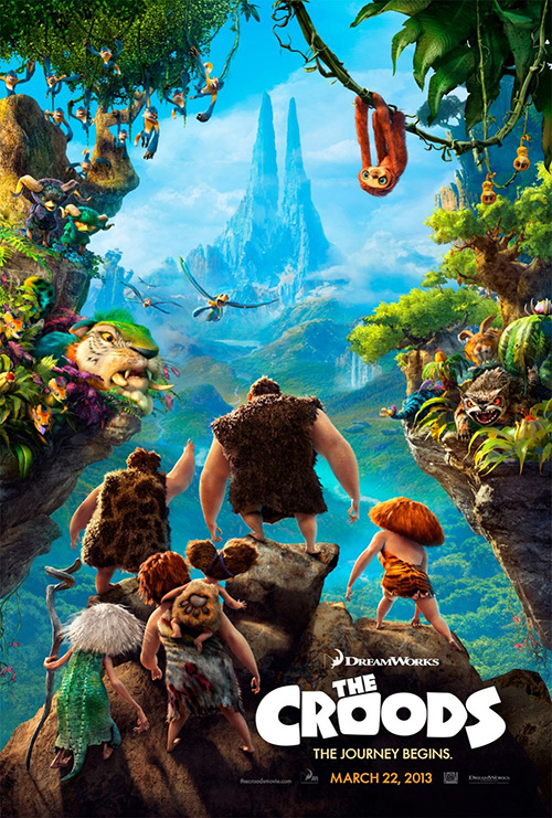
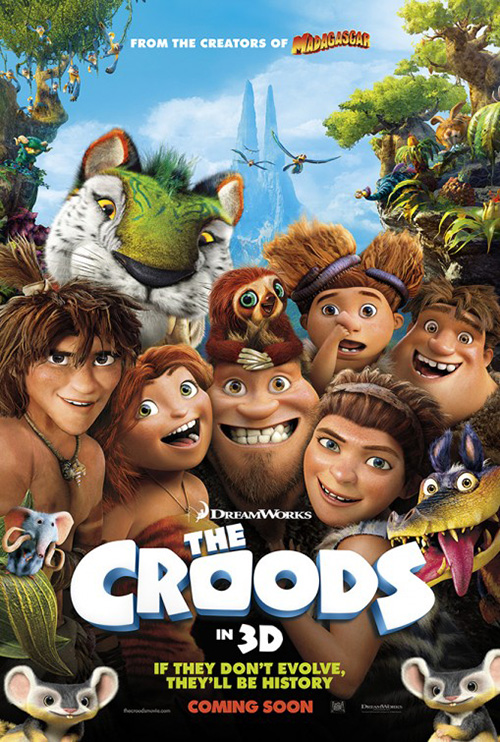
I have no idea what The Croods (open March 22) is about but Midnight Oil Creative’s original teaser definitely intrigued me when I saw it in theaters. The colors and textures are gorgeous and the depth of field into the background beautifully rendered. With all the weird creatures hanging out in the foliage, my interest was piqued to see what these cavemen would look like.
Umm … not so good. Despite the intricate detail of fur and reptilian skin, the humanoids have a plastic sheen that makes them appear as more action figure than living, breathing being. I like what Midnight did by putting the whole family in your face with big grins and nose picking, but the disparity between nature and man is too much. Hopefully the film itself will come off better.
An interesting note on the character poster, the bottom right has a “Scan This” arrow. I don’t know if a QR-Code sticker is supposed to be placed there or perhaps an NFC chip, but I do like the fact posters are starting to use technology to their benefit. If that scan leads you to the trailer or bonus material—kudos to them.
 |
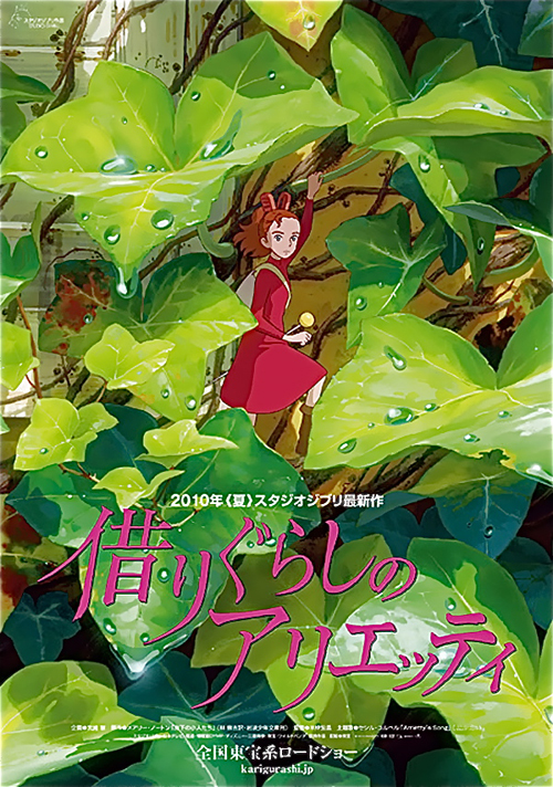 |
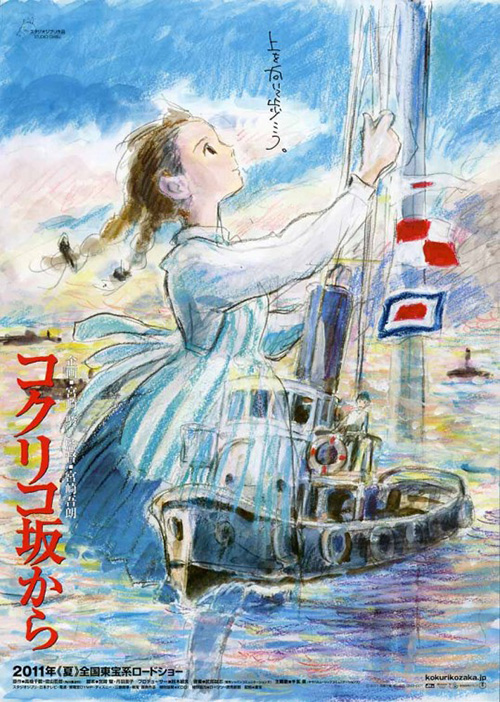
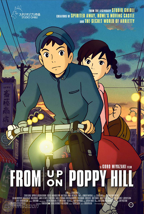
Where Studio Ghibli’s From Up on Poppy Hill (limited March 15) is concerned, I can’t stop thinking how much more impressive the hand-drawn Japanese version is compared to the film still here in the States. By this point I think everyone knows what the anime studio’s work looks like—Hayao Miyazaki is practically a household name by now, right? So why not give us something different?
Much like The Secret World of Arrietty, all the artist gives is the heroine in an almost blank slate from text. It just goes hand in hand with cinephiles’ affinity to look behind the scenes and understand process to the point of huge DVD releases overflowing with extras. There is something about the fragility and in-the-moment aesthetic that becomes infinitely more attractive than the polished result.
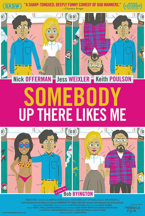 |
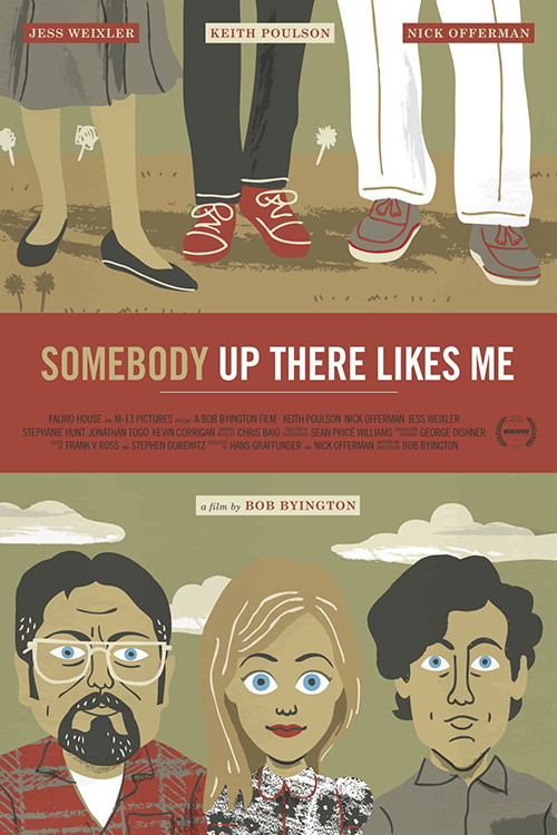
Somebody Up There Likes Me (limited March 8) utilizes cartoon in quite a different way. Rather than project the process of the film or depict how it will look, this romantic comedy reappropriates the medium for hipster cred. Whoever designed this and its alternate poster chose this artistic direction to appeal to a certain demographic of the population that the film targets.
It’s fodder for Tumblr and the type of people who attend a festival like SXSW. This isn’t a slight at all, I actually like both—the brighter colors of the second popping much better than the earth tones of the first. I’m simply stating that the reasons for them being cartoon is purely from a marketing standpoint in order to represent the culture it hopes will buy tickets.
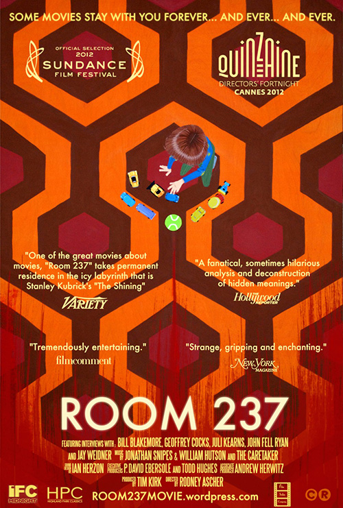
The opposite is true for Room 237 (limited March 29). Well, it kind of targets the hipster crowd as well, actually. Besides that, however, the poster also helps the artist achieve a greater level of control than with one of The Shining’s actual frames. They can add smears of blood from the bottom, carefully measure out where each rug pattern hexagon should go so text may be superimposed above it, and really get at the heart of what the documentary stands for—interpretation. As everyone interviewed would be quick to state, The Shining is no longer Stanley Kubrick’s. The film is now the property of the millions of people who’ve seen and willfully attempt to dissect it.
Moody artistry
 |
 |
 |
 |
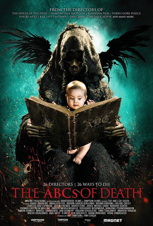 |
Yes, I did say above that three non-animated films had cartoon posters. The third is for The ABC’s of Death (limited March 8) and boy do they take the essence of the name and distill it down to an almost universal level of nostalgia. I mean who hasn’t played with alphabet blocks either as a kid or with your own? And just as the film includes twenty-six shorts of horror, the blocks have twenty-six pieces of iconography to stand for each.
I honestly don’t know why they even tried to do another design. I get that the coloring and aesthetic may not scream horror like a shrouded in black grim reaper reading a book to a toddler does, but when did things have to be so on-the-nose? The blocks even form a skull! It’s simply a perfect representation of the film. I only wish I knew who was responsible to give proper credit.
 |
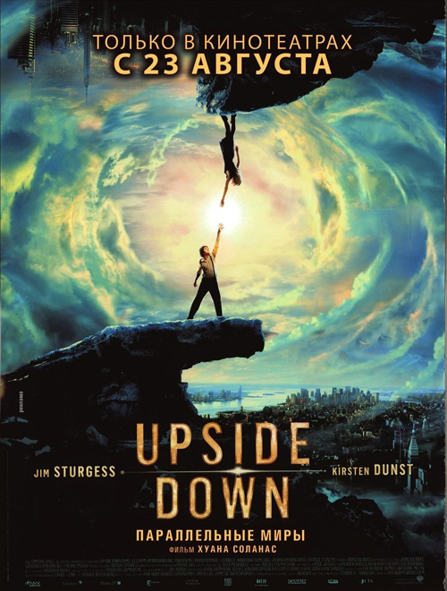 |
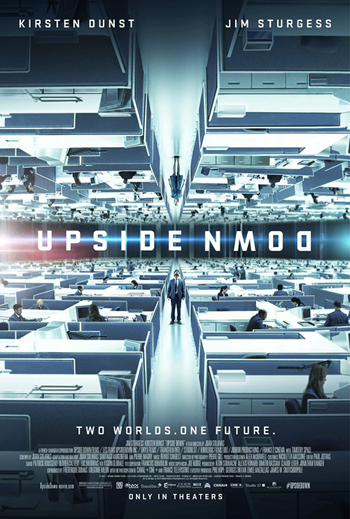
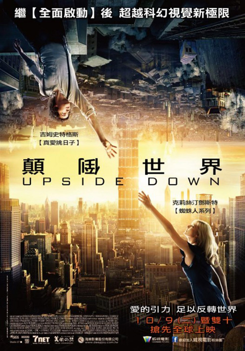
In that same vein, Art Machine, A Trailer Park Company takes Upside Down (limited March 15) and creates a visual that appeals to both the name and the content. If you’ve seen the trailer you know the concept—two worlds exist parallel to each other, one on top of the other with separate gravities. In fact, the recently Oscar nominated short Head Over Heels just used the same general rules.
This one-sheet reminds me so much of that scene in Inception when Ellen Page bends a dream in on itself from the clinical sterility of the colors to the geometric symmetry of the shapes. Life is moving in two directions while Kirsten Dunst and Jim Sturgess stand alone as one—fluid, biomorphic entities trapped in cold rigidity.
The foreign examples try to utilize the same motif with much less effect as the Asian entry destroys scale and the Russian looks like The Lion King. There is a simplicity to the office setting the outside can’t equal, creating a mirroring effect you can literally get lost in trying to find where both halves diverge.
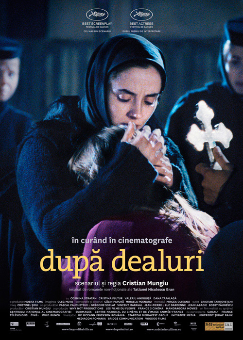 |
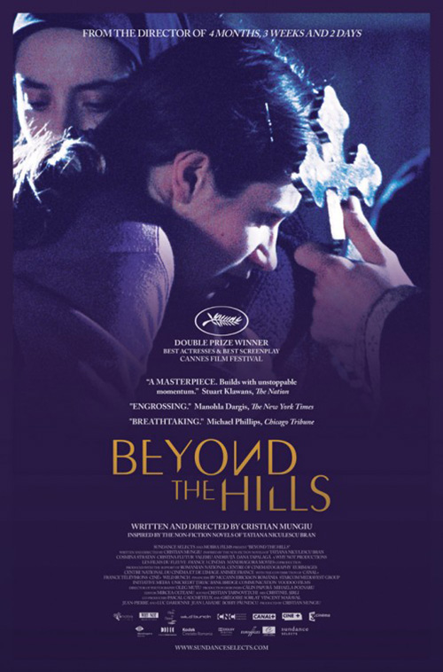
For Beyond the Hills (limited March 8), mood becomes everything. It is interesting to note that the original sheet and its American counterpart use the same subject matter but with a different image. Both display the hug of two people as a religious leader stands above them with a cross—the original showing the hugger’s face and the second the huggee.
There is something hugely menacing about the American version’s decision. While we still see the eyes of the hugger in sympathetic sorrow, it’s the fear on the face of the other character that will bring a chill to your spine. The cross is also closer to make everything more compact and the bluish hue to the whole strips it of all warmth. Add the sharp edged letters of the title font slowly disappearing or expanding to stab and you have one disturbing piece of marketing material. I can’t wait to see this film.
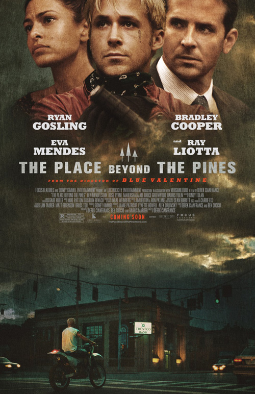 |
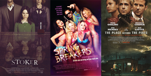
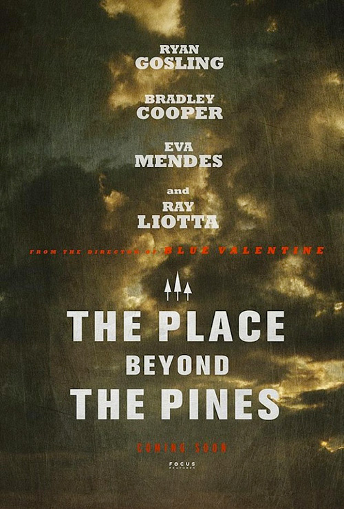
Similarly—although this one I have seen—The Place Beyond the Pines (limited March 29) takes atmosphere to the nth degree for full impact. I will infer Ignition is in charge of the campaign since I know they handled the floating head montage sheet and it uses the same filter technique as the teaser before it. The hauntingly minimalistic tree icon, however, was used in the film itself.
Either way, whoever came up with the idea of muting the yellowish green sky with a paint-stroked textured wash is a genius. There is a rumbling in the heavens as the foreboding nature prevalent from frame one of the film leaps off the page. How great, though, would it have been if the second poster removed the heads at the top and let that gorgeously chaotic sky fill up the page? Then only Ryan Gosling‘s solitary, troubled soul contemplating whether or not to go down a road that will affect an entire community would be left at the bottom. Now that would easily have been my favorite of the year.
Head of the class
 |
 |
 |
 |
 |
It may be cheating to talk about a poster that debuted way back in 2011, but technically Quentin Dupieux‘s Wrong (limited March 29) hasn’t hit mainstream theaters yet so it’s fair game. Looking at it again now, I’m not sure why I left it off my favorite posters of 2012 list—the film made the rounds on the festival circuit last year. I think it’s because I already included two sheets that were sideways so adding one upside down seemed even more redundant.
Having now seen the film, however, I can’t help but see my enjoyment increase exponentially. Knowing who owns this car and where and why he takes it just makes the juxtaposition with the title that much more meaningful. It is a surreal, strange little gem of oddities and impossibilities that can truly be encapsulated in an image as completely unhinged as this. The blue sky provides a clean, solid background with which to place white text and the credits box at bottom is balanced perfectly with the minimal imagery on top.
As far as the second version is concerned now that Drafthouse Films has picked up distribution, it may be too weird. That seems counter intuitive since the movie itself is, but the artwork is just plain absurd and without basis. It looks like lead actor Jack Plotnick and his character does lose his dog, but there is an explanation for the disappearance. Making his brain look like a dog and shaving his ‘stache to be the title appear to be nothing more than an artist being cute.
 |
 |
 |
 |
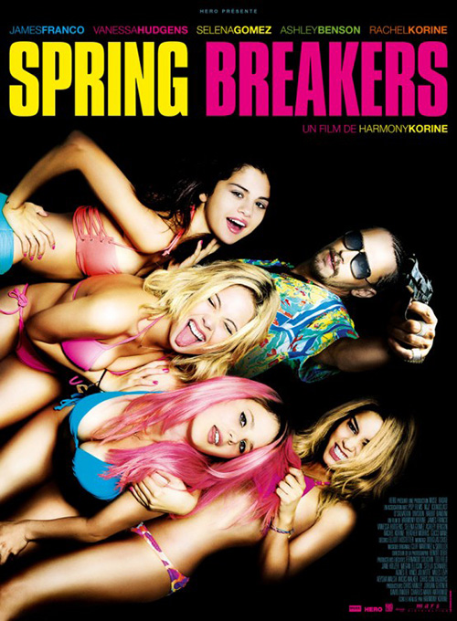
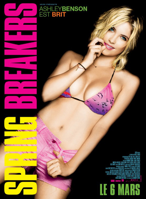
Continuing on with more rotated imagery brings us to Spring Breakers (limited March 15, wide March 22). The French ad material from Le Cercle Noir is fantastic. This is a film that utilizes actresses caught in a tween/Disney mold desperately looking for an opportunity to break out and show what they can do. Stripping down to a bikini may not be the acting prowess they want to express, but it definitely garners attention.
The firm oversaturates the colors so the yellow and pink of the title pop against its black background and the neon bathing suit tops stand out against skin to pull your eye into their cleavage. James Franco is almost completely lost in comparison.
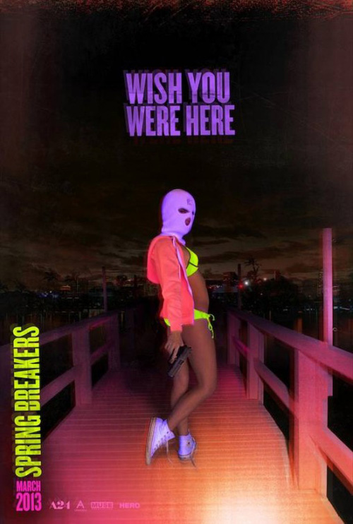
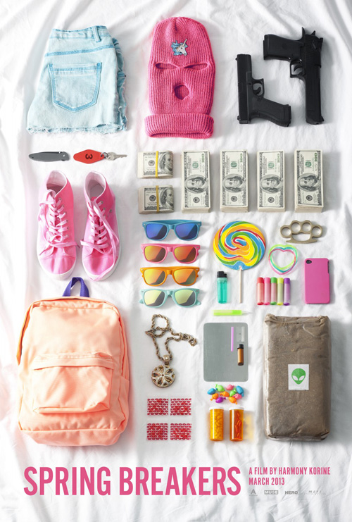
Art Machine adds an intriguing sheet of one of our breakers in black light bright ski mask to showcase the plot thread of armed robbery and Le Cercle Noir’s character sheets introduce these girls as the women they have become. And while an American iteration of the original image becomes washed out without the oversaturation, a second spread of the teens’ luggage adds another layer to the enterprise, cast unnecessary.
 |
 |
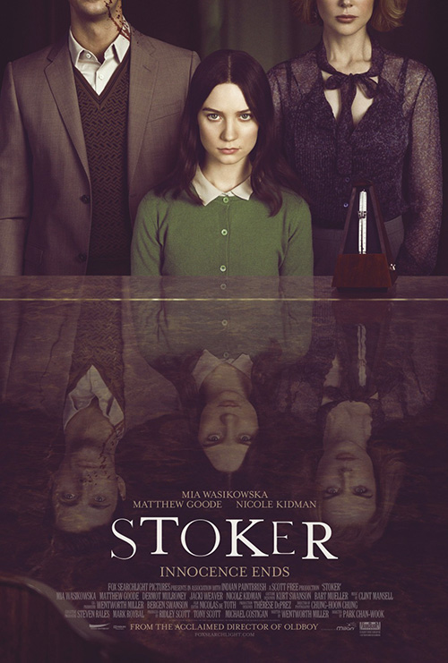
Also using filters is Empire Design and their poster for Stoker (limited March 1). It’s another film I know little about—because I want to go into the theater without preconceptions—but you cannot deny the feeling of dread and unease when peering in the cold dead eyes of Mia Wasikowska.
There are so many little details to look for like the tops of Matthew Goode and Nicole Kidman‘s heads only being visible in the table’s reflection, the origin of the blood on his collar possibly coming from his nose, the rather odd inclusion of a metronome, and the crazy revelation that this English language debut from auteur Park Chan-Wook was written by Prison Break‘s Wentworth Miller. The mystery increases.
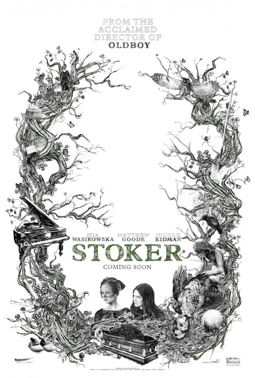
Empire also goes down a rabbit hole of hand drawn pen and ink collage full of dead things, personal items, and a ton of twisting branches that almost look like a tattoo around Masikowska’s neck. These are some brave depictions of a work that’s almost guaranteed to be divisive and they keep your interest piqued without easily understood spoilers.
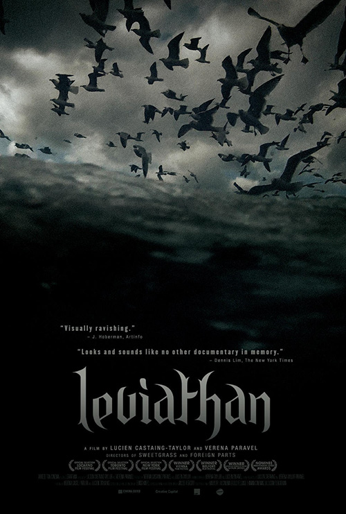
The poster this month that wins the award for most foreboding, elegant, and undecipherable, however, is for the documentary Leviathan (limited March 1). This thing is about the world of commercial fishing—what, you couldn’t tell?
It doesn’t get more mysterious than a complete wild card giving away nothing while utterly captivating at the same time. From the gothic font; the heavy, grainy blacks and greys; and the symbolic grouping of seagulls appearing more like crows in the shadows, J. Hoberman’s sound byte “Visually stunning” seems to be the understatement of the year. My only fear is that the film has no chance of living up to the excitement built.
What is your favorite March release poster? What could have used a rework?

