“Don’t Judge a Book by Its Cover” is a proverb whose simple existence proves the fact impressionable souls will do so without fail. This monthly column focuses on the film industry’s willingness to capitalize on this truth, releasing one-sheets to serve as not representations of what audiences are to expect, but as propaganda to fill seats. Oftentimes they fail miserably.
—
There aren’t many films coming out in April that scream “You have to see me on the big screen!” The ones that do, however, are high on my list of musts. Accordingly, I don’t have that many posters to talk about either. Despite five sub-sections, only twelve entries are mentioned.
Few this month are memorable; fewer still inspiring. It’s also interesting to note how two find themselves with multiple campaigns from different design studios that frankly don’t look dissimilar at all. This either means both distilled the film’s essence to perfection or both merely scratched the surface of what could have been possible with a little more digging.
Spot the differences
 |
 |
 |
 |
 |
 |
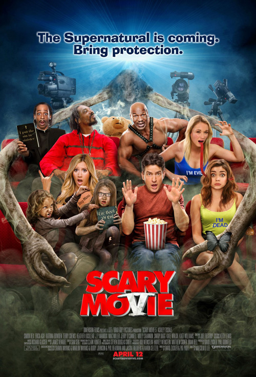
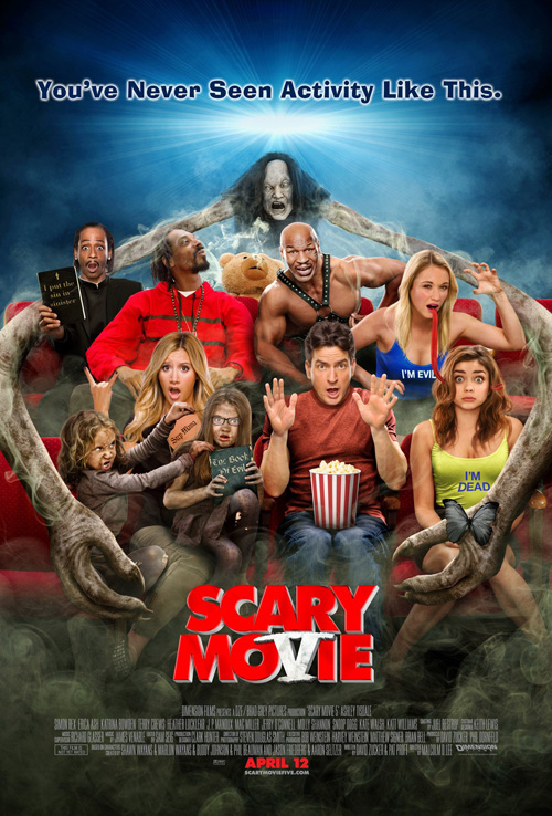
I almost feel bad for BLT Communications, LLC being saddled with the unfortunate job of providing marketing materials for Scary Movie V (open April 12). The fact we’ve lived to see a fifth installment is a sorry proposition in itself, so I guess we should let whomever is willing to make money off the project do what they can.
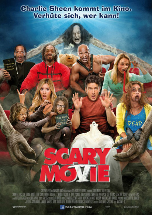
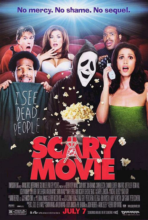
The design mirrors the original film’s advert with its characters sitting in a movie theater with godawful attempts at horrified looks. Just as the franchise increases in numbers, so too must the list of C-list celebrities. It’s a Photoshop clinic as you toggle between both American releases to notice some hair work on Katrina Bowden and the intriguing addition of movie cameras and atmospheric haze at the top. Why did they decide to hide the monster’s face too? It couldn’t be because of how plastic-fake it looked …
The real joy of BLT’s work is switching between domestic and international to see our differing levels of censorship. We’re all about the pot smoking and Snoop Lion exhaling through tilted head while Germany keeps his face straight for recognition. We like our attractive females in low-cut tops and unblemished faces while Europe covers the cleavage and throws on buckets of blood (and I thought we were the puritanical ones). The best discrepancy, however, besides the excision of the word “I’m” on the girls’ t-shirts is the handling of Charlie Sheen‘s little friend. The MPAA probably had a field day with that scary ghost.
 |
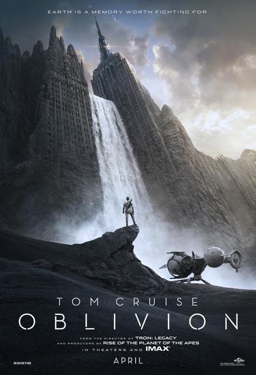 |
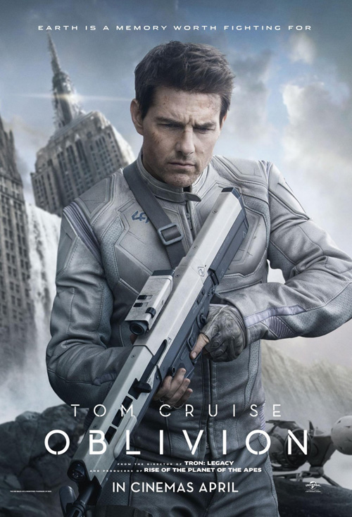
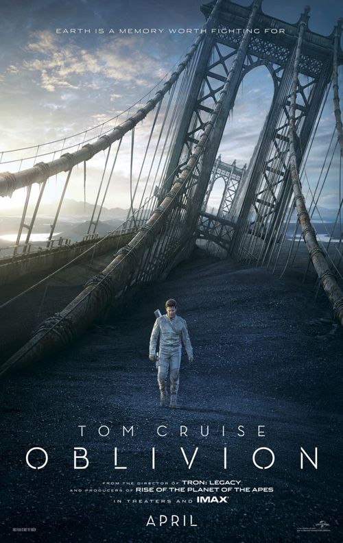
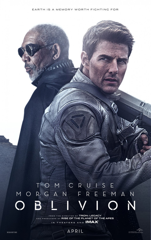
For Oblivion (open April 19), the differences are much subtler and for no apparent reason whatsoever besides wanting to pay two firms for the same work. Kudos to REV CREATIVE and Ignition Print for both getting in on the action when one would have sufficed. Usually when you have multiple firms attached to one project it is because they are completely unique in vision and content. Here it looks like the studio provided a template and accidentally emailed their second choice for creative before hearing whether the first had accepted.
Only Ignition’s title font being slightly heavier separates it from REV’s in my eyes. Well, that and the fact the former enjoys showcasing actors while the latter puts our ruined Earth’s architecture on display. If you’ve been reading this column regularly you can probably guess I hold REV’s work as the better of the too due to its sense of scale and detail at selling the world rather than the celebrity. As far as the piece parts used in each, I really love that font. So simple and elegant, the tiny gap in each letter gives it a futuristic stencil feel that truly captivates.
Why so many cooks in the kitchen?
 |
 |
 |
 |
 |
 |
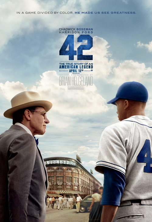 |
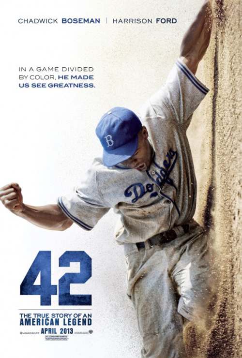
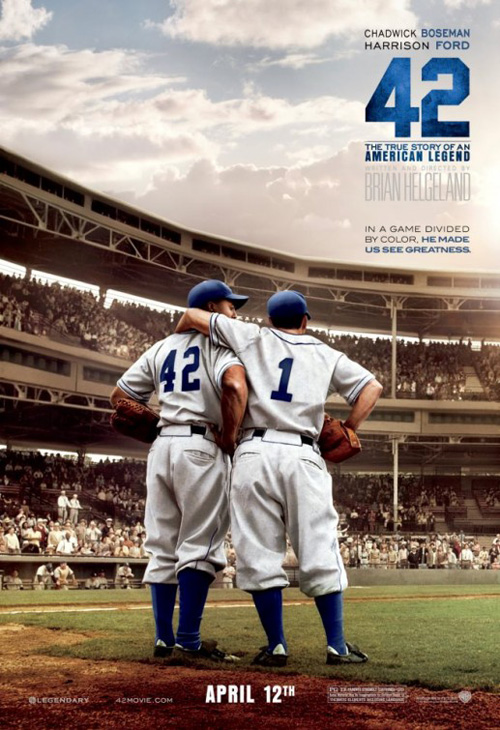
I honestly have no idea what is happening with Warner Brothers’ 42 (open April 12) besides knowing The Refinery‘s entry of Chadwick Boseman‘s Jackie Robinson sliding home turned 90 degrees is the best. There’s no question—it’s a great poster with amazing texture detail and authentic dirt work to offset the stark white at left. And the playing with the photo’s angle only adds to the intrigue.
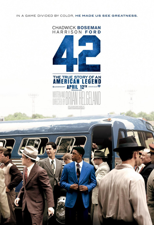
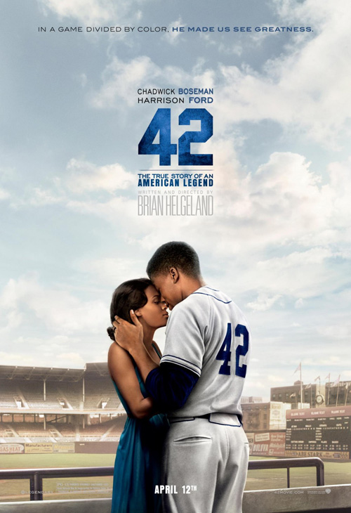
With all that said, though, what is the deal with the litany of followers? I get Ignition’s teaser sheet—it does its job perfectly. And I’m not even saying their other adverts don’t work. They’re an extreme example of overkill, yes, but the use of a film still and blocked credit anchor does the job despite being utterly redundant. So why not make it more cookie cutter by having another firm—Concept Arts—do the exact same thing with painterly, fabricated versions of the stills instead?
Just like Oblivion, 42 for some reason paid two design teams to bring the exact same concept to life. The difference between these is that Ignition’s block puts the “Written and Directed by” text to the left of Brian Helgeland‘s name (Concept puts it above) while also including the April 12 release date (Concept does not). Again I question the studio not just commissioning one to do them all. And not only that, I question them needing anything other than that great Refinery piece. They should have given the whole campaign to them and called it a day.
Optical illusions
 |
 |
 |
 |
 |
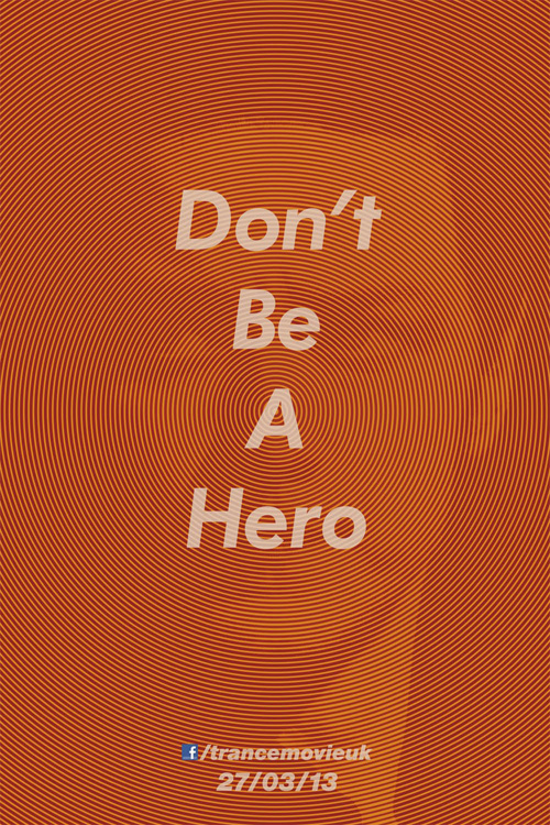
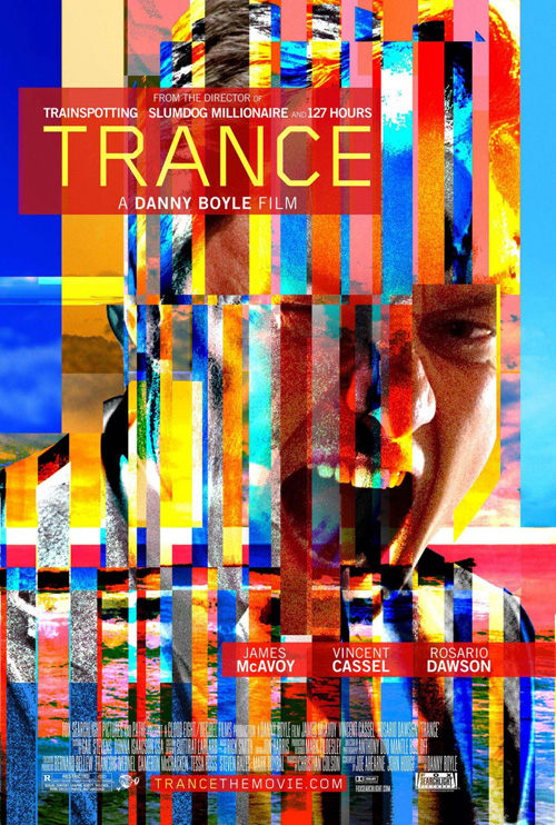
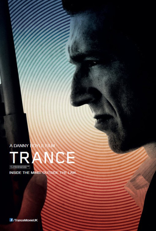
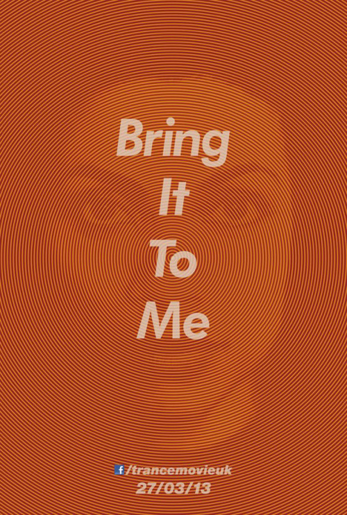
I’m not sure who is responsible for the UK Trance (limited April 5) entries—or if the two variations come from separate agencies—but I’d be interested to learn which came first. Did the idea for a full-bleed circular optical illusion come before it was utilized as a background for high contrast character shots or did the lameness of those make them want to strip all photo quality away?
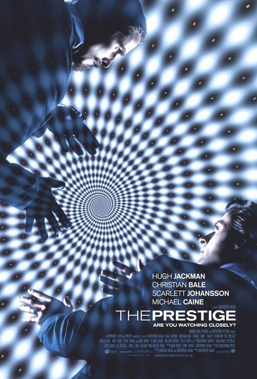
It’s a relevant trope considering how memory and the mind work into Danny Boyle‘s newest, but its effectiveness is contingent on its use. Looking at Vincent Cassel‘s determined face above the pretty colors and circles does nothing but instill ‘cool design’. And even then it’s a bit lacking in terms of depth and complexity. While the orange posters remove all three-dimensionality, there is still so much more at play. By not breaking up the circles our eyes are drawn to the center in visual hypnosis and the words “Bring it to me” only increase the sensation with their authoritative demands. It’s not as good as Crew Creative Advertising‘s The Prestige, but the effect is similar.
In a rarity, however, I have to say the American sheet from Mark Carroll is the winner in terms of aesthetic. Busy, ugly, loud—no matter how much it looks like a computer threw-up colors and twitched in seizure, it’s tough to look away. James McAvoy‘s scream is animalistic, the noise and scratches in the shadows add textural grain for a gritty sheen, and the colors stick to the backs of your eyelids when closed. It’s a powerful image of pure emotion that gives away nothing but also begs you to find out more.
Front and center
 |
 |
 |
 |
 |
 |
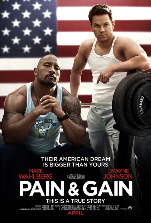
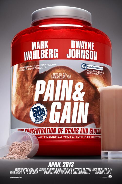
Putting your stars front and center can go one of two ways. Either the technique overshadows the movie itself—which sadly is sometimes the point—or the designer finds a way to integrate the desire to showcase celebrity into his/her creation of a mood, atmosphere, or visceral connection to the subject. I’m not quite sure which BLT’s layout for Pain & Gain (open April 26) falls into.
Looking at their teaser and its giant receptacle of muscle-building powder is a nice in-joke to the fact these would-be criminals pump iron like it’s their job, but it really does nothing to beef up interest. Gimmicky and mildly humorous earns a grin and nothing more. That doesn’t mean their decision to put Dwayne Johnson and Mark Wahlberg’s biceps on display is any better. Nowhere do we see any indication of the comedic elements the trailer utilizes so well and that’s a shame.
It is simple, however, and does bear a resemblance to BLT’s teaser for Michael Bay’s last foray into comedy, Bad Boys II. I still find it so weird that marketing materials say this is a new area of growth in the auteur of explosion and fire’s career—he’s done this type of thing before and well at that.
 |
 |
 |
 |
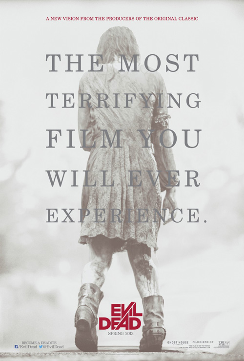
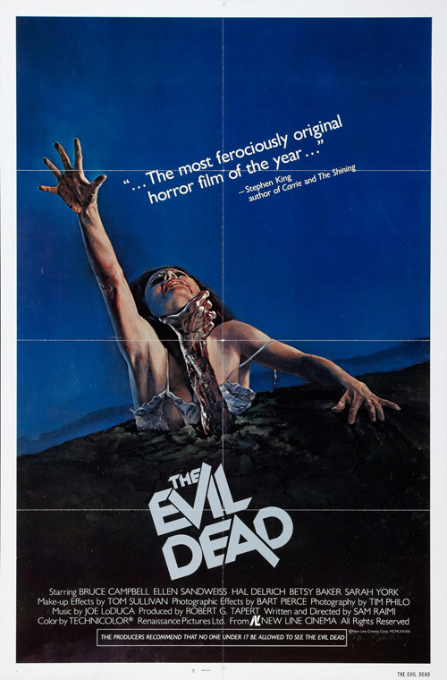
For Ignition’s Evil Dead (open April 5), what’s front and center is a victimized innocent almost unable to shuffle away from the camera. Here is a great hybrid of tone and photo representation that acknowledges how most of its horror genre’s fanbase is already aware of the franchise and what this remake promises to bring. With the subtly updated and polished logo from its 1981 predecessor standing out in blood red against light grays, there’s little else needed to pique interest.
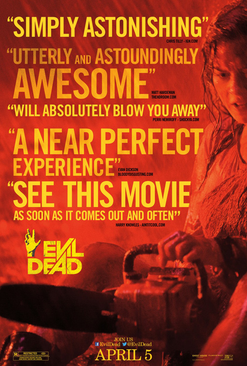
It is interesting to see that their updated sheet then decides to throw atmosphere out the window for bright, in-your-face coloring and a lame contorted hand coming up from the now lost logo. The yellow on red barely discerns itself to be easily read and it all just blends together into a boring, less effective offspring.
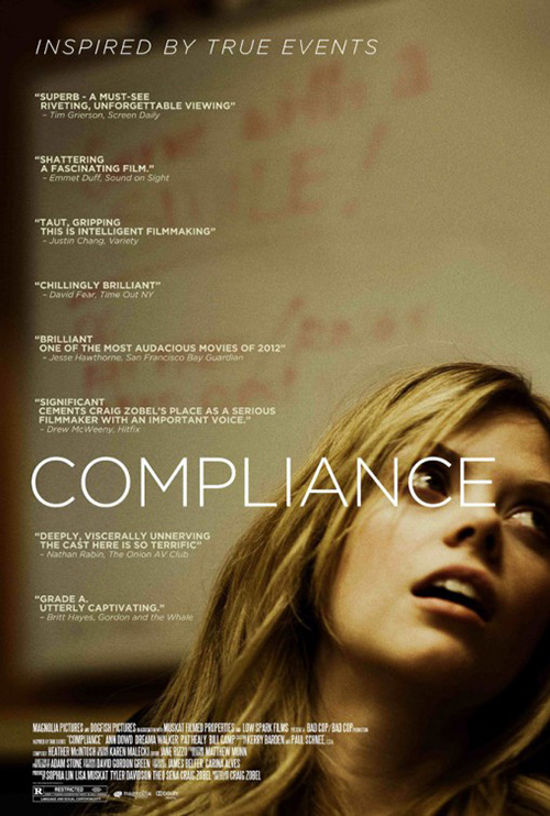
Poster #3 tries to right this wrong by using heavy sans serif text—although they utilize transparencies to blend it with the background anyway—and some playing with layers as type disappears beneath the actress at right. Mystery is gone in lieu of platitudes and the attempt to mimic last year’s Compliance is wasted by cluttering the negative space her extreme crop creates with giant words.
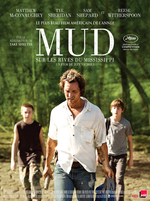 |
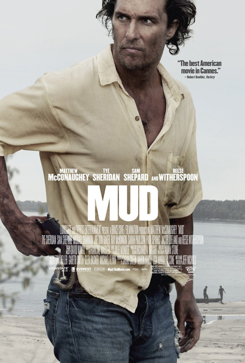
It’s Bemis Balkind who fully understands the concept of using celebrity to enhance a poster rather than handicap with their sheet for Mud (limited April 26). It is a strikingly dirty and unkempt Matthew McConaughey who takes up the full frame with a meticulously calculated crop of an elbow and forehead to still give us enough to never have to leave the page.
There is a wealth of darkness in his look with the tilt of the gun in his hand either alluding to his removing it or stowing away. Without a shred of compassion or forgiveness in his face or wardrobe—the torn and tattered jeans mixed with an unclean, wrinkled shirt—you know something is about to go down. And as far as the kids so up close and personal in the French poster go, you still get them small in the bottom right so as not to be forgotten.
If I were to take issue with anything in the design it would be the title font’s excruciatingly tight kerning. It’s completely off-balance without any breathing room because the “M” is so much wider than the other two letters. It overpowers them much like McConaughey’s figure does the boys at bottom, so maybe it’s just one more visual cue to their dynamic. Either way, this is a clinic on how to make a film still mysterious and captivating at the same time.
 |
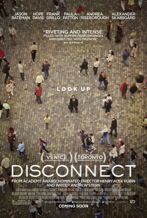
Outdoing itself, Bemis Belkind also brings the gorgeously simple yet unique poster for Disconnect (limited April 12). It still puts its lead actor Jason Bateman front and center, but not quite as blatantly important as one would expect. Looking like the Mii screen on your Wii when making avatars for you and your friends before picking them up by their heads, we are the eye in the sky peering down on the unsuspecting masses with one solitary soul willing to look back.
There are a lot of interesting details that may or may not have anything to do with the actual film, but do spark questions here. Why are the two “N’s” in the title blurred? Why does there seem to be a spotlight of sorts highlighting a circular area around Bateman before turning darker at the edges? What is he looking at? It’s a wonderfully orchestrated composition that provides us a yearning to discover more.
A little ingenuity
 |
 |
 |
 |
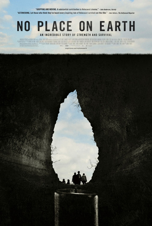
April does bring us four awesome one-sheets that should be in consideration for end of year talks due to their ingenuity and minimalism. They distill their films to a single image that perfectly encapsulates what it is we can expect from the movie itself.
Gravillis Inc. is first on the list with No Place on Earth (limited April 5). The story of Holocaust survivors living in an underground cave for over a year, the mouth of their salvation has been transformed into the candle flame of hope they held onto. It holds a brilliant duality from its position underneath the horizon line of grass and credit text to it placement above the superimposed stick of wax from which to rise.
The children are almost an afterthought peering into the hole in heavy contrast of shadow as the cave walls are illuminated as though from the flame to show its depth down into the earth. It’s an incredible juxtaposition of thematic elements and photographic representation for an incredible story deserving of such precise care.
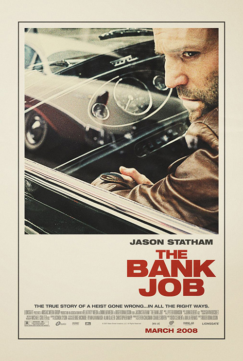 |
From contemporary artistry to retro-aesthetic, I move on to Simon Killer (limited April 5). I’m not aware of who the responsible party is for the design, but it is a gorgeous piece recalling an old school look with deliberately separated image panel from text like Ignition Print’s equally familiar The Bank Job.
The saturated red projects a watercolor-like texture of absorption that allows the grain to seep through its black and white print as we enter the displayed eyeball to see a reflection of love’s embrace in the pupil. In fact, the poster appears more a depiction of Karina Longworth’s review blurb at its top than perhaps the film itself. From “Sensually rich” to “an embodiment of … cinema as a manipulation of the eye and the brain,” you either have a textual and visual example of the film’s essence at once or two grossly miscalculated ones. I’d like to believe they both hit the nail on the head.
 |
 |
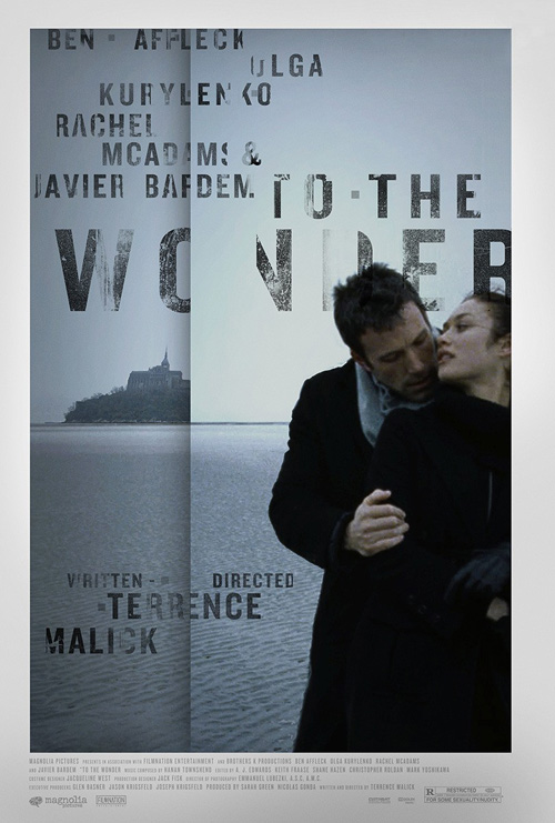
Another poster of which I’m sadly unaware of its creator, To the Wonder (limited April 12) is stunning. I loved the simplistic nature of the original quad-sheet’s portrayal of Ben Affleck and Olga Kurylenko’s tender embrace because it got to the heart of Terrence Malick’s film of glimpses and memories. This new one sheet, however, becomes a work of art on its own.
Possessing a window onto a scene perhaps colder than its predecessor, the complete disregard for wholeness is refreshing. The image appears folded in on itself to break-up words and objects without ever removing too much to become unreadable. Letters fade as though eroded through time, words are bisected and overlapped ever so slightly, and some names are given two lines to breathe. Affleck and Kurylenko are now enlarged beyond their resolution for a heavy grain of soft color and it all seems more like a dream of fleeting glances into the past that are no longer as crisp as they once were.
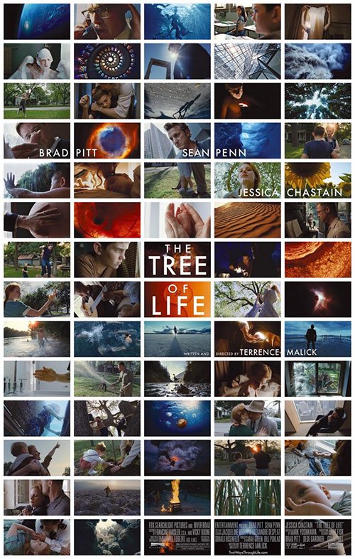
There is a break—a fracture in time and space—that coincides with the film’s darting through both as characters come and go with few words besides the poetic narrations laid on top. Where The Tree of Life showed its many splendid things at once and in full, To the Wonder splits its moments between the minds of characters and their distinctly different interpretations of events together for an overlap of love, sorrow, hope, and regret.
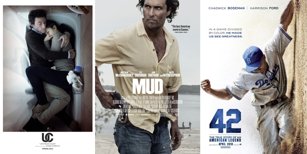
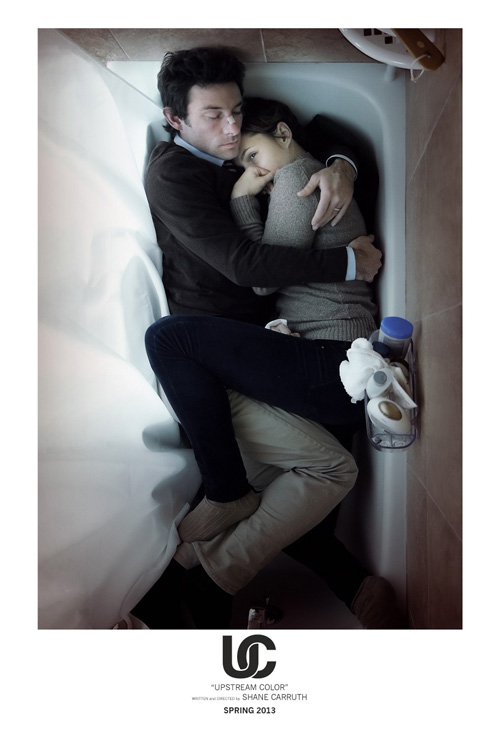
Where Upstream Color (limited April 5) is concerned, I wouldn’t be surprised to find writer/director/star Shane Carruth designed the poster himself. The guy seems to have a handle on every aspect of his movies and also the artistic eye to know exactly what’s needed to promote his iconic work.
Honestly, knowing Primer and the shroud of mystery this newest piece has cultivated, I don’t want to know anything about it before sitting down in the theater. So, while this re-enactment of Will Smith and his dog from I Am Legend does little to explain anything but the possibility of a relationship between the two actors depicted, I’m excited at the prospect of finding out it may be the key to everything after watching.
A striking image of fearful and protected embrace, one must wonder what they’re hiding from—the curtain is drawn after all; why Carruth’s nose is bandaged; and why his counterpart’s sad eye remains open to look at us watching. We need no text besides the former engineer’s name, release window, and quoted title, but the addition of the interwoven “U” and “C” only gives the whole a bit more elegance and branding. I can’t wait to see what it all means.
What is your favorite April release poster? What could have used a rework?

