“Don’t Judge a Book by Its Cover” is a proverb whose simple existence proves the fact impressionable souls will do so without fail. This monthly column focuses on the film industry’s willingness to capitalize on this truth, releasing one-sheets to serve as not representations of what audiences are to expect, but as propaganda to fill seats. Oftentimes they fail miserably.
Despite only having four Fridays, October 2017 is jam-packed with films. And so many of their studios apparently like boxes. Tiny boxes, big boxes, boxes forming shapes, and boxes in frames. Whether it’s the uninspired Marshall (open October 13) grid (link) overshadowing its predecessor’s starkly bold frame (link) or The Meyerowitz Stories (limited October 13) cribbing off the lo-fi aesthetic of old album covers with film still boxes (link), the boredom is mind-numbingly intense. Add Suburbicon‘s (open October 27) not so cute irregular grid (link) and these things start to make Blade Runner 2049‘s (open October 6) blue and orange palette over totem portraiture look interesting by comparison (link).
Sadly so few selections actually intrigue. At least eight of the ones below deserve mention, so not all hope is lost. But when Professor Marston & the Wonder Women (open October 13) rejects its comic birthright for JC Penney studio backdrops (link), it’s tough to remain wholly optimistic.
The Allspark strikes again


Hasbro is reinvigorating another of its toy lines into a potential film franchise this month with My Little Pony: The Movie (open October 6)—not to be confused with the 1986 edition that utilized the same title. Did you know it was coming out? I sure didn’t. Not one trailer passed my eyes via TV or internet despite the traffic of like-minded fare such as Trolls blanketing media everywhere last year. By the looks of the posters, maybe the studio put all their eggs in the print media basket instead.
I’ve collected four character sheets from seven different styles here. Seven. Another popped up after I began writing and there’s surely more besides that. LA did most if not all of the disparate aesthetics spanning kaleidoscope, neon lights, watery drip graffiti, anime, geometric cutouts, and comic book. There’s something for everyone.


The question: why? You would assume this property is targeting young children and yet they have no use for infinite styles that may or may not look like the actual movie animation or the dolls they own. I have to therefore believe the studio is targeting the nostalgia factor of its first generation of fans from the 80s as well as the contemporary subculture known as “bronies.” These series obviously appeal to an older crowd who may want to see what the film is all about more than their kids. Bravo if it works.
Personally I would have just stuck to the main sheets with their sparkling Lucky Charms marshmallow of a title icon and their literal representations of the characters. I’m not sure why one has the ponies looking like mermaids, but what do I know? They may be busy as far as sheer content, but each is much simpler in context than the psychedelic onslaught of hypnotic color above.
A nostalgic filter


Who doesn’t love an ugly sweater come Christmas time? The Refinery certainly doesn’t as evidenced by their creating one especially for Better Watch Out‘s (limited October 6) teaser. It’s a fun trope to utilize (see Sightseers) with room to add relevant motifs (Where’s the paint can?) and a whole lot of charm. A few blood spots here and there show we’re in for a horror-tinged and comedic experience—so do what the title says.
Unfortunately you can’t really do much with it beyond calling card. There’s enough here to put the title in your mind (it’s original name was Safe Neighborhood), but nothing to truly grab you. I’m not certain its successors do either, though.


The first is cookie-cutter with any old headless model wearing the sweater with a festive “Lucille” in his hands. While a slight lilt remains, the tone is definitely shifting to more serious territory. The proof comes in the final poster putting fear front and center. All humor is excised in order to showcase the two leads poised to fight back against whomever seeks to scare. Considering I found the film a bit unsure of itself as far as handling the tonal shifts with precision, I’m not surprised the marketing follows suit. It’s a shame that choosing one or the other can never do the film justice.
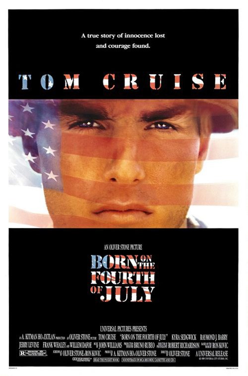
While Better Watch Out used a generic motif with its sweater, you can’t call it a copycat. No, that label is reserved for Iconisus L&Y – Visual Communication Systems’ Thank You For Your Service (open October 27). Not only is the film still with solid color at top and bottom for text a tired choice, the flag overlay can’t help but conjure Born on the Fourth of July. They are quite literally the same poster.
Does that mean it’s a flat out failure? No. If anything it improves upon the Oliver Stone advert by scaling back the gaudy text patterns and minimizing the words. You have your celebrity star spotlight, your stark white title, and your flourish of red to catch the eye while also soaking into the background’s black. And who knows? Maybe the comparison will actually sell a few extra tickets.
For P+A’s Breathe (limited October 13), the similarities to other sheets is less overt but no less prevalent. You can come up with tons of examples utilizing a sweet embrace washed out by a blaring sun, but you don’t have to go too far to find one that shares a color palette and a tree. Look no further than MIDNIGHT OIL’s A United Kingdom from earlier this year to see a sunset wash of exotic desert, the romance working overtime.


With that said, however, I do think this iteration is better than its others. It could be that I’m just done with the whole translucent text over faces trope, but this next one is extra annoying due to the alternating of line length. I felt seasick reading through it, like my body was swaying out to read the big words and in to read the small. It’ll make you dizzy.
Luckily the final rendition on this image does away with the vertigo. Sadly it throws the kitchen sink in with long critic blurbs, accolade-ready cast highlights, and a collage of stills with no purpose beyond unnecessary distraction. At least that first one had style in its composition and focus on its subject. This one is all over the place.
And that brings us to The Secret Scripture (limited October 13) and its washed out antique of a sepia-toned memory trapped as photo. I like this one because of its unique visual texture that actually muffles what we see instead of making it “pop.” And I really love the austere title block with its expansively kerned all-caps serif forming a pyramid to house a squeezed tight point of stylish lowercase script. It’s a perfect complement of sharp lines and vintage feel to accompany the aged beauty of love.


My affinity may be a result of its mirroring the atmospheric choices of another Rooney Mara picture in Ain’t Them Bodies Saints and that’s okay. If you’re going to crib off of something, make it good. But my fondness could also stem from nothing more than the fact that its sibling is so disappointing. Its collage of faces is out of proportion, the shadows are made darker by its use of deeply saturated greens, and the title is all business without a shred of nuance. Love is destroyed for the potential of espionage-based thrills. Its utter lack of character makes me weep.
Careful compositions


I’m as surprised as you to say that our entrance into the really good posters for October starts with Jigsaw (open October 27). We can argue the merits of why this movie was created years after we thought the torture porn series earned its “final chapter,” but at least LA has brought it into public consciousness via creepy imagery.


If you read my thoughts on Allegiant and Remember you’ll know I’m a huge fan of the behind glass aesthetic to change up perspective and proximity. It doesn’t work better than with the horror genre, though—as evidenced by New Wave Creative’s Midnight Meat Train. But while the foggy translucency is cool, the combination of water drops, scratches, and gouges is even better. This is a glimpse at a psychopath toying with us: his/her prey. They want us to look at them and know there’s no escape.
From there the firm goes into a series of generic character sheets depicting random people wearing the iconic mask. They are plain and yet still possess intrigue enough to cause us to wonder if we’re seeing an army of perpetrators or unsuspecting victims. Unless you’re a fan of the franchise, however, they are easy to walk by without a second thought since the “fear” factor is absent. You need the menace of that first sheet or the weirdness of Tobin Bell in cracked puppet make-up.
To look at Mister.S’s Walking Out (limited October 6) is to see that good work is possible on a small budget. You don’t need a blockbuster franchise or Hollywood studio throwing money around to conjure a serviceable composition that uses the rules of design despite limited resources.
You may lose your suspension of disbelief as far as whether or not the actors are a part of the scene—the coloring and positioning seems to scream Photoshop pasting—but they are hardly the focal point of the whole. We’re meant to see the scale of the environment, those desolate snow-covered mountains in nature as an expansive setting for what appears to be a quiet father/son journey of connection. The text never overwhelms and our eyes are afforded the room to journey freely.
The same can be said about Gravillis Inc.’s Human Flow (limited October 13) and its seemingly scattershot overhead view of people walking. It’s a cool image because there appears to be an inherent spiral to things that simply does not exist. Our eyes seek to make a cohesive pattern out of what truly is a random snapshot of strangers in motion. Some look up at what I assume is a camera-carrying drone, but their gazing at us is playful rather than telling.
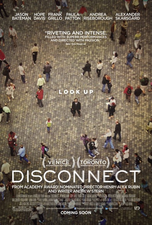
InSync Plus did the opposite with their poster for Disconnect because they wanted Jason Bateman to interact with us more than us with him. As such we’re drawn to him so that the rest fades away for better or worse, our freedom stunted while Gravillis Inc. embraces it. The text here is unobtrusive by comparison—small and a lighter tint of the ground’s color. The title spreads out to coexist with the human travelers rather than overpower them. It’s almost impossible to stop soaring in and out of their fluid rows with carefree jubilation.
Even so, the best laid-out frame of this quartet to me is 78/52 (limited October 13). Because the title represents the number of shots and cuts used in Psycho‘s iconic shower scene, easy money would have had designers breaking the poster into tiny boxes of those shots. But seeing them statically sequential rather than kinetically ruins the visceral impact Alfred Hitchcock and Saul Bass manufactured—the very thing this documentary strives to explain.
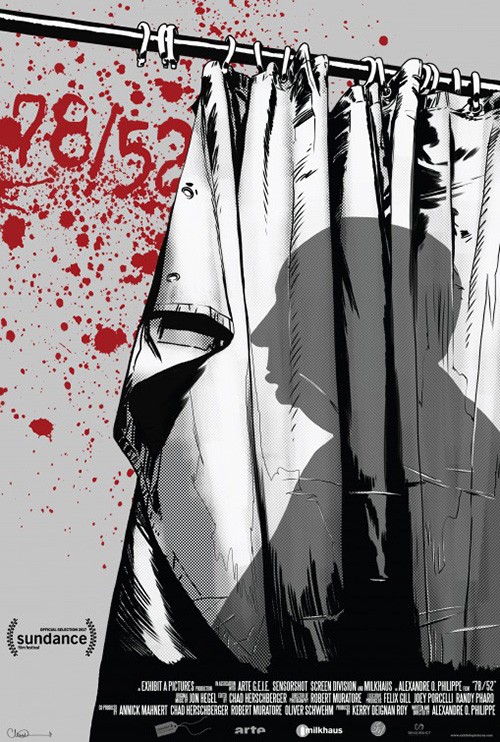
That is why you must embody the fear and anxiety of watching the scene without falling into the trap of portraying the technique behind it. I can’t think of a better shot to therefore focus on than Janet Leigh’s clenched fist on the shower curtain. This is desperation incarnate and yet still anonymous. It is pure emotion distilled into a second that lasts forever.
The fact it also bisects the page to leave ample room for text is a bonus. I would have put less on since the font size is so tiny, but it does all fade into the background thanks to the black and white monotone save the title’s red. The whole proves a nice example of restraint in the face of potential exploitation.
As such the Sundance illustration is a complete failure. It delivers horror grotesquery despite Hitchcock very consciously avoiding that train of thought. This flashy yet antiseptically loud assault is the very antithesis of what makes the shower scene so legendarily unforgettable.
Making more out of less


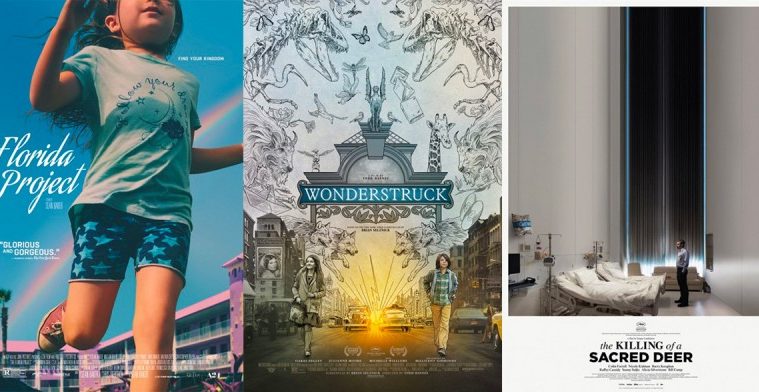
I’ll say right now that I do not like the poster for The Killing of a Sacred Deer (limited October 20). The way it takes an obviously landscape oriented image and simply stretches the top portion well beyond capacity to fill the rest of a portrait frame is wholly unsettling. But that’s why it is successful. Despite my personal distaste, I cannot deny its impact. If I hear the title, this is the image that comes instantly to mind. It’s like I’m standing where Colin Farrell is as the floor drops without an end to stop it.
We’re drawn into this trippy scenario as though it depicts the sinking of his heart upon the death of whoever used to be in that hospital bed. No matter what comes next he’ll be trapped in that room forever feeling the pain and anguish of his loss. It’s like an elevator going down, your eyes focused on the curtain’s void one minute and your body lying on the floor the next. There’s magic to turning a design shortcut and visual blemish into a powerful psychological tool. Bravo.
MIDNIGHT OIL’s Goodbye Christopher Robin (limited October 13) doesn’t possess that same sense of futility, but it is just as effective in projecting a feeling of hope. The whimsical melding of reality and fantasy that goes into creating a fictional version of a real person (as A.A. Milne did with his son) is perfectly expressed by the juxtaposition of photograph and drawing. We’re watching as this father and son quite literally step into the world of their imagination to cement the fact that the metaphor of Pooh comes from truth.
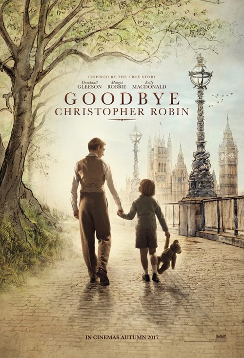
What really makes this poster work for me is the frame within the frame. If you look at the actors’ feet, they are walking into the illustration. There’s a transfer of environment that carefully delineates one from the other and shows how they exist in both. The choice also allows for the room at bottom to let the title and text shine as a cohesive whole that doesn’t take anything away from the delicate visual marriage above.
Creative Partnership’s rendition with the entire page being illustrated shows why the former is better. This is more of a Roger Rabbit scenario wherein live actors live in the animated world rather than the animated world being a part of them. It may seem inconsequential, but that’s a huge distinction. The Milnes don’t hallucinate another world and enter it. They create it in order to give a piece of themselves to the masses. They willingly transform our world into a place of magic. It’s not dream; it’s choice.
The latest Wonderstruck (limited October 20) sheet by The Refinery merges photo and drawing too, but in a different way. It removes metaphor for a direct line into the imagination with dinosaurs and wolves looming without definition in the sky above. They are outlines while the street setting is colored—or perhaps I should say how it’s being colored. Contrasting the Milnes as they go into the fantasy, these two children are leaving it. They even retain the thick black outline on themselves as substance takes over where only a frame used to be.


What’s really neat about this sheet is its asymmetrical symmetry. Fold the page in half vertically and objects will align imperfectly whether it’s boy to girl, past to future, or butterflies to birds. Some things remain identical, but very little. So we see a connection between these two characters, a bond that unites them despite so much separating them. Suddenly two “worlds” become four as each real life holds its own fantasy—mirrors unto themselves and the other.
The decision to color this design was the right one as the black and white line drawing becomes too busy to really see what’s happening. The lines just become muddled gray rather than defined objects, the white of sky and object making it impossible to discern where one thing begins and another ends.
Personally I wouldn’t have minded the studio sticking to the teaser’s mysterious museum of curios. Perhaps it was too non-descript in its lush detail.
If you really want to see less as more, however, bask in the glory that is InSync Plus’ The Florida Project (limited October 6). So much of this poster is probably manufactured in post and yet it looks and feels like the product of a lucky snap of the camera. Whether the building or rainbow were brought in to fill a different space behind young Brooklynn Prince or not, it all comes together in perfect harmony.
The way she is cropped off of three sides shows her in motion as she runs past us. There is a playful inhibition to the act, her legs kicking out loose as speed overtakes precision. And her visage oozes personality whether from the starred shorts, “Follow your dreams” tee, or smiling mouth to ensure we know she’s running towards something rather than away from something else.
The rainbow intersects her body as though an “X” marking the center of the page and thus the horizontal line that the title rests upon. All the text comes in later to fill the gaps left by the composition and yet nothing feelings cramped (except maybe the title courtesy of little room to breathe around it). The critic quote and tagline are easy to pick out in their simplicity, both bookending Prince as our main focal point. She makes us want to turn around and see what awaits us that’s so exciting.
What is your favorite October release poster? What could have used a rework?