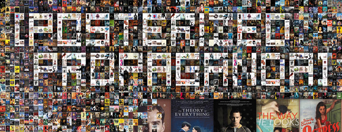
“Don’t Judge a Book by Its Cover” is a proverb whose simple existence proves the fact impressionable souls will do so without fail. This monthly column focuses on the film industry’s willingness to capitalize on this truth, releasing one-sheets to serve as not representations of what audiences are to expect, but as propaganda to fill seats. Oftentimes they fail miserably.
I guess studios are gearing up for a huge December push because this month has a pretty sparse line-up. Thankfully, however, it appears quality has trumped quantity because most of what’s opening has been on my must-see list all year (or longer).
While the films themselves do look great, I can’t necessarily say the same about their marketing campaigns. Very few here stand above the rest unless you count blatant rip-offs expressing how over-saturated and uninspired the medium has become. The best thing to my mind is a sheet with its image turned 90° …
Well’s run dry
 |
 |
 |
 |
 |
 |
 |
 |
Let’s talk a bit about those copycats.
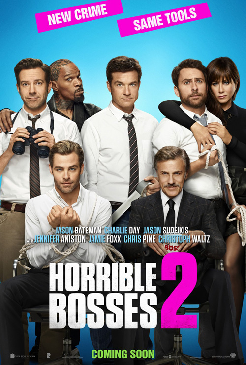 |
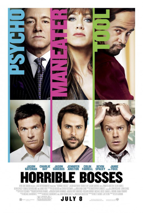
I will give WORKS ADV (with photography by Brian Bowen Smith) the benefit of the doubt where Horrible Bosses 2 (November 26) is concerned solely because I can understand why consistency is important in a product’s brand. The problem becomes the fact that the brand begun by BLT Communications, LLC with the first film is less than inspiring.
WORKS ADV did simplify things by focusing only on the stars, even going so far as breaking them out of their boxes despite retaining said cages in a deluded “if we remove the borders it will seem more open” way. Sorry guys, it doesn’t. And the fact that this rigid Photoshoped triptych (just look at that fake roll of duct tape) is better than the “family photo” collage only shows how bad things are.
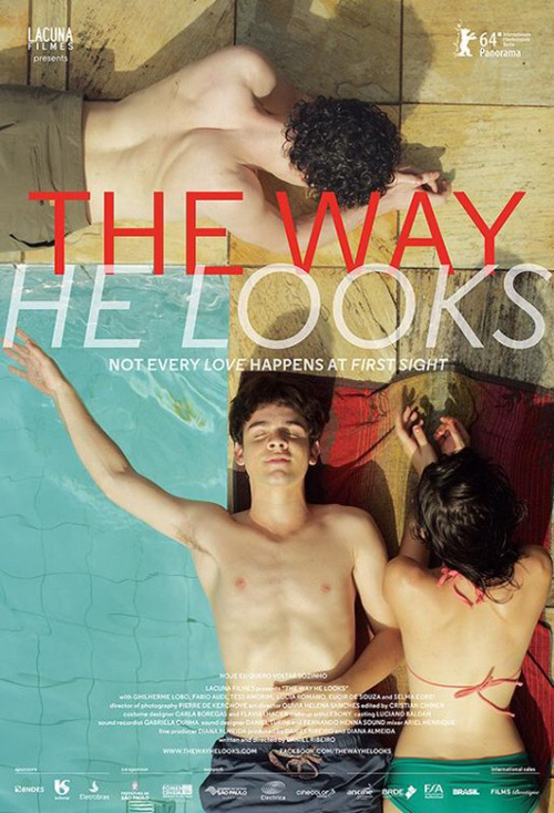 |
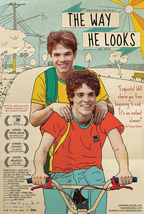
Onto The Way He Looks (limited November 7) and its theft of P+A / Mojo‘s Away We Go aesthetic. No, not just aesthetic—it looks as though whoever designed this found those firms’ working files and simply slapped their actors on top. I mean, wow. Just wow. I hope that either P+A or Mojo did this one too because at least then I can blame it on one artist’s personal style.
The real shame is that the second poster for the film is quite lovely. The straight lines of the pool tiles nicely contrast the curves of its three characters lying in the sun. I don’t love the transparency effect of the title nor the distractingly too-thin sans serif font, but it doesn’t totally ruin the crop’s brilliance.
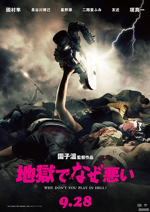 |
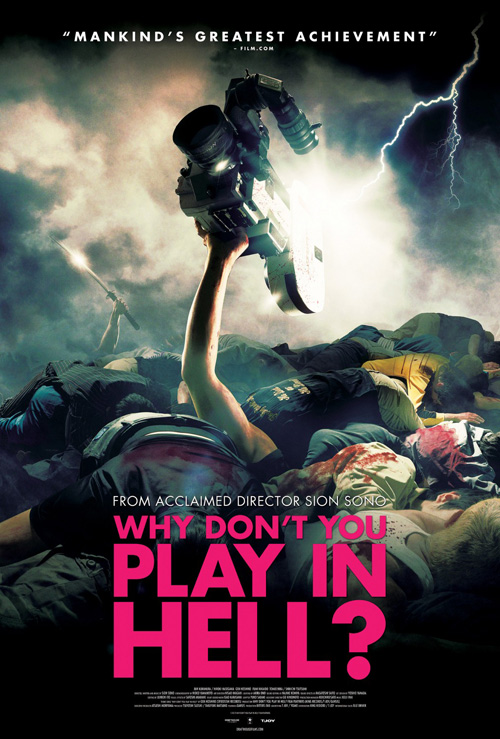
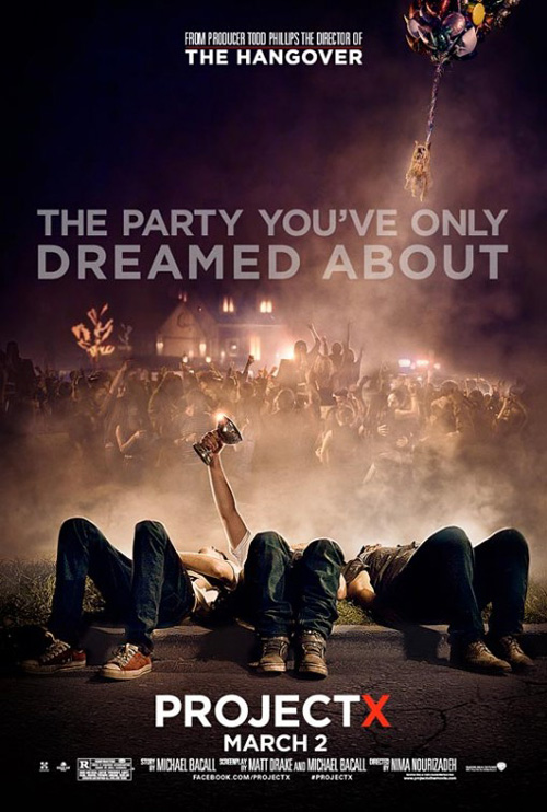
Next up is the English-language sheet for Sion Sono‘s Why Don’t You Play in Hell? (limited November 7). Add a decapitated dog flying through the air and you have the nightmarish version of Concept Arts‘ epic party aftermath from Project X. I’m talking faceless people lying on the ground, an extended arm holding his grail, and the fog of temperature change brought on by warm bodies on a cold night. Hell, nevermind about the dog since that flash of lightning fills its role nicely.
I can’t even save myself by showing the original advert either since the international design is identical. At least the image conjures thoughts of humor with that silly sword reflecting light in the background. The tone is appropriate; I’ve just seen it all before.
 |
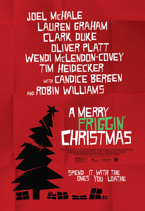
The most egregious offender of the month, however, proves to be the Saul Bass-stealing designers on A Merry Friggin’ Christmas (limited November 7). Since I’m keenly aware that the master of poster design has been copied for decades, I won’t begrudge them the homage.
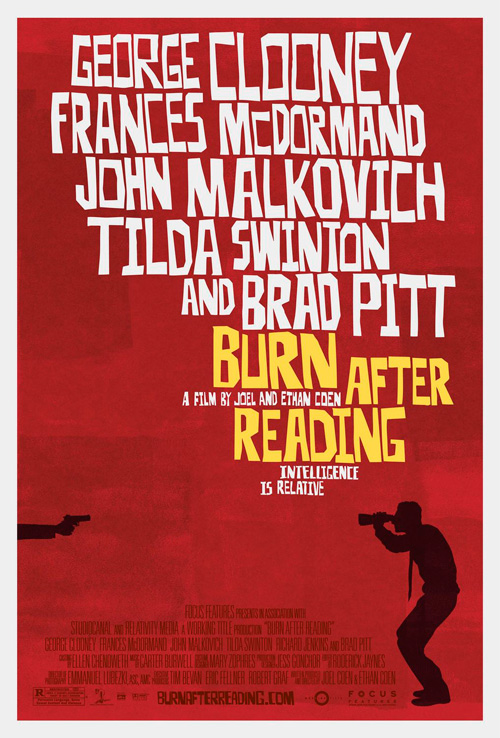
Instead my qualm is with their unoriginal desire to do what P+A / Mojo (boy those guys should hire lawyers with enough brass to negate “fair use” rhetoric) did on Burn After Reading. We’ve got the Bass-esque names large at top in white, the single isolating bright color in the title to set it apart, the black silhouette drawing to whet our appetite, and the boxy/folded red background to pop everything out.
The similarities honestly pain me.
Eject it into space
 |
 |
 |
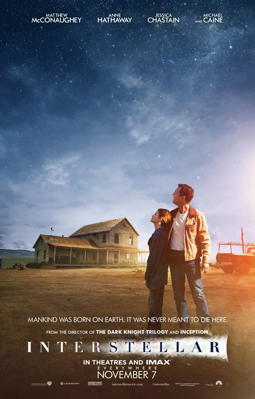 |
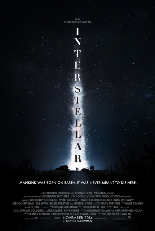
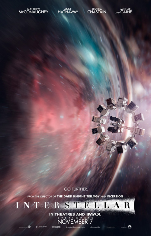
When I say eject it into space, I mean it. I do not like what BLT did with these Interstellar (November 5 on film and wide November 7) posters. It started with the first teaser doing a nails on chalkboard design move by stacking each letter of the title on top of each other rather than rotating the full word 90°. Not only that, they also altered the boldness of each letter to make it thin up to where the bottom of the shuttle should be and widen again up to its tip. Guess what, though? The smoke in the background is already doing the same thing.
The other entries are hardly better for the most part due to that logotype. They’ve laid it out according to how we read English this time, but why does it still has the space dust behind it? The font’s razor thin edges help it get lost in the effect and make it somewhat invisible against the barely readable credit block beneath. The whole thing is silly.
Thankfully the imagery is captivating enough to ignite a modicum of awe. Not the second poster above with multiple astronauts looking as confused as we are, but the others. I like the blur of motion under the circular spacecraft in number three and the painterly sky’s vastness in number four. There’s an aura of washed-out color in that last one that really creates a nice, warm and relatable atmosphere. But then I look down at the logotype and realize how it ruins everything.
Constructivist homage
 |
 |
 |
 |
 |
As a fan of Russian Constructivism art, when I first heard about the hockey documentary Red Army (NY November 11) I desperately hoped the marketing materials would pay tribute to the artistic philosophy practiced by greats like Alexander Rodchenko. Suffice it to say, I was delighted once I saw these collectable designs.
There hasn’t been a finalized sheet for the film yet, but I can’t imagine anything being better than these. The horizontal entry that makes note of its Cannes selection is Mondo worthy and definitely something I’d hang on my wall. From the colors to the line work to the blocky font, this thing screams Communist Russia.
Of the others, the fourth is a close second with its faux symmetry radiating from the center. The way the hockey sticks cut negative space into the red of the players is delightful and the shading a brilliant trompe l’oeil to make it appear as though someone crafted a three-dimensional pop-up poster out of cardboard.
They aren’t about the players specifically because they’ll get their opportunity to speak about the era and what it was like to play for their country in the film. These posters are meant to conjure a feeling and sell the film beyond what we can find out online. I can’t think of any other campaign this month that better makes you want to discover more.
Oscar bait
 |
 |
 |
 |
 |
Art Machine, A Trailer Park Company has a tendency of creating some of the cutest posters for family fare and they deliver again with Disney’s Big Hero 6 (November 7). A memorable tease, there is humor and intrigue in the feet of its stars. We don’t know what Baymax or Hiro look like, but we know from this glimpse that one is a human child and the other something wholly different. The smoke trail and shoelaces give it a sense of rocket propulsion and the scene a sense of adventure.
Kudos on the Japanese aesthetic with a woodcut-esque release date and blocked title font delivering everything but the fact that this is a Marvel property. Maybe the Mouse House didn’t want to confuse their “cinematic universe” by putting the Marvel brand on anything that isn’t Avengers related, but it’s not like they don’t put Disney and Pixar together on top of the latter’s work.
As for a full sheet, this geometric comic book styled piece is beautiful. There’s a whimsical tone to the flowered trees, floating fish, and fluffy clouds. The shadow of its heroes turning their regular silhouettes into that of armored warriors is playful as well, showing their worth under the gaze of a pretty menacing foe. Add the gorgeously sharp edged Hiro and Baymax at top all streamlined and videogame-y and I’m sold.
 |
 |
 |
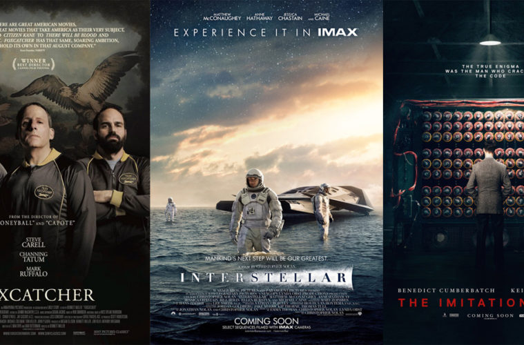
InSync + BemisBalkind worked on the tease for Foxcatcher (NYC/LA November 14) and it is creepy in the best way possible. Between Steve Carell‘s Penguin from Batman impression sticking his prosthetic nose in the air, the dark mystery of the building shown through the window of his profile, and the frayed edges adding a palpable tension, the film could easily be a straight horror rather than thriller from the visuals. It’s simple yet effective.
Following it comes a series of character sheets—and an amalgam of each—showcasing tense, murderous faces shrouded in darkness over an aristocratically foreboding backdrop. Whereas the artwork and American flag under Carell and Channing Tatum respectively lose impact through obscurity, the painting’s full glory in the final rendition is perfectly placed. The bird’s wing cradles Carell and Mark Ruffalo‘s heads while its prey can be seen between Steve and Channing. Here’s a man-eater and his toys: what comes next is anyone’s guess.
 |
 |
There’s a similar brooding tone to the main sheet for The Imitation Game (limited November 28) with Benedict Cumberbatch‘s back facing us, dwarfed by the computer he has created. The symmetry of it all is a little unnerving as darkness seeps in everywhere but under the lone light at top. Man and machine remain a mystery, their relationship with each other the only sure thing on display.
When you’re going to make character sheets, however, faces must be seen. To combat that reality, the designer here has covered Cumberbatch and Keira Knightley with an alternating grid of circles reminiscent to the aforementioned computer. The result is a mesmerizing optical illusion that makes it a welcome struggle to read the separated letters composing a tagline. It’s pretty cool too how the eyes pierce through the wall.
 |
My favorite of the group, however, is P+A’s work on The Theory of Everything (limited November 7). They could have gone the easy way out by simply putting Eddie Redmayne in his wheelchair front and center with “For Your Consideration” at top, but instead chose to show us the fun and motion of Stephen Hawking‘s earlier years. Here he is dancing with Felicity Jones—equations fading in and out above them—as the joy of life and family coexist with the math. And by turning it sideways we not only get added fascination, but a sign of the tumble and physical fall to come.
It’s only made more captivating when seen next to the film’s other advert plainly putting the actors beginning a kiss and at an angle that makes the whole scene spin as though we’re in a drunken stupor. The concrete calculations do nothing to help this feeling of vertigo as the sense they are twirling around the couple creates an increase feeling of nausea. Maybe they were going for a “feel like fainting” effect.
Dystopic portraiture
 |
 |
 |
 |
 |
 |
 |
 |
November’s unequivocal showcase is less about selling a movie and more about enhancing an already created world. This was the task for Ignition on The Hunger Games: Mockingjay – Part 1 (November 21) and they have risen to the task again after success on the previous two films. Whereas the first was more teaser-centric on the Districts and the second had an intriguing series of wardrobe designs playing with the idea of The Capital’s excess, this time around has the firm combining those two ideas.
We may not receive all twelve Districts, but the concept is fulfilled nonetheless with seven. Creating a tribute to the work each does is an inspired thematic direction, one that proves successful in thinking if not quite perfect in execution. The one for “3” looks like it’s from an old illustrated copy of 20,000 Leagues Under the Sea; the tire pants in “6” are plain absurd; “7’s” wooden leg is overtly grotesque in showing how dangerous chopping trees can be; and “10” could be the new album cover for Bon Iver. They are all rendered with top-notch art direction, though.
 |
 |
 |
 |
What Ignition did that I thought was a cut above the rest—besides the guerilla teaser trailers courtesy of Beetee—was the whitewashed statuary-like scene of President Snow and his prisoners. It’s a memorable aesthetic that plays perfectly into The Capital’s decadence and the ubiquity of all things Hunger Games ensures the look isn’t sacrificed by logos and credits.
This fact reaches all the myriad poster series to the point where Coin can be shown against a tall concrete wall with nothing but the film’s pendant for identification purposes. The same goes for Katniss’ back—a beautifully composed chiaroscuro of light against her leathery get-up sucking the oxygen away from the small fire burning below. I’m not quite sure what to say about the Xerox collage piece, but it’s at least original if completely devoid of meaning.
It’s helps to have a Blockbuster budget to do so much, but that shouldn’t belittle the reality that Ignition is making the most of the opportunity.
What is your favorite November release poster? What could have used a rework?

