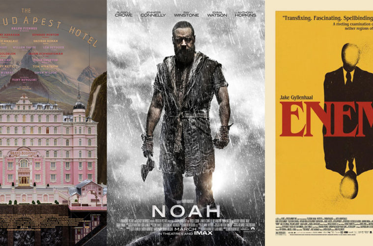
“Don’t Judge a Book by Its Cover” is a proverb whose simple existence proves the fact impressionable souls will do so without fail. This monthly column focuses on the film industry’s willingness to capitalize on this truth, releasing one-sheets to serve as not representations of what audiences are to expect, but as propaganda to fill seats. Oftentimes they fail miserably.
Has summer started early? Big blockbusters like Divergent, Noah, 300: Rise of an Empire, and Need for Speed are releasing in March—I guess they must therefore be the studios’ lesser box office juggernauts. You know, the ones they aren’t quite sure will earn the bank they had hoped when forking over the cash for production. Tween action/romances did not fare well last year, no one knows who Noah is targeting besides Darren Aronofsky fans, Rise looks like a 300 rip-off, and Need for Speed is, well, exactly what you’d think from a racing video game property. At least some of their posters are pretty …
Kids love variety
 |
 |
 |
 |
We start with the kid-friendly, family films. Or as I like to call them in March 2014: The Ty Burrell show. Yep, if the Modern Family star has a profit-based salary, he’ll be able to retire from real estate for good.
 |
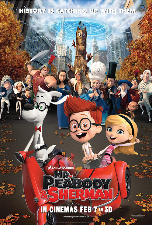 |
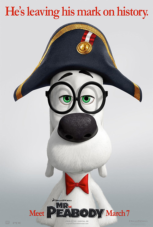
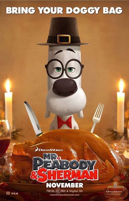
Dreamworks pretty much decided they liked every poster idea pitched to them for Mr. Peabody & Sherman (open March 7) because they have used them all. When you only have to put a dour dog in the center of the frame each time, there isn’t much variety to try something new. So we get Proof’s tease with his Napoleon hat and no background before Sherman was added to the title. BLT Communications, LLC draws up a Thanksgiving themed iteration in time for the holiday only to watch it not get released. And MIDNIGHT OIL swoops in to takeover in 2014.
It’s this latter pair that I like best if only because they aren’t as boring. We’re talking about a time traveling dog here—you can’t just keep changing his headwear and call it a day. I like MIDNIGHT OIL’s teaser the best. It adds Sherman, crops everything in a fun way, and gives Mr. Peabody a personality with a smile and bowtie tug. Their main poster is way too busy but it does instill that fun the previous firm’s lacked. And by that cast of characters in the background, I really hope this is Bill & Ted’s Excellent Adventure for children.
 |
 |
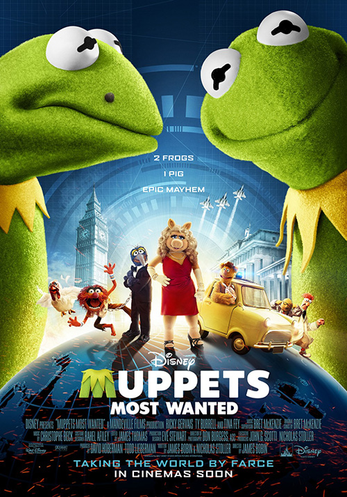
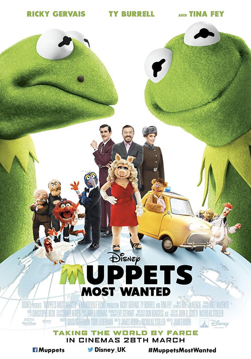
Next comes Muppets Most Wanted (open March 21) and boy is eclipse’s work lackluster. The campaign for The Muppets wasn’t incredible, but Proof’s jam-packed frame of characters was pretty great—especially as a refresher course to Jim Henson’s creations. BLT tried to mimic it with a selected grouping plus Ricky Gervais, Burrell, and Tina Fey, but it is far from a success. If anything it reminds me of Where in the World is Carmen Sandiego? with its globe and closet-raided costumes.
Back to eclipse, though: those giant Kermits are scary. Add the Bourne Identity high-tech video game graphics at the back with some more Muppets in the foreground and you have “safe”. No more no less. But it gets even worse with the UK edition as the cool blue is removed for stark white, the humans are added for star appeal, and that mole on Kermit’s face glares at us even more. They’re both trying to do too much and it shows. It’s the Muppets people—we don’t care what they’re doing. Tickets will be bought because of the name alone.
Stylized Characters
 |
 |
 |
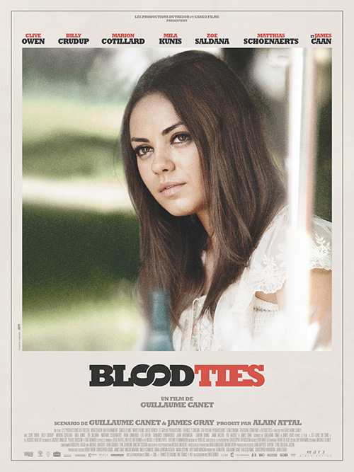 |
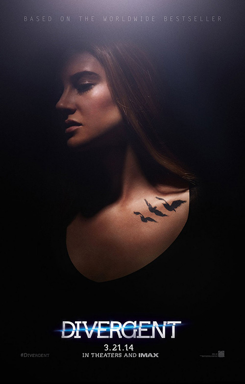
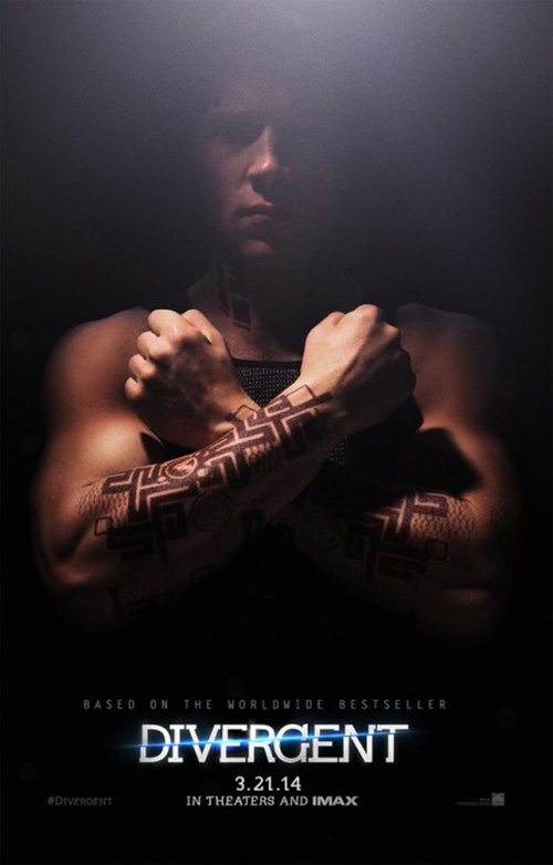
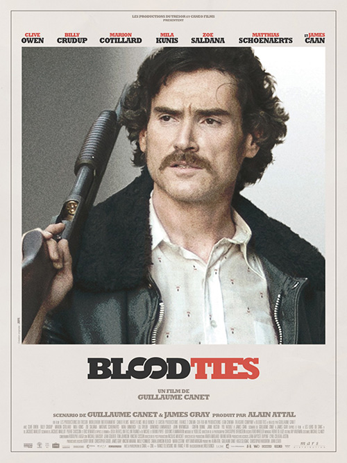
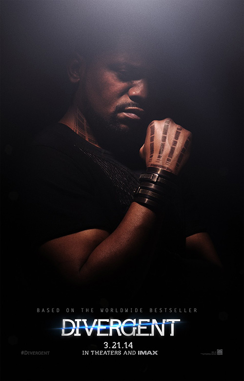
I really like both of these series: Divergent (open March 21) and Blood Ties (open March 21). They complement each other nicely too with the heavy black of the former and the 70s style off-white of the latter. It’s fantasy darkness versus pulpy, newspaper portraits that’s conversely good (dark) and bad (light).
 |
 |
 |
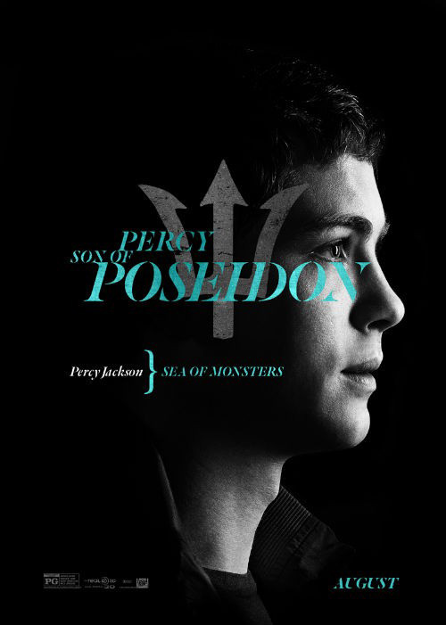
Divergent comes courtesy of BOND. Scratch the cartoony logotype at the bottom and these are pretty fantastic. Everyone’s serious face pairs perfectly with the mood, the glare of the overhead light casts a fuzzy haze on everything but the tattoos, and those tribal motifs turn the skin into a gorgeous abstract pattern against the blackness of the background and the drawing within. It’s a cleaner version of what MIDNIGHT OIL did for the Percy Jackson sequel.
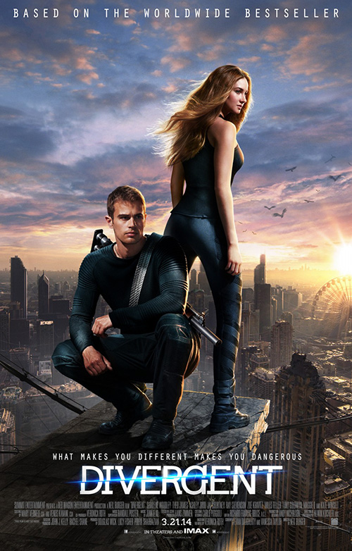
Why Summit didn’t have BOND come up with a main one-sheet, however, I have no idea. They went with BLT instead and got a horribly generic helping of blah with a cityscape/comic book-esque look at “superheroes” about to descend on the city’s criminals. At least the highly glossy title works on this one …
 |
 |
 |
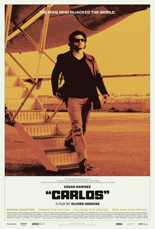
As for Blood Ties, Jeff Maunoury really captured the 70s aesthetic on his French-language sheets to show this family pitting criminal against cop. It’s very similar to Sam Smith’s poster for Carlos—using the large, soft focus image above a bulky, retro fonted title with all pertinent information small and out of the way below. It suits the hairstyles/costumes on display in the character highlights as well as the foggy, under the bridge scene with Billy Crudup and Clive Owen looking our way.
Like all good things, though, the studio came back stateside, hired Art Machine, A Trailer Park Company, acquiring a rigid collage of film stills for their trouble that loses all the classy cool Maunoury injected. It’s a shame too because the look was so good that it even made the weird sideways, interlocking “Os” of the title work despite my better judgment.
Badass dudes
 |
 |
 |
 |
 |
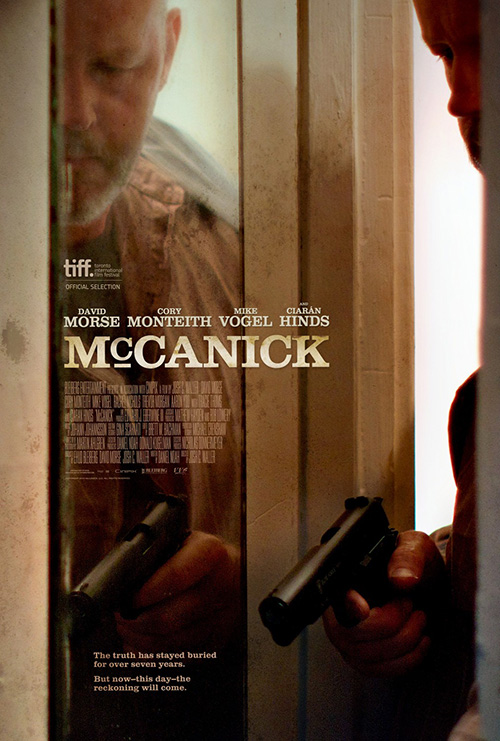
It’s the best of this foursome and yet I only included it to round out the section header. I’ve never heard of McCanick (limited March ), but it has David Morse so it can’t be all bad (except for also staring the late Cory Monteith). It’s a very cool composition in a muddy brown palette that utilizes reflection well. The font choice is a bit Western-y and perhaps cheapens the whole, but it’s not horrible.
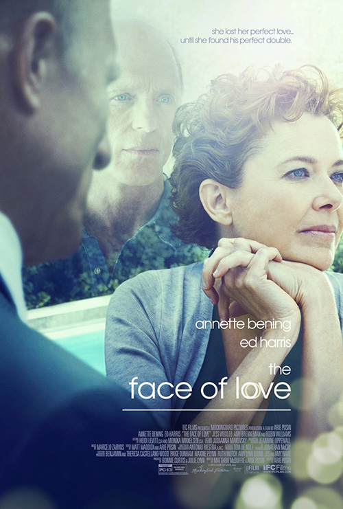
If you want horrible, just look at Face of Love (limited March 7). Effective photo burn and framing, but what is with the ghost of Ed Harris creeping in the back?
 |
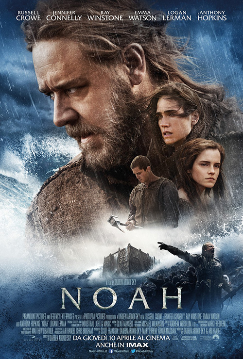 |
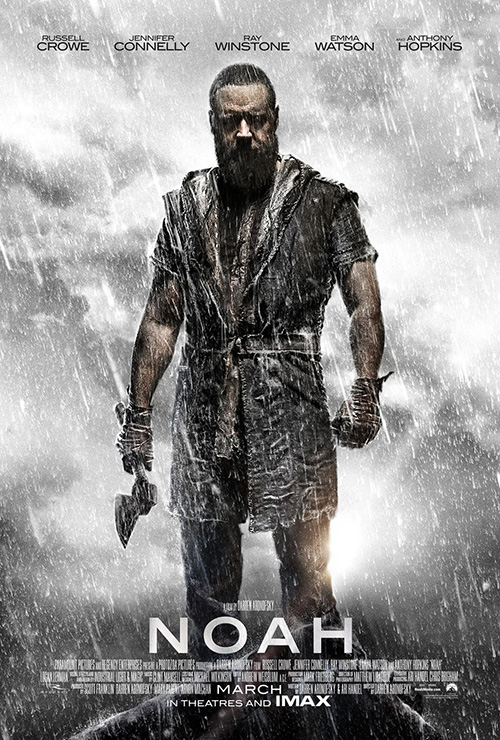
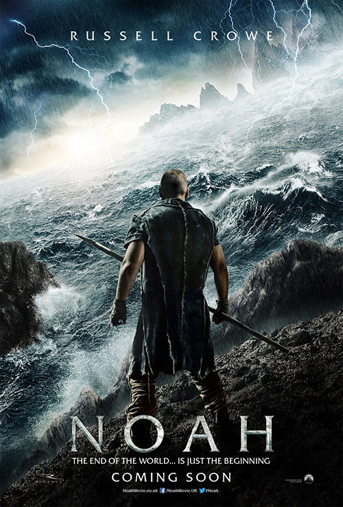
While Morse is often cast as a badass, no one does it better than Russell Crowe. It’s little surprise then that BLT would choose to focus on this reworked Noah (open March 28) for Aronofsky’s latest passion project. If there wasn’t any text and someone asked what I thought this image was for, though, I’d probably say a film about Zeus. Crowe is pissed and looking mighty vengeful with that hatchet, so watch out.
You can’t really blame the firm for going all action-packed/Clash of the Titans on it either—that may be the only way to trick people into going to see what could potentially be a very spiritual drama. They did good flipping the tease around so we could see Crowe’s scowl as well as changing the font from Greek bevels to contemporary sans serif. And we’ll just forget about the floating heads/checkout aisle book cover version they created for Italy.
 |
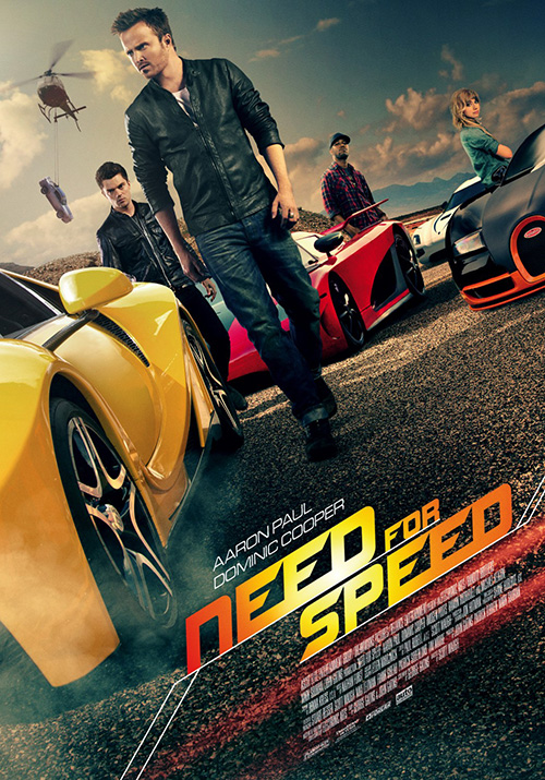 |
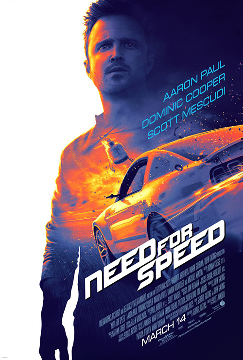
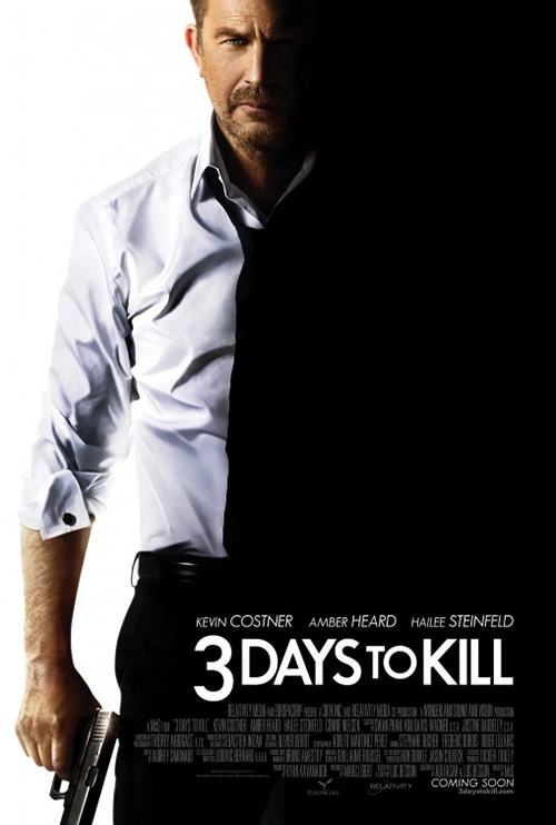
BLT is at it again with high-octane actioner Need for Speed (March 14) and I’m a fan of the sunset coloring they’ve given star Aaron Paul. It’s very 3 Days to Kill (Concept Arts), but with some added intrigue via Fast and Furious diesel—a combo made in heaven for a movie based on a plot-less video game property. Although the oil painting look may be a bit highbrow for the target audience.
To counter it BLT went full-bore into F&F territory with fast cars and their leather jacket wearing rogue’s gallery of roadsters. It’s just a shame that Kid Cudi and Imogen Poots couldn’t look fearsome if their lives depended on it because their attempts pale in comparison to Dominic Cooper’s and Paul’s badass stares. And who’s flying that helicopter if Mescudi is on the street? I saw the trailer; maybe he has a twin.
 |
 |
 |
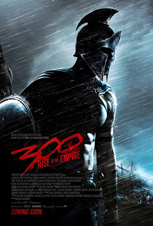
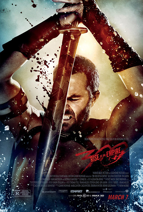
That leaves P+A to be tasked with doing their best to capture lightning in a bottle again on 300: Rise of an Empire (open March 7). Like the film, though, no amount of new technology and polished flourish can make what appears to be a cash-grab anything but. It’s too bad too because I like the imagery of this Spartan against a crimson wave in the distance. It’s a beautifully composed sight ruined right off the bat with the convoluted name so desperate for people to know it’s a sequel to 300.
The Refinery comes in to improve upon the look with their shrouded in shadow warrior against pouring rain while cold open amps up the Spartacus-esque bloodshed in their view of Sullivan Stapleton hulking out. But it ends up being Mondo who gives us the most interesting of the bunch with a bloody mess of liquid water forming Xerxes’ Wizard of Oz projection style face housing shields, ships, and columned buildings. While a bit cartoony for my tastes, I have to laugh because you could probably say the same about the others.
Photos are overrated
 |
 |
 |
 |
The heading of this section is a bit misleading since two of the four do utilize photography, but they don’t do so in the way you’d normally assume movie poster designers would.
 |
 |
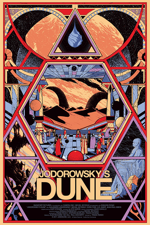
Mondo’s sheet (illustrated by Kilian Eng) for Jodorowsky’s Dune (limited March 7) is not one of these. No, its elaborately constructed, geometrically compartmentalized design is drawn to look like storyboards you’ll probably be seeing in the film. There are sandworms, a gaudy wardrobe, space, and statues to whet your appetite for the marvels of one of cinema’s forgotten projects about to be digested. This is how such a project should be represented, but a couple other iterations had to be made before acquiring the following to do so.
First up is the festival illustration of the aforementioned storyboards being lost in the sands on Dune—a comic strip cartoon that sadly doesn’t do the content enough justice. On the flipside is Cardinal Communications USA’s packet of materials clipped together and floating in space that does way too much. There’s a ton of quotes, a Star Wars crawl, and cropped photos hidden by a rendering of a space ship surely to have been used in Jodorowsky’s unmade adaptation. It does give you a glimpse of actual material, but it isn’t as eye-catching as Eng’s.
Looking at the poster P+A put together for Jason Bateman’s directorial debut Bad Words (open March 14) small may have you thinking, “What’s this guy talking about photos not being used as photos should?” Well, you definitely have to click on it to see an enlarged version to witness the gorgeous moiré pattern that’s been enlarged above the image it forms. I love the bare-bones, pop art aesthetic it gives off as well as its feeling of being a copy (since the pattern is generally found when scanning a printed image without any descreening filters to blur it).
It fits the movie nicely, giving us this down and dirty shot of a man about to let loose with the f-word on one of his many tirades throughout. He is a coarse character with a grudge and until the film’s end uncovers his motives he must remain so. Not even little Rohan Chand can polish those dots into a smooth image of dignity.
 |
 |
 |
 |
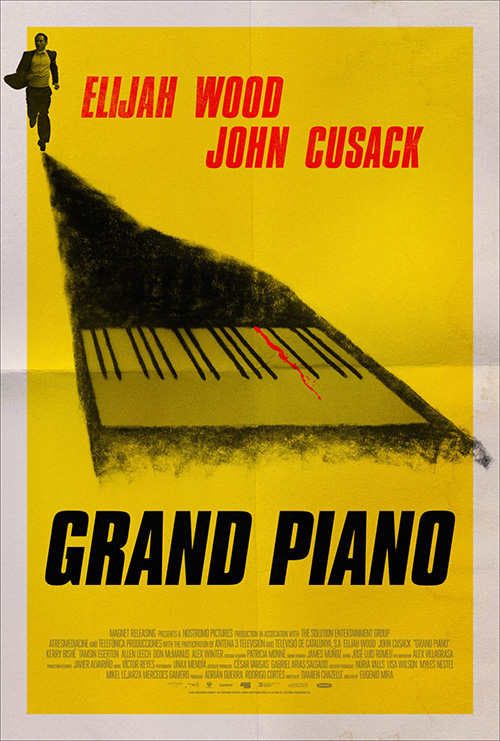
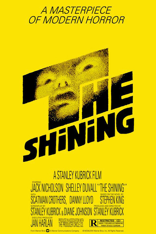
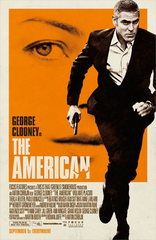
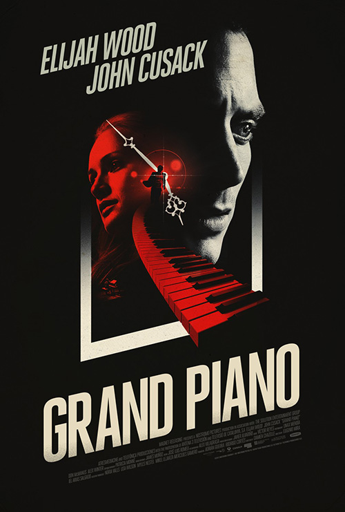
The Refinery looks to play on the themes of their client Grand Piano (limited March 7) as well by going retro with what reminds me of Saul Bass’ unsettling advert for The Shining. It has an old school vibe with that wide border, the tall bold types, and a charcoal drawing allowing its roughness to shine. Tiny little Elijah Wood at the top may be too pristine a photo to truly complement everything else happening, but it’s a small detail on an otherwise unique piece. It’s a nice sibling to P+A/Mojo’s The American.
The firm wasn’t done with that, though, as they also give us an even more stunning collage of piano keys, actors, and time in a spiral falling through the depths of itself at the center of the page. The use of red is just the right hue to pop against the black and the high-contrast shadows cast a mysterious look at the psychological suspense. This film must be huge on inspiration because the Spanish sheet by ImageMassive is just as foreboding and minimalist. I love the piano motif usurping the title’s font.
 |
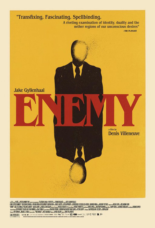
It’s another film, however, that wins the month for me that goes by the name of Enemy (limited March 14). A24 has become the studio to watch hot-on-the-heels of Annapurna Pictures and they’ve found a brilliant stable of artists to create iconic imagery. This illustrative version with blank faces fading into the yellow is straight up weird in an old hardcover book from my elementary school library kind of way that fascinates the hell out of me. Even the red of the name intrigues considering it isn’t bright enough to pop, but surely done so intentionally.
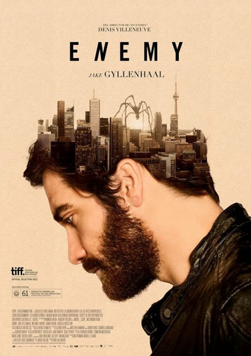
And it might only be the second best poster for the movie once you look at the international sheet with Jake Gyllenhaal’s head becoming a cityscape traversed by a giant monster spider. What? It may be spoilery as a result, but the imagery is too good to hide.
Focus on me
 |
 |
 |
 |
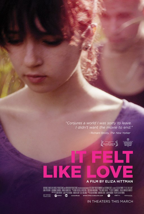 |
The designer on It Felt Like Love (limited March 21) decided to go right for the emotional drama by zooming into the person feeling it. It’s a captivating crop that draws you straight into the actress’ eye looking slightly off the page. You can relate to the sense of shy embarrassment as she sneaks a peek over at the object of her affection, seeing without necessarily being seen. And you know that if eyes lock she’ll be turning her head back sharply to pretend she wasn’t looking at all.
The white text is nicely juxtaposed against the blurred, non-descript background as the one true highlight besides the glare of her nose. It’s so much better than the film’s other poster trying to get away with pink atop too many different hues. One could see this as the precursor before distilling the scene of girl and boy into the secretive glance binding them so our focus can be on her affection and nothing else.
 |
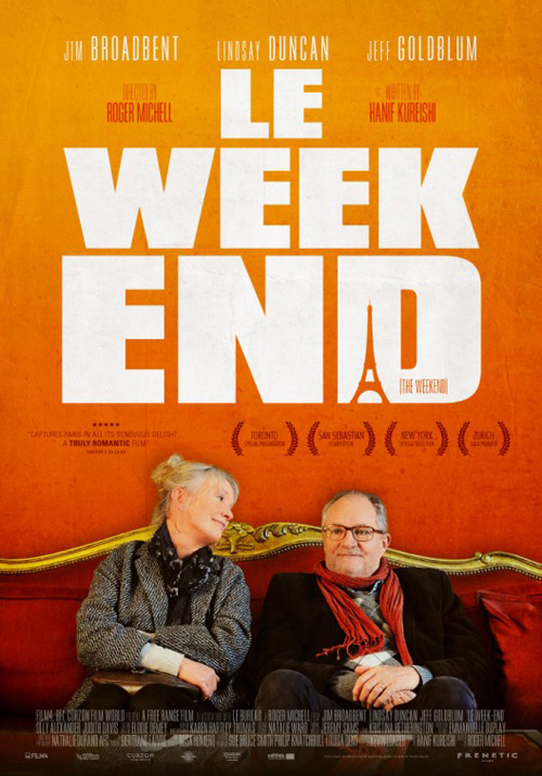 |
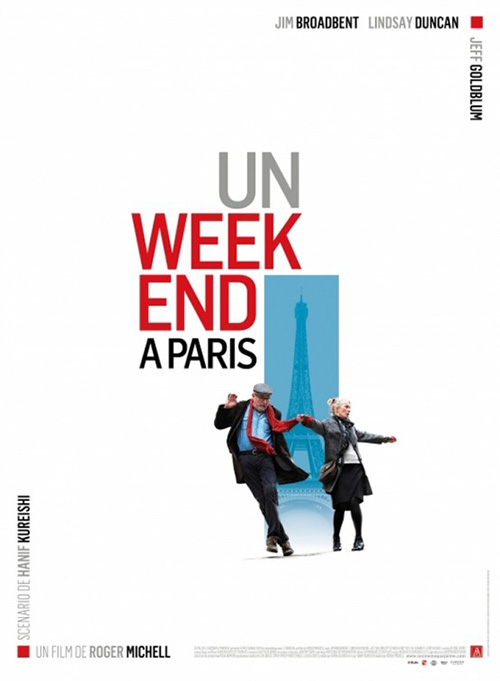
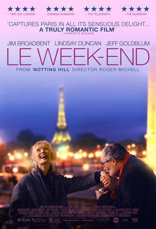
For Roger Michell‘s Le Week-End (limited March 14), there is even less confusion as to what we should give our attention. A minimalist scene of Jim Broadbent and Lindsay Duncan in a frivolous dance against a graphic representation of the Eiffel Tower contains a startling amount of movement for being two cutout images laid atop one another. The French language title—longer and more obvious considering the original’s lack of translation actually helped share its setting with an English audience where it wouldn’t with native speakers—is broken up to balance the actors and not simple float away into the white canvas.
It’s a lovely image that does so much more than its photo-heavy counterparts either putting us in the Paris skyline or at least on an ornate sofa to declare they’ve arrived. The scene of Broadbent kissing Duncan’s hand does thankfully retain the playful laughter of the French one, though, something the over-powering text and oppressive orange fails to do in the other. Less is most definitely more when you can ensure an audience sees exactly what you want.
This is the rule that The Einstein Couple uses for their abstract interpretation of sex in Nymphomaniac: Volume I (limited March 21), stripping down the orgasmic faces of an earlier series for the complete story to its piercingly painful desire and/or aftermath of abuse. Just having the name set in close proximity with a fishing lure conjures nightmarish thoughts; the tag “Forget About Love” making you wonder if some sadistic character may in fact use such a tool to torture and/or arouse his subject. And centering it directly under the vaginal parentheses of the title only makes me squirm to think about someone yanking the line up, catching its mark on the way.
 |
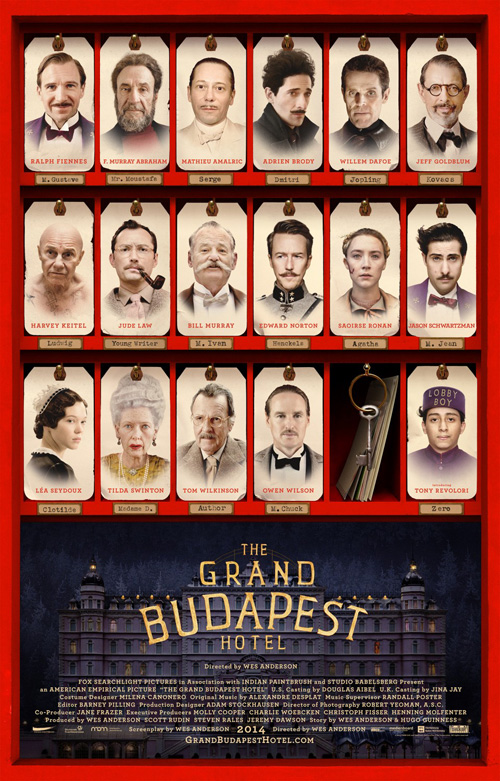 |
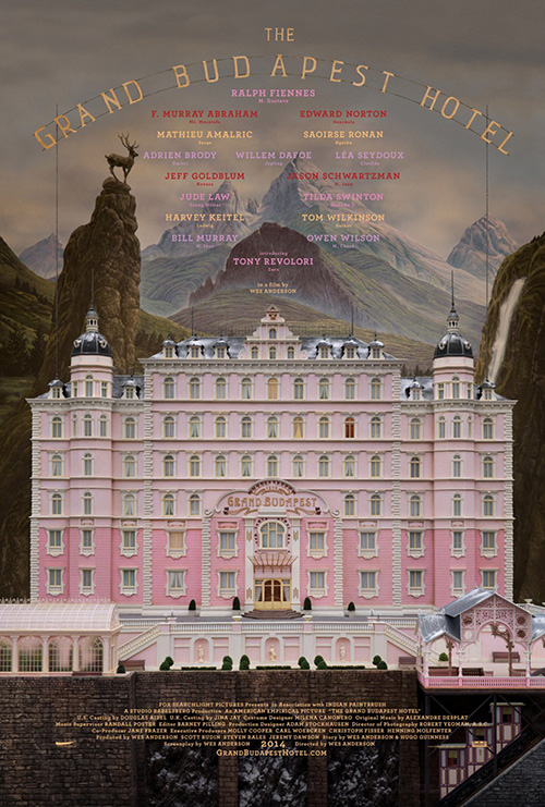
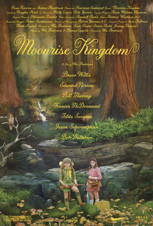
Last but certainly not least is The Grand Budapest Hotel (limited March 7) and its desire to elicit a more playful, comic atmosphere than anything made by Lars von Trier would. Is it a small-scale model? A painting? A combination of both? Whatever medium is used to construct this grandiose hotel, you know it is for a Wes Anderson film without reading any of the names present. It’s blatant artifice is a trademark of his marketing campaigns and a direct cousin to those P+A crafted for his last work, Moonrise Kingdom.
The second design tries to maintain the same feel but in my mind fails thanks to the myriad actors it attempts to introduce. Besides newcomer Tony Revolori, we know what faces go with the names the first poster provides; we don’t need to see them in their goofy outfits, especially in such a stale, static way as this. I give credit to keeping it flavored “hotel”—making each portrait a key tag is inspired—but it’s simply too much unnecessary information.
What is your favorite March release poster? What could have used a rework?

