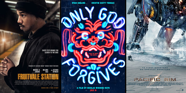
“Don’t Judge a Book by Its Cover” is a proverb whose simple existence proves the fact impressionable souls will do so without fail. This monthly column focuses on the film industry’s willingness to capitalize on this truth, releasing one-sheets to serve as not representations of what audiences are to expect, but as propaganda to fill seats. Oftentimes they fail miserably.
—
Welcome to the heart of the summer folks—where giant robots, faux Native Americans, retired CIA operators, and mutants come out to play. It’s a tough time of year for true creativity when most tent poles are bombastic sequels or remakes, but a couple intriguing morsels do sneak through.
There is one plus on the print medium side this month, however, and that’s the surprise effectiveness of a couple campaigns for two of the month’s biggest releases. I was ready to crown the design firm behind one of my favorites of the year thus far—Violet & Daisy—the easy July victor until I found myself unable to ignore one of the big boys too. But I’ll get to that at the end.
Sequels—young and old
 |
 |
 |
 |
 |
 |
 |
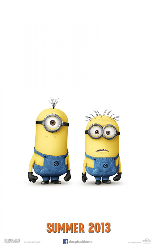
In a month packed with sequels, it was those little minions from Despicable Me 2 (open July 3) that I anticipated the most. After the brilliant 3D teaser singing The Beach Boys’ “Barbara Ann” by putting “banana” and “potato” to melody while one blows his party favor kazoo at the audience, I’ll admit I really couldn’t have cared less about Gru and the girls. Just the thought of hearing those yellow things giggle again had me ready to buy a ticket.
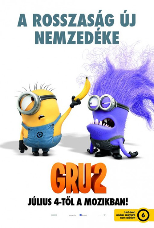
The Cimarron Group knew what we craved and made sure to just put Gru’s trusted duo on a stark white background with the only reference to the film’s title lying in the Facebook link at its bottom. I like the foreign tease’s inclusion of a serum-infected guy too, but simpler may be better—stick with what the audience already knows.
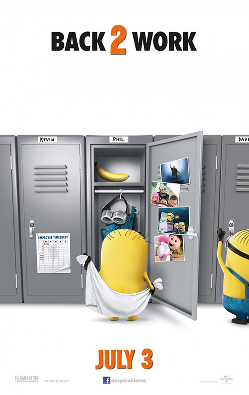
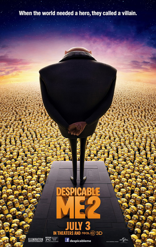
Ignition Print tries to do the same with a bit more scenery inside the minions’ locker room, but there’s too much happening for it to be minimalistic and too little for it to be illustrative. The studio does better with the main poster and its thousands of workers—the only problem being that it makes Gru out to look more nefarious than we know he is.
 |
 |
 |
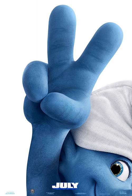
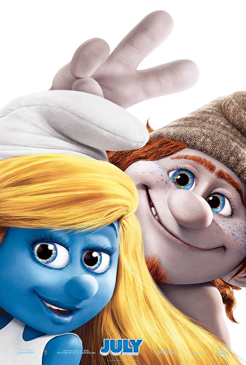
For Smurfs 2 (open July 31), Pulse Advertising looks to stay equal to the task by also sticking with an iconic character devoid of superfluity. He’s a smurf and he’s holding up the universal sign for “two”—there’s your advert. Nothing more is needed until the marketing team’s bottom-line requires them to ask for some Smurfette.
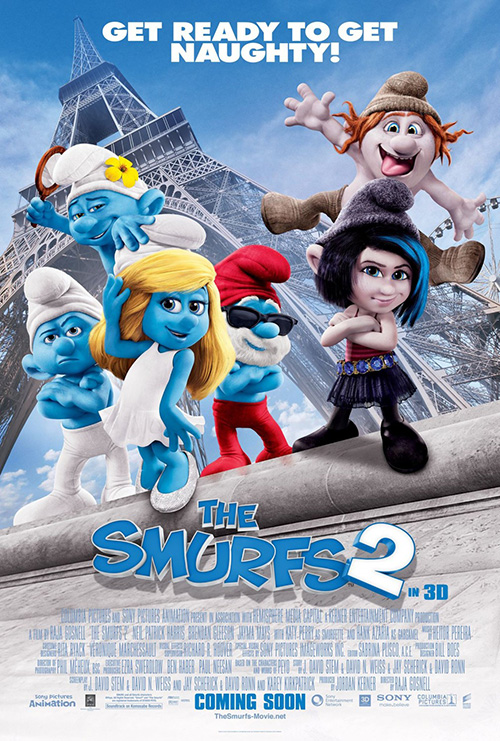
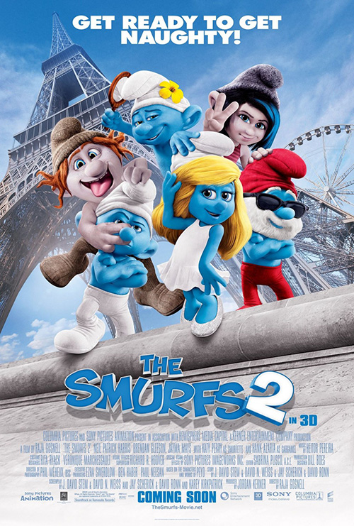
And I don’t necessarily mind her sheet with one of the new Care Bear Cousins-esque offshoots that appear integral to the plot, but that doesn’t mean it’s needed. At least it’s better than the Paris-set poses of too many characters doing stupidly goofy things. I can’t get enough of toggling between two almost identical designs to find their slight variations, though, so they are good for that.
 |
 |
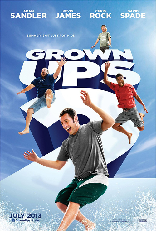 |
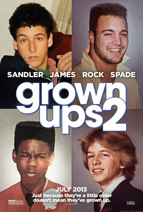
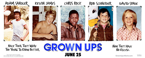
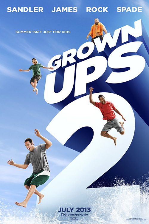
Sequels aren’t all for the kids, though—some are for no one. This brings us to ARSONAL’s poster for Grown Ups 2 (open July 12). It’s a fun concept that expands on the firm’s original idea of taking the actors’ actual childhood photos and showing them to the world. The difference now is that the images are from high school and Rob Schneider is either no longer their friend or died in the first (I don’t know, never saw it).
Where that sheet excels in concept, however, it’s no surprise the studio would request something lamer. The culprit here is Bemis Balkind and their desire to show how Photoshop needs no perspective. If you’re going to switch from three-quarters to straight on, try not to use the same exact images. Or better yet, don’t do it at all.
 |
 |
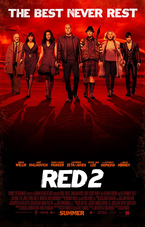 |
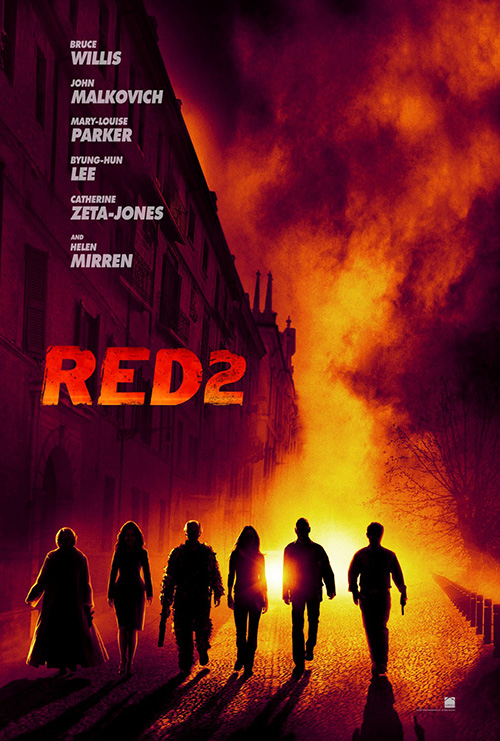
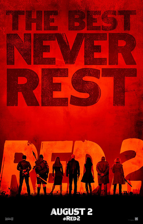
But if you have no kids and consider yourself mildly intelligent, the wide release sequel for you this month is Red 2 (open July 19). I’m not sure who designed my favorite of this bunch, but I really like the comic book look taking the product back to its roots. The silhouettes are easily identifiable if you’re familiar with the first film and the cast list above, the colors add heat of the flames, and the wide expanse of white space top right makes sure we stick to the architecture’s diagonal bisecting of the page and content below.
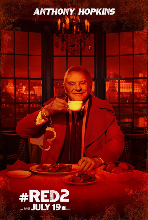
BLT Communications, LLC does a decent job as well by putting everyone’s backs to us while text dominates their space—and even their character sheets add some nice humor too. It’s just a shame their latest is so ugly with way too smooth skin on a group of actors’ faces pushing 60+ and their blatant collaging to save time from actually taking a photo of them all together is as shameless as ever.
Once again the teases always shine brightest.
Why so violent?
 |
 |
 |
 |
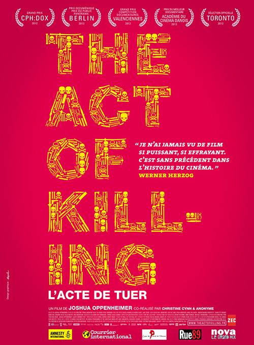 |
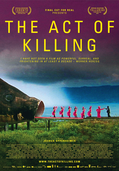
What is there to say about this sheet for The Act of Killing (limited July 19) other than head-scratching wonderment at what it could all mean? Dancing girls exiting the mouth of a giant fish at a harbor to meet a black suited man in a top hat? I know it’s most likely a film still, but one can’t help wonder what other crazy things are happening if this is the image chosen to represent the entire film.
The yellow sans serif text pops nicely off the grainy, almost VHS quality image; the bright pink of the girls steal your eyes’ attention; and the foreboding clouds can’t help but beat the weird juxtaposition of darkness and frivolity. Aurélie Huet’s French iteration is all about the actual murder with its yellow skulls and weaponry, but besides its unabashed use of a hyphen to split “Killing” doesn’t captivate like that fish.
I will say I’m going to take Werner Herzog’s one-line review to heart and file this as a piece to see.
 |
 |
 |
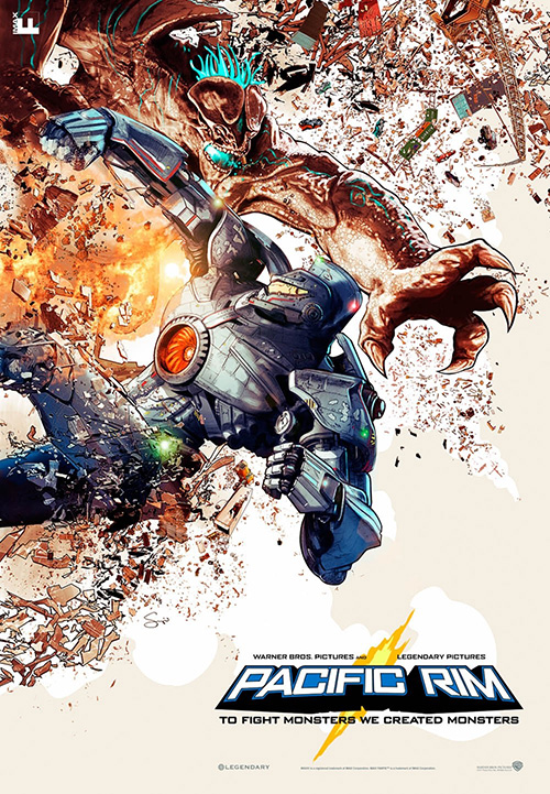 |
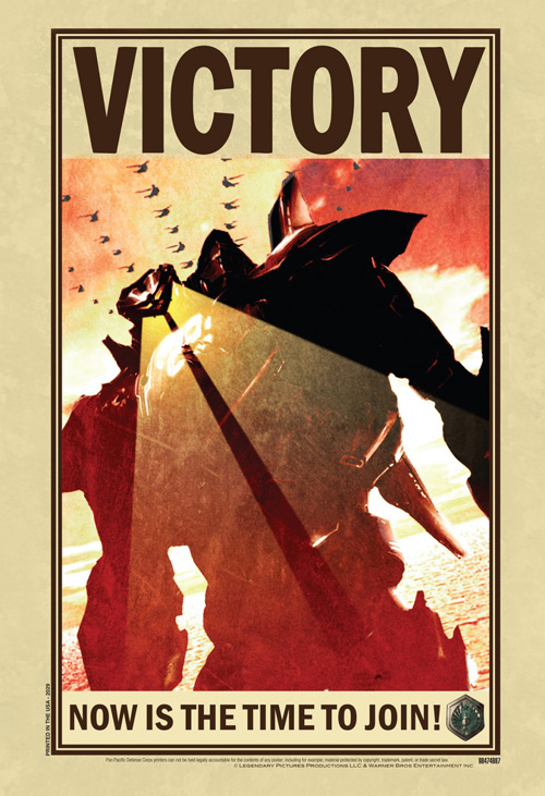
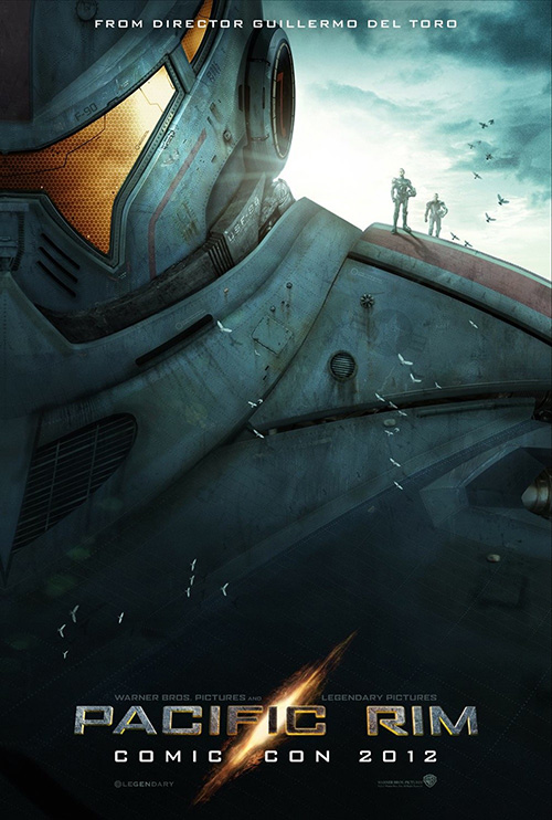
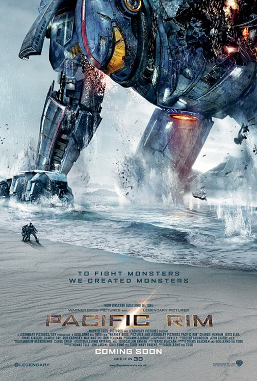
For actual depictions of violence, however, look no further than Guillermo Del Toro’s newest foray into monsters, Pacific Rim (open July 12). With an uncredited retro war enlistment sheet leading the way, Art Machine, A Trailer Park Company follows with a slew of Transformers lookalikes.
With tiny details like “Printed in the USA • 2029” at its side and the clunky fonts chosen for utility rather than attractiveness, this recruitment imagery is exactly what you’d expect from the war machine. We have the good guys’ crest at bottom right, a fleet of helicopters overhead, and some sort of laser beam action emanating from the giant metallic beast’s eyes—something I don’t remember seeing in trailers yet.
Art Machine then delivers multiple versions of what we can assume are movie graphics showing little but the scale on display in terms of the robots and their tiny controllers. They’re all cartoony without trying to be so—going so far as character sheets that feel like an international Rock ‘Em Sock ‘Em tournament. This is probably why Sergio Grisanti’s IMAX works so well going straight to animation in a fun bit of anime destruction with a great alternate rendering of the logo’s glowing rift.
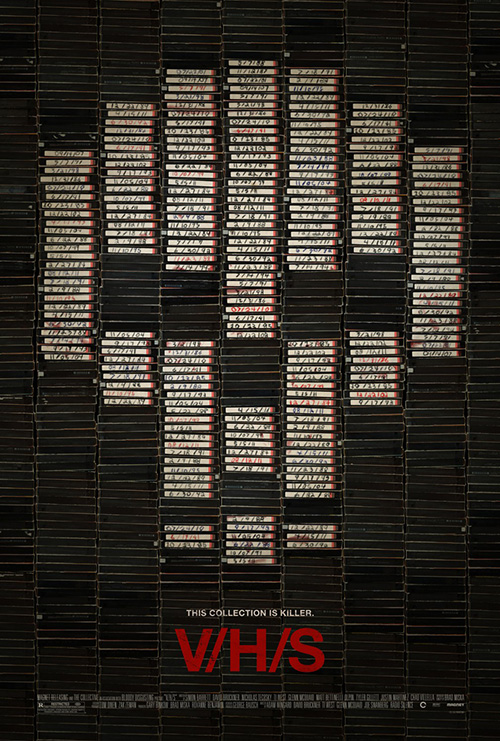 |
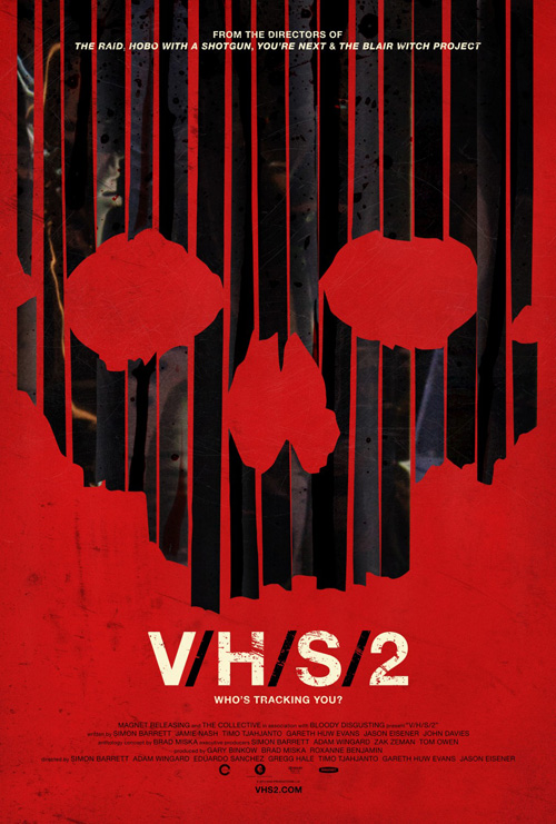
On the actual horror side of things—because, let’s face it, those Godzilla things in Pacific Rim are horror unto themselves—comes Gravillis Inc.’s update of their V/H/S design for the aptly named V/H/S/2 (limited July 12). Like the original’s use of videotapes aligned on their collector’s shelf with white labels to form a skull, this time around sees the insides unwound and hanging like meat in a butcher’s shop.
It’s not as effective, but I do like the fact Gravillis stayed true to the conceptual idea in order to keep a cohesive connection alive. The “/” between each letter is annoying—especially if you’re trying to search through IMPAwards.com—but that’s not their fault. I will give them credit for the inspired tagline, though: “Who’s tracking you?” I desperately hope the idea of “tracking” on a VHS tape wasn’t lost on the writer who thought that one up.
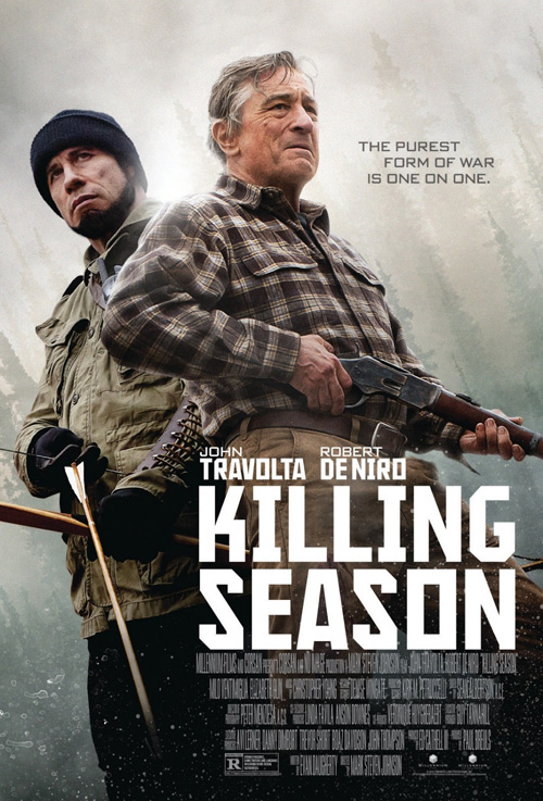
And that leaves us with Killing Season (limited July 12) as far as the violence goes. In all honesty, I can’t really say much about the poster because I can’t stop laughing at the markered beard of dirt under John Travolta’s chin …
So, the title font uses some kind of Constructivist aesthetic, Travolta and Robert De Niro not facing each other makes me think they’re going “one on one” against some unseen force (so two on one?), and … nope. Sorry. Just saw that facial hair again.
Old School versus New School
 |
 |
 |
 |
Just like the music topping college radio this past decade, designers have found it fruitful to repackage old appearances under a new hipster guise too. And I’ll admit to being okay with it—when done right, of course.
 |
A good example comes with Computer Chess (limited July 17). It’s original sheet before winning its Alfred P. Sloan Prize at Sundance tried to get the aesthetic down but obviously wasn’t crafted by someone with the necessary capabilities to go full bore. Its flat and simple components are slapped together with an old computer font at the bottom and generic lined choice for its title. It’s a decent attempt overshadowed by its potential realized in what followed.
In readying for a theatrical release, the idea gets pushed further with an off-white, crumpled and creased page that adds the kind of muted earth tones one would see on the box art of an old Atari game. The title font is über hipster with an 80s vibe and the piece really does look like it could be an unearthed gem from a bygone era. And what is the thing that makes it look authentic? The subtle, textured coloring of an aged piece of paper.
 |
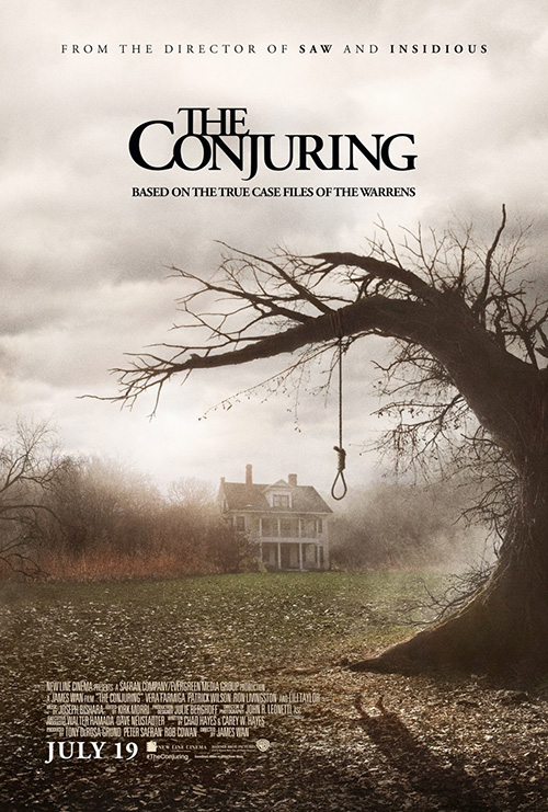 |
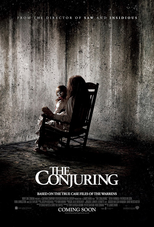
Ignition knows this and uses it to their advantage on The Conjuring (open July 19). There is an ethereal quality to its image of Lili Taylor that’s only augmented by the crop and washed out saturation. You sense the fear in her eyes and follow them up to the flame of her match beautifully licking up the “I” to consume it.
While such a tonally sound piece, Ignition ends up stripping away the suspense for cheap scares at what I’ll assume was the behest of the studio. A girl in a rocking chair holding a creepy doll—it is a James Wan film after all—and an atmospheric noose wrapped gnarled tree with its victim’s shadow still visible on the ground below? Whatever.
At least the firm decided to keep the stunningly gorgeous logotype throughout, though. I love the extremely close kerning and leading that bleeds the letters together mentally if they aren’t already physically.
But just as we love The Killers redux of New Wave, so too do we like the rousing originality of a Radiohead forever altering its style. A little freshness is nice and while nothing is actually “fresh”, it’s still a pleasure to pretend it is solely from the fact everything else isn’t the same.
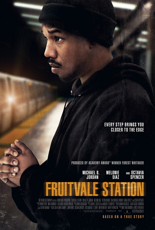 |
I see this in Gravillis’ Fruitvale Station (limited July 12) in that it uses what could be a Phtotoshop filter, but not the one we’re used to seeing. Its darkened, cool colors are brushed with a melancholy that seeps into the faux canvas texture so that the white text and bright red title can be seen in its shadows. The washed out fields of light blue elude to a rain-streaked expanse and the stolen look from Michael B. Jordan gives a lingering love for whom I assume to be his sister.
It’s a far cry more creative than the firm’s alternate take with Jordan shown in actual photography, pensive as he awaits the coming train. All the character and creativity of the first disappears into mainstream tropes as the motion-blurred title provides unnecessary attention whereas its red counterpart simply was.
For a true look at the industry hipster, however, you don’t have to go into artistic endeavors or vintage appeal. No, you just need to give an inventive designer a crazy concept and let the content to the work.
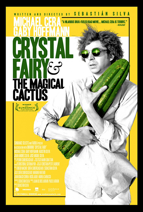 |
This is what happened with Crystal Fairy (limited July 12) and its use of Michael Cera doing his best Hunter S. Thompson with a “magical” cactus. There’s starkly contrasted black and white imagery with yellow highlights and the plant’s normal green to go along with Cera’s multiple stages of emotional turmoil and paranoia for a smile-inducing WTF reaction.
cold open attempts to take all this in a more regimented direction with thick black borders and a more mainstream approach, but there is definitely something missing. For an image so oddly extreme as this, the freedom from constraints that the white bleed adds helps our eye travel the work organically. Once you begin to cage that natural desire to investigate and explore you’re only left with a scary image of an unkempt weirdo rather than the off-kilter humor from before.
Header
 |
 |
 |
 |
Our Runner-Up: BLT Communications, LLC
Congrats to BLT for finding a bit of artistic flair in order to treat two films that could have gotten away with lackluster effort some intrigue.
 |
 |
To clarify, enjoying their sheet for The Lone Ranger (open July 3rd) does not mean I’m endorsing the film. While it may be amazing—I haven’t seen it yet—I’m not holding my breath. Instead I’m simply throwing some appreciation behind the tease’s effective use of texture, creativity, and simplicity.
Yes, it would be easy to say this design looks like a bird took a crap on a tree, but that would be unwarranted. Whatever reservations you might have for Johnny Depp’s borderline (?) racist portrayal of Tonto, the desire to play up such motifs is welcome. I like the paintbrush streaks forming a feathered wing at the left and the way the white and black paint build the contours of the eyes.
Honestly, though, what really struck me as beautiful are the cracks in the bark showing through the paint. The character sheets mimic the look and texture too; the film still main poster gets a bit of filtering on the edges; and the scrawled text carries through all.
 |
 |
 |
 |
 |
Whereas that campaign is good, the one for The Wolverine (open July 26) is stunning. Taking the knowledge of the film’s setting being Japan, BLT went crazy by creating a series of ink on paper style silhouettes of the main cast. Hugh Jackman’s rendering is of course the best of the bunch with those blades rising from his chest, but the subtle use of color in the rest is equally appealing.
 |
 |
 |
There is no need for a title—especially after the titular drawing arrived so early to cement the concept in theatergoers’ minds—but it would be amazing to learn the small, red wood block stamp is Japanese for Wolverine.
Art Machine, A Trailer Park Company gave an interesting entry with Logan Tebowing in the rain, but to see their other one of a Photoshopped Jackman showing his neck veins disappoints. And while another ninja iteration is cool in concept, the cartoonish delineations between dark and light make it way too fake.
No, the ink wash literati paintings are inspired and need no embellishment.
First Place: Gravillis Inc.
After excelling with their darkly saturated sheet for Violet & Daisy, Gravillis continues their ascent to the top rung of poster design.
Like the aforementioned sheet’s ability to make a photograph seem painterly, their work on Blackfish (limited July 19) is gorgeous. The sparse black and white of the Orca gives us all the intrigue we need as the light grey text draws our eye down to the credits.
The grainy texture removes any remnants of what was probably a shot taken with a digital camera as the whale’s pose eludes to motion on its turn. It’s a breathtaking image of an attractive beast. And there’s just enough of a foreboding quality to let us understand and respect it’s strength—after all, this specific creature has already killed before.
That said, Gravillis’ best—and this should be no surprise to anyone who has seen it—is the captivating tease for Only God Forgives (limited July 19). It’s amazing if someone manufactured its neon bulb glow, even more astounding if the firm created a real version of the light fixture solely for this design, and not too disappointing if I were to discover this exact piece exists inside the film. Even if the devil face is onscreen, the rendering of the title in a matching aesthetic is wonderful.
 |
 |
It literally speaks for itself with the only thing I might have wanted changed being to put all the text at the bottom so as not to distract at top, middle, and bottom with its contrastingly sharp edges and stark superimposition.
Mention should also be made for Ignition Print’s saturated color studies of the cast—the Kristin Scott Thomas using the neon logo while the Ryan Gosling replaces it with a simpler neon font. Yes they’re stills, but there was definitely some work done too.
In the end, though, it’s all about the glowing dragon and I wouldn’t doubt there being an Etsy shop somewhere with an artist who makes replicas to sell.
What is your favorite July release poster? What could have used a rework?

