“Don’t Judge a Book by Its Cover” is a proverb whose simple existence proves the fact impressionable souls will do so without fail. This monthly column focuses on the film industry’s willingness to capitalize on this truth, releasing one-sheets to serve as not representations of what audiences are to expect, but as propaganda to fill seats. Oftentimes they fail miserably.
2015 has started with a whimper—or at least that’s my opinion when American Sniper wins the box office two weeks in a row despite being a 2014 release. Now that January is behind us, though, some contenders are beginning to arrive. Not legitimate contenders for Oscar glory or anything, just a few with the potential of making bank.
Heck, I’m just happy that film quality of the year’s dump doldrums aside, posters don’t always have to follow suit. Sometimes they do when the studio chooses redundant material as uninspiring as the product their selling, but I’ve seen my fair share of stinkers with gorgeous marketing material attempting to polish what cannot be helped. Hopefully at least a couple of the below films can give us something to cheer for on both fronts.
The cartoon wins
 |
 |
 |
 |
 |
 |
 |
 |
 |
 |
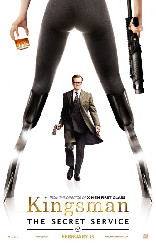
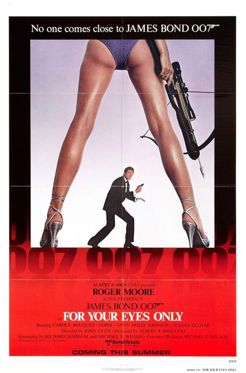
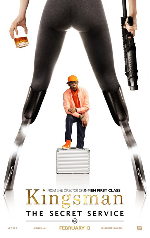
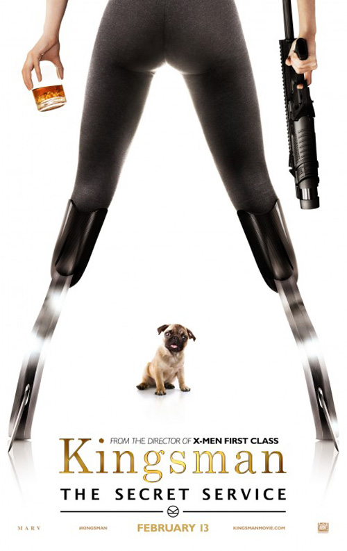
While Bill Gold surely wasn’t the first to use the ol’ between the legs poster shot on For Your Eyes Only, he definitely wasn’t the last. Generally reserved for comedies these days, it seems Ignition wanted to dust the trope off for some action espionage again on Kingsman: The Secret Service (open February 13). And why not when one of the villains is a female on blades? Making it appear like she has a stiletto accessory for them probably wasn’t necessary, though.
Ignition’s decision to use the design homage on the film’s character sheets rather than the main sheet is ill-conceived. It’s one thing to willingly make it your poster, but putting every male actor in the movie between those same legs starts to be less “fun” and a whole lot more misogynistic. Did they have to include the dog too?
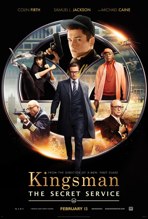
Sadly, The Refinery‘s work isn’t much better with its uninspired collage of characters in an attempt at throwing everything in our faces at once. I also don’t like the title fonts since the serif on “Kingsman” isn’t as posh as it hopes while the sans on the subtitle is generic and clunky in its excessive leading due to the “g’s” descender. But that’s not their fault—the studio seems to have regulated that one.
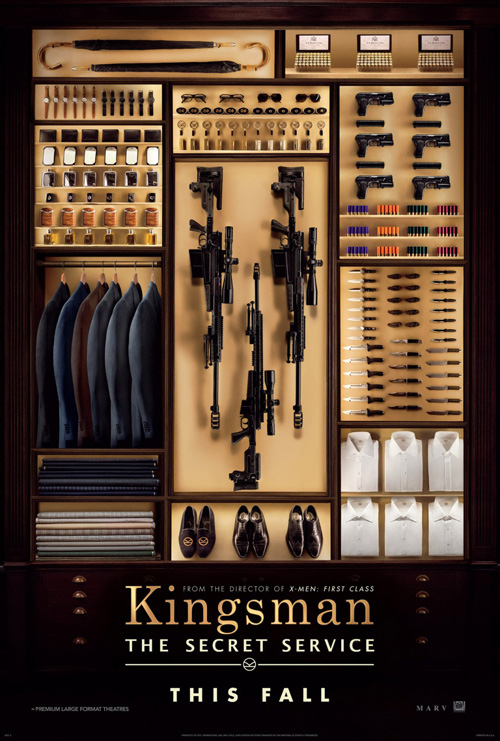
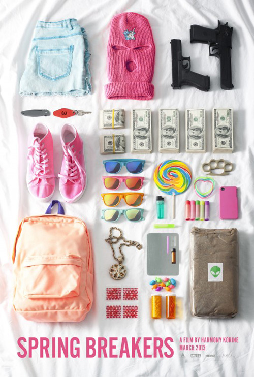
Thankfully the teaser has some appeal in its jam-packed, pristinely organized closet. It too is less than original (see Spring Breakers most recently), but at least it gets a point across with some tact.
 |
 |
 |
 |
 |
 |
 |
 |
 |
 |
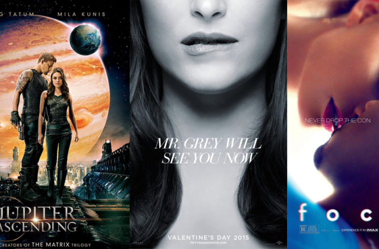
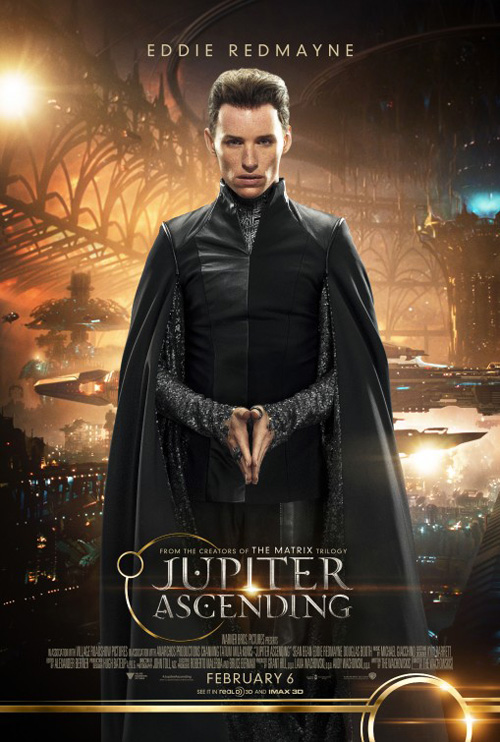
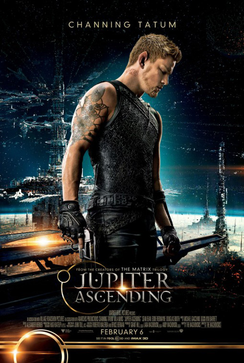
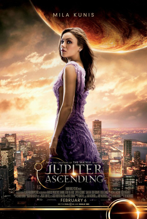
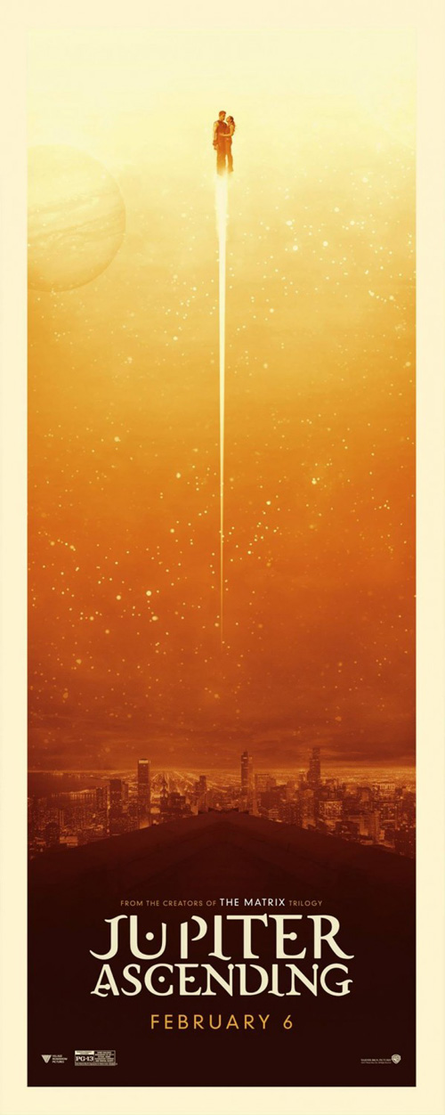
When it comes to WORKS ADV‘s art on Jupiter Ascending (open February 6), I can’t say they do much better despite the lack of legs. Their hope to intrigue with computer-generated worlds is commendable, but the poses of the stars in the foreground are more than lacking in their obvious superimposition. They do allow us to meet everyone before opening night, though, so I guess they do half of their job.
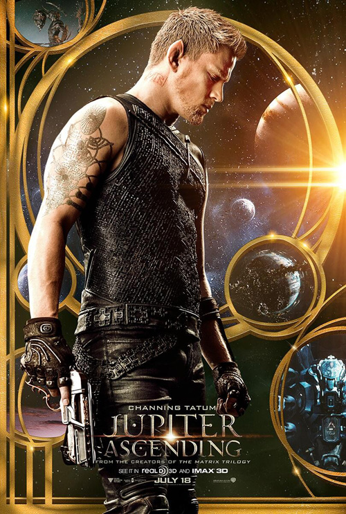
No, the character sheets I enjoyed most for this film were the ones with ornate gold work a la The Great Gatsby with planets and stars reminding me of Tom Jung‘s Dune for whatever reason. The one I show here helps prove that Channing Tatum likes his right profile (or refused to take a second photo), but it also gives us a tone our imaginations can run with rather than matte painting cut scenes. Even Art Machine, A Trailer Park Company‘s Tatum/Mila Kunis pairing is more intriguing because the background is crisp enough to look at.
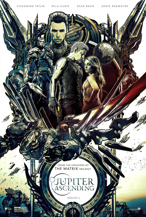
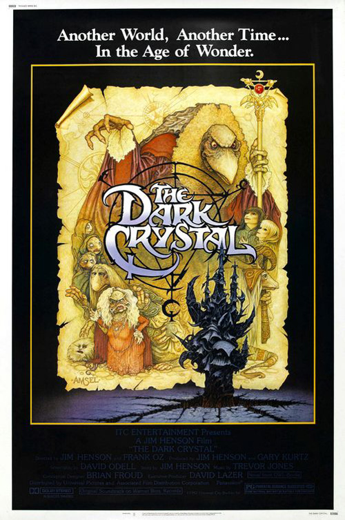
What’s coolest, though, is Art Machine traveling into the forum of alternate prints. I admire the attempt to spice things up, but the results are less than appetizing. One looks as though a Photoshop plastic wrap and cutout filter were used above a jagged composition bringing The Dark Crystal to mind. Another tries hard to homage Drew Struzan.
They do get one right: I adore the arty, Mondo-esque thin print of space dwarfing celebrity similar to J. C. Richard‘s wonderful IMAX John Carter.
 |
 |
 |
 |
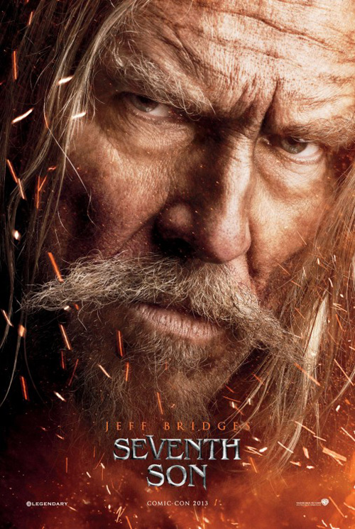
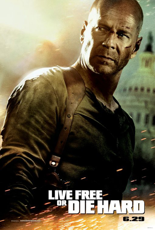
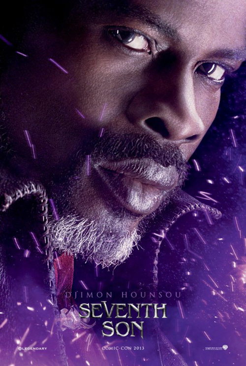
And while I don’t love Seventh Son‘s (open February 6) attempt via Ignition to repurpose BLT Communication, LLC‘s flying sparks from Live Free or Die Hard, the close cropping ensures nothing is overshadowed. All we get are faces so we can focus on the faces and not any shoddy environment work behind them.
Who knew these mugs were going to be the only thing we’d receive from the movie for two years? Little more than placeholders to tell us a film was made, the journey forward was an arduous one that culminated in a sad excuse for poster excitement. Not only does Ben Barnes look like he’s posing for a cosplay website, but the dragon appears just as flat and uninteresting.
I can’t help wondering what cool things could have been done with that red moon in the distance playing a dominant role.
|
|||
|
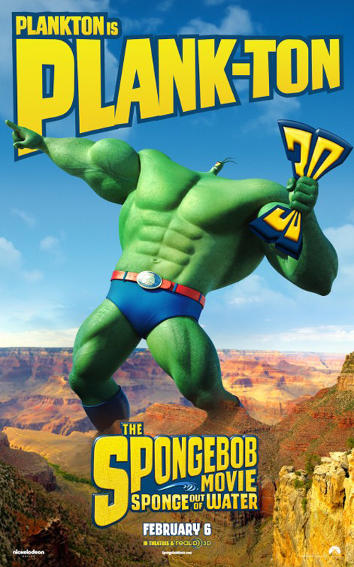
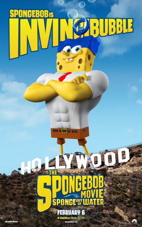
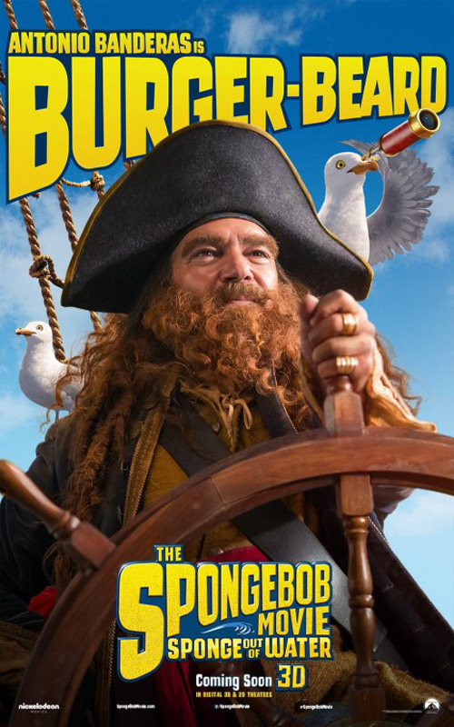
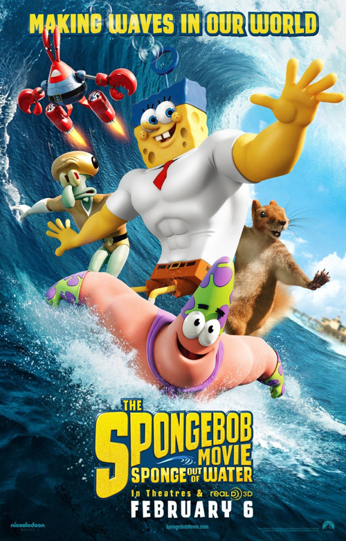
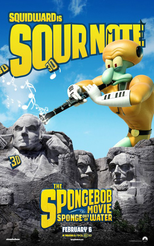
So, in the competition of character sheets, February 2015: the winner is The Spongebob Movie: Sponge Out of Water (opening February 6). Is it because they are amazing? No. Inventive? Meh. I think they win by default simply because they’re advertising a children’s film. And as we all know, family friendly fare is the only fare where character sheets are valid. The kids want to see their faves on movie theater walls.
The work of BLT, they are kind of fun too. I like George Washington plugging his ears at Squidward; I chuckled at Plankton’s small head; and how can you not laugh at Antonio Banderas‘ beard?
You can’t go wrong embracing the absurdity of the subject matter either by throwing a random squirrel into the mix on the surfing sheet (Is that Sandy Cheeks’ true form?) and going all Coppertone on us with Spongebob’s untanned bottom.
Now that’s a good year
 |
 |
 |
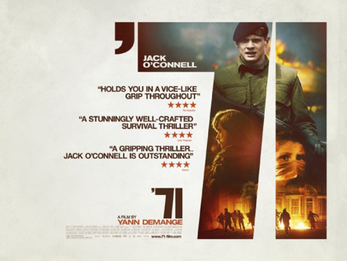
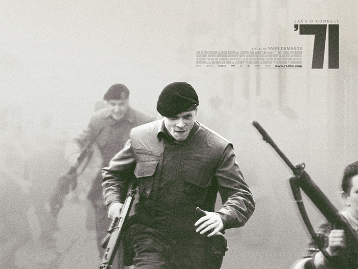
Wonderland has created two great quad sheets for ’71 (limited February 27).
The first isn’t perfect due to its not using the giant see-through title as the title, but instead placing a smaller version of the same at bottom middle. Even so, it’s a pretty cool poster in its fearlessness to keep everything outside those large numbers blank or only inhabited by text. The collage is painterly with a sense of drama and it nicely doesn’t appear as though cardboard cutouts slapped together in haste.
The second, however, is fantastic. I love the black and white, the coarse grain, and the shallow depth of field helped by smoke/fog. Jack O’Connell is sprinting forward either towards the enemy or away from them, fierce in his expression and ready for whatever fate arrives. The heavy block numbers from the first return in a dark black to contrast the gray beneath and there’s a very cool bit of double exposure on the gun at right to delight in its blemish.
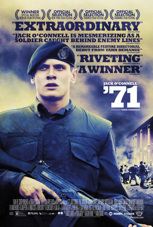
Unfortunately, Canyon Design Group couldn’t replicate the visual aesthetic with their US domestic advert. Instead it’s merely star power in the foreground, uninteresting periphery everywhere else, and obnoxious press quotes in between. Oh, and that font. Boy, oh boy. There’s something wrong about its want to be 90-degree angles yet desire to have curves too. It looks bloated and ready to pop. Making the apostrophe as big as the “7’s” top left serif doesn’t help either—it overpowers the rest by unbalancing what was already unbalanced more.
Looking a bit worse for wear
 |
 |
 |
 |
 |
 |
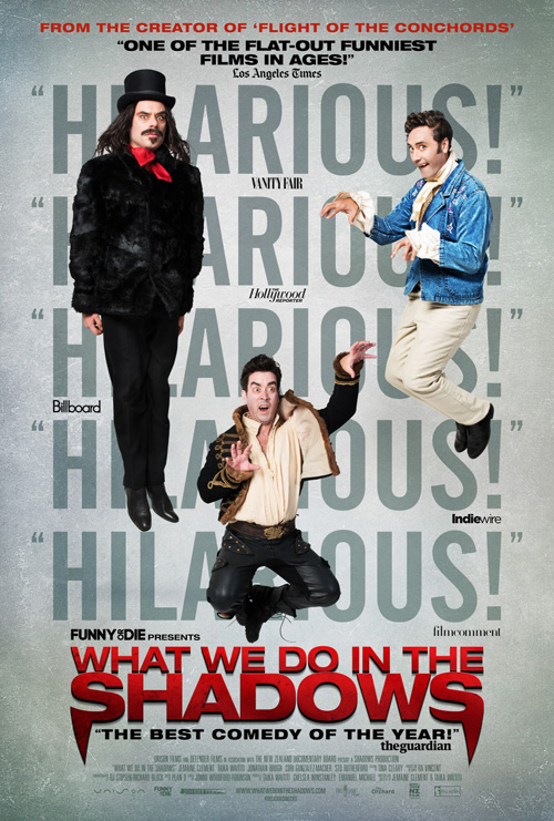 |
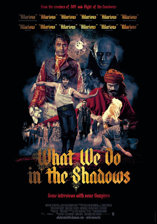
Jeremy Saunders made a couple cool, creepy posters for What We Do in the Shadows (limited February 13). I think I prefer the painterly collage with its less exacting edges seeping into the dark shadows of nightmare while the actors’ attempts at scary faces retain its inherent comedy. That is the goal after all—you don’t make every critic quote the word “Hilarious” unless it is. This maneuver in itself is funny while not being overpowering because we get the point despite the joke not taking up half the poster in lieu of what causes viewers think it.
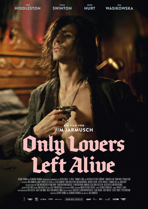
I love the gothic, angular font a la Only Lovers Left Alive too. The illuminated “W” and “S” are beautifully ornate touches.
While the quad family portrait lacks some of the other’s mood and screams “fake” with its not quite natural positioning of actors atop one another, it is still much better than what Indika Entertainment Advertising has done. I get why they did what they did because of the Funny or Die branding coveting a straight to DVD after debuting online aesthetic with a garishly generic font set, but boy does it shed all appeal. Here the myriad “Hilarious” quotes seem to be trying hard to cover-up an unfunny reality.
 |
 |
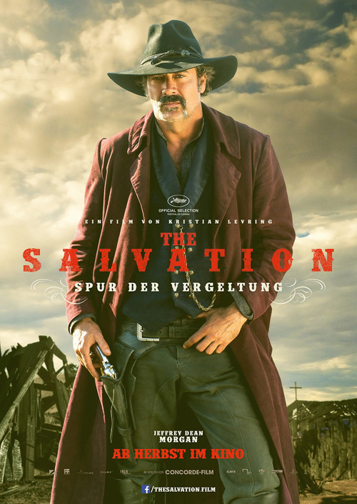 |
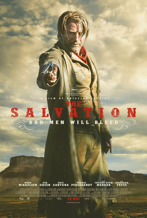
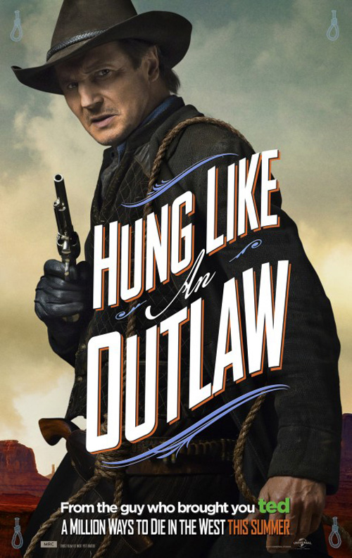
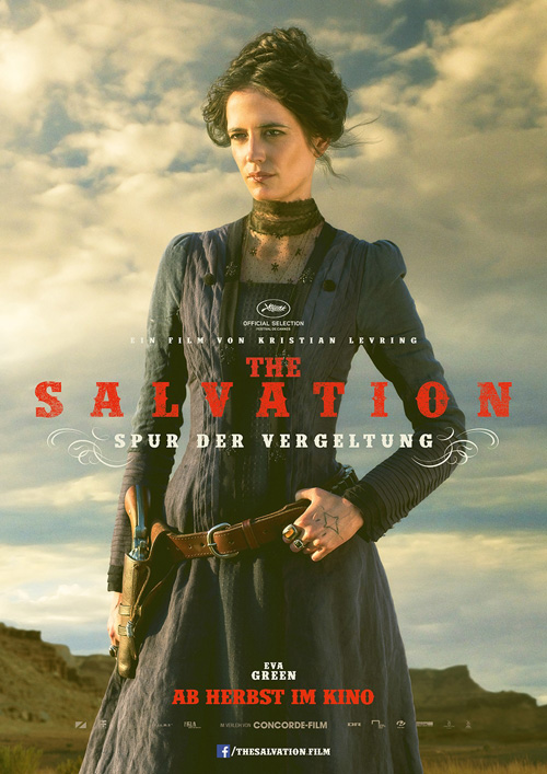
I’ve yet to find a US poster for Salvation (limited February 27), but I’m digging the German selections courtesy of Ignition. There’s a gorgeous sepia tone quality to them that epitomizes the Western genre. Making the title a distressed red both allows it to pop out above the darks and melt into the lights as though each was hand-stamped at the print shop next door to the saloon. And it’s through the flourishes bookmarking the tagline that we see the potential of the style A Million Ways to Die in the West parodied.
It’s a small thing too, but I enjoy how Ignition gives each character a different background. Yes the clouds take up a majority of the space, but the attention to detail that allows one to have plateaus and the next wooden buildings does wonders in making a redundant layout feel fresh.
 |
 |
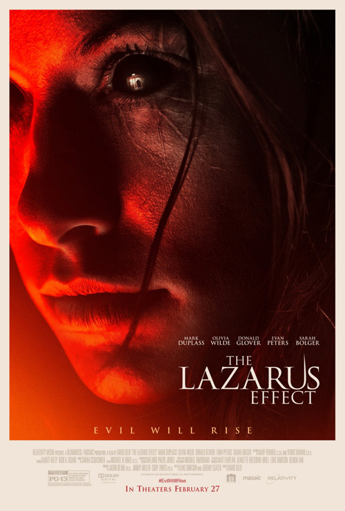
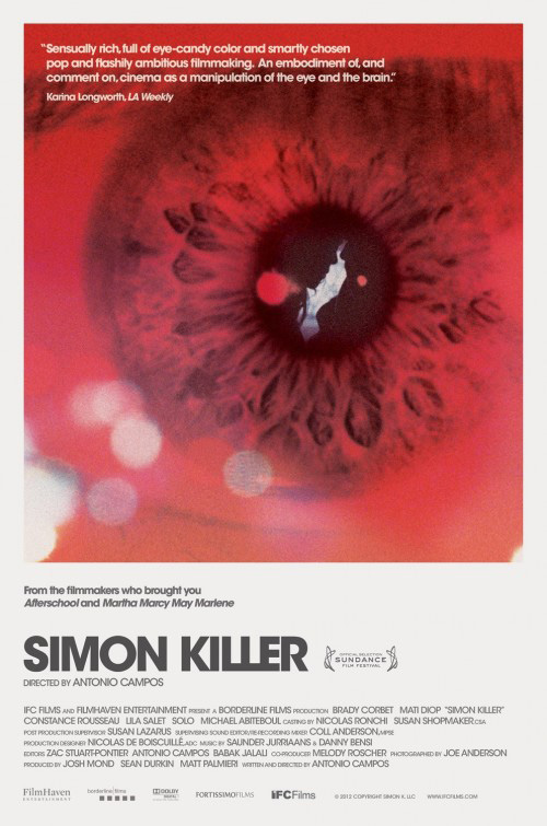
From funnily creepy to gritty, I now go to bad dreams-inducing terror with InSync + BemisBalkind utilizing a fast-growing trope in the thriller department (see Simon Killer) for their The Lazarus Effect (February 27). There’s something about the bright red permeating its anger and rage into the depths of our soul while the pitch black eyeball on Olivia Wilde gives us the shivers of demonic pleasure. To realize how much more effective it is to focus on this one attribute as opposed to showing a complete scene is harder than it looks.
It also provides us a glimpse at the reflection illuminated in the pupil’s glassy surface. Is that a soon-to-be victim? A mirror of herself slumped over and shuffling forward? There’s an eerie homage to The Exorcist at the very least with its figure underneath a lamppost. Just remove that silly spike to the right side of the “U” in the title and this is a great mainstream design.
 |
 |
 |
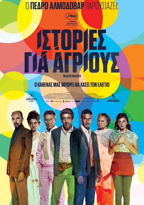 |
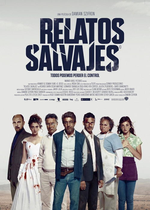
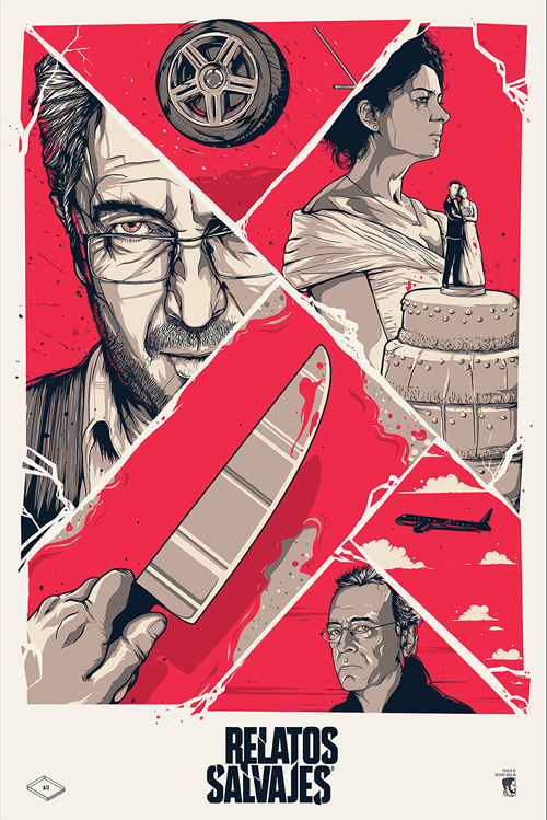
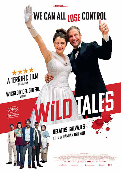
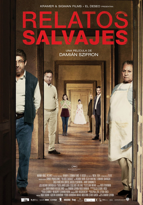
The king of genre fare this month is something else entirely, though—an Oscar nominee no less. Cannes favorite Wild Tales (limited February 20) has received a lot of love in the art sector not only with official posters, but fan art as well. I wouldn’t have thought too much about it after looking at the Spanish sheet with its line-up of battered characters, but people have run wild.
To me the best attribute is the stunning logotype painstakingly refusing to stay centered. “Relatos” shifts left at the top and “Salvajes” right at the bottom to laugh at our brains’ want for left to right reading. The scratched breaks add suspense, the scuff marks a metaphor for the bloodied faces below, and the jagged points a delicious contrast to the otherwise rounded edges.
It’s no surprise then that Berkay Daglar would retain its effect on his Mondo-esque alternate sheet. All six stories in the movie are represented by six quadrants, the duotone coloring strips it down to its base form, and the animation style calls back to the actors being frayed and unpredictable.
Of course the English-language iteration would throw it all out the window for an overtly goofy pose devoid of all intrigue. Tell me this one doesn’t look like an advert for a new BBC sitcom. Why we’d strip it of all character I do not know, especially when there are so many others that don’t.
The second Spanish poster gives us a fun house mirror optical illusion with each player introduced and the Greek version goes all-out with color overlaying color. My favorite part of the latter is that the actors themselves overlay each other too with arms visible through torsos and the background colors changing everything before our eyes.
It’s all about the face
 |
 |
 |
 |
It may not be perfect, but Random Bench‘s advert for All the Wilderness (limited February 20) is striking nonetheless. A duotone to stand out amongst the glossy photographic posters residing next to it on the wall, there’s also a neat trick happening wherein the pine trees double as quasi rips in Kodi Smit-McPhee‘s bust. This isn’t a photo merging into foliage—it’s a forest deckled frame that just happens to also be bisecting his face.
I’d have liked a little more done textually, though, maybe give the title a font comparable to the imagery rather than a bland, liberally kerned sans bold. I’d definitely like to see what it could look like with the title and actor names not spanning the entire width of the page too. You provide all that beautiful negative space in the portrait, why be so quick to distract from the effect by covering it up?
 |
 |
 |
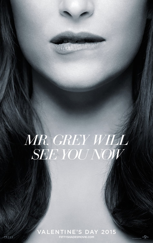
Iconisus L&Y – Visual Communication Systems‘ Fifty Shades of Grey (February 13) design isn’t flawless either, but I do like its intent. The steel gray coloring is obvious, the allusions to sexual tension as well. Maybe it could have gone a little wilder and risqué in its cropping too?
Regardless, Dakota Johnson‘s sheet is sexy in most part because we’re drawn to her bitten lip simply due to the absence of anything else. With no clothing peeking up from the bottom we can assume she’s naked, her hair dragging our eyes from her mouth down to where only our imagination can conjure what’s next. The ubiquitous nature of the source material makes a title unnecessary, and the tease is in full effect.
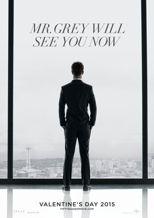
It’s a more evolved play on what Gravillis Inc. did months earlier with their behind the back shot of Christian looking upon the city. The contrast is starker here and the tension more of the mystery variety than sexual if you aren’t aware of the subject matter already. Whereas Johnson’s invites you in, this one potentially proves too cold to care.
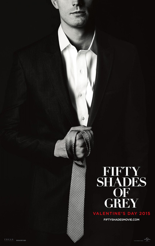
As far as Concept Arts‘ go, well perhaps it’s too dark. Death Sentence keeps popping into my head as I only see violence rather than S&M in the image. This could be the intent considering most know the subtext, but I can’t help wondering if there was a better way to do it. Perhaps you need Johnson included, a close crop of the two with sex and violence merging. This looks like a revenge thriller.
 |
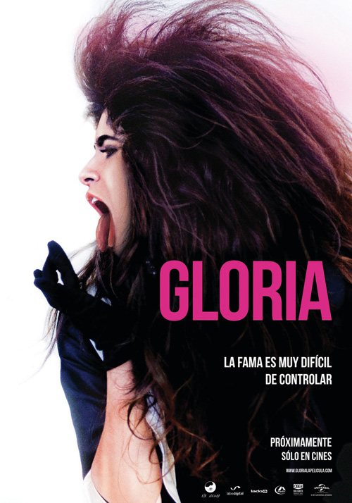
I really like what Archer Troy Publicidad did on Gloria (limited February 20), especially when compared to their second version’s gaudy excess. Where that one assaults with film stills that don’t conjure the tone besides what escapes through boring visual context, the first says much more with less.
This image is ferocious with bright white surrounding a lion’s mane of wild hair itself defining the titular subject’s profiled face in full force. The photo screams as she does, making us work for the centerpiece at the same time as it ensures her pale skin is the aspect that pops. Its hot pink title is bright enough to glow above the mass of shadow but not enough to steal all the attention. Everything is in perfect accord.
 |
 |
 |
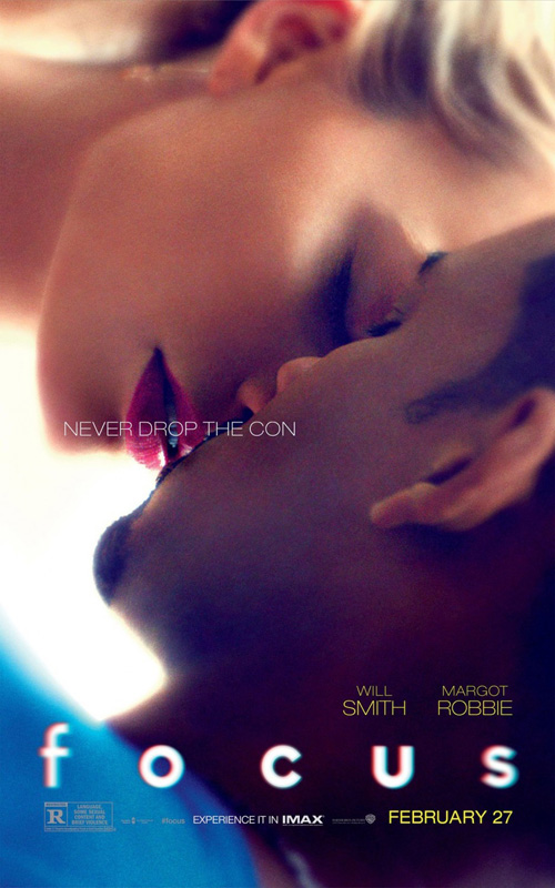
The same goes for this stunning image for Focus (February 27). It’s February’s best from the soft airbrush quality of the image’s color to the tagline covering the kiss it’s all framing to the title’s on-the-nose effect careful not to devolve into cartoon. The eye exam quality o the word could cheapen the whole—and it probably does for some—but I think it’s filtered just enough to work with the rest. After all, turn the page sideways and the edges blur to its sharper kiss in much the same pattern.
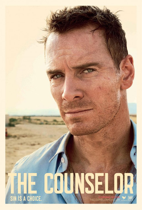
BOND‘s character sheets attempt to give us grit instead of the love drug above. Similar to The Counselor, these hyper-real resolution photos provide all the nooks and crannies of their faces in tense brood mode. They are pretty in their own right, but something about the extreme clarity fights against the title’s promise. I know that sounds odd since “focus” is clarity, but it’s in the lack thereof that causes us to truly understand its definition. It’s about keeping one thing in semi-focus when the rest isn’t. That’s what makes us remember exactly what it is you want us to see.
What is your favorite February release poster? What could have used a rework?

