It’s a busy April this year. One less Friday than last month, but the exact same number of posters to sift through. Yes, having films release the Wednesday before Easter helps add to the total, but only two titles are taking advantage: Air (April 5) and The Super Mario Bros. Movie (April 5). And with only one other wide release following them a couple days later, the numbers even out anyway.
It goes to show just how much real estate Disney demands whenever they have a new debut. Everyone else must wait for a month without one to push and shove their way onto screens while they can. Supply and demand—even if the struggle these days seems to be more about the theaters deciding which to show than audiences deciding which to see.
Portraiture


AV Print gets the weathered and worn paperback aesthetic down pat with their poster for Polite Society (limited, April 28). The little fold creases at the corners. The textured distress spider-webbing towards the center. The only thing missing is a similar sort of blemish via color degradation/fading through use or light. The image itself is perhaps too perfect to fit with the canvas’ imperfections, but it remains fun anyway.
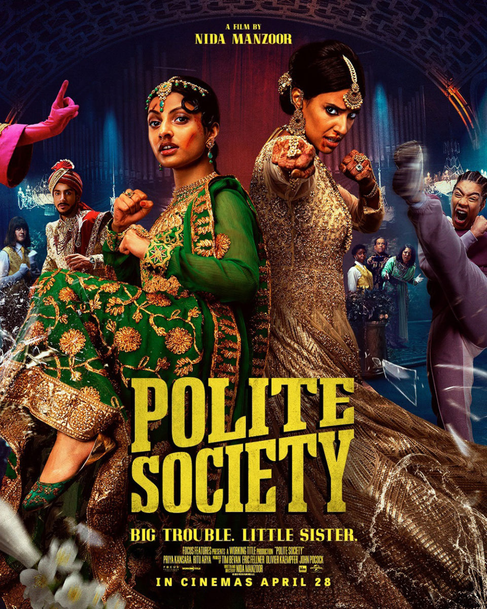
The more traditional photo-based sheet is also fun. Its typography has a lot more character than the generic sans of the above and the back-to-back positioning of the main actors allows for action to play out on the periphery as though everyone is engaged in a fight rather than cobbled together for a collage. The cut and bloodied faces are a nice touch too.
I’d love to therefore see a hybrid of the pair. A dynamic shot and title like the second put through the wringer like the first. Two women beaten and bruised who keep standing tall printed on a book that does the same.
P+A goes for a more straightforward portrait on Showing Up (limited, April 7). Here it’s all about the crop and composition to make a static shot of Michelle Williams and a collection of sculptures dynamic. It’s perfectly blocked with her head in the center, both showing physical scale and perhaps psychological/emotional turmoil being that she is in the background and surrounded/overpowered by the art. Her work is here and demanding focus, yet her attention diverts off-screen.
The image speaks for itself, so the designers do well to showcase it in a frame that keeps most of the text outside so as not to distract. The festival laurels are almost invisible as they bleed into the background and the critic quotes small and thin so that the bold publications are all that pop (you can assume the words are praise, so the prestige means more). All they must do is ensure consistent coloring so that the title sticks out from its placement rather than a forceful sensory assault and the result epitomizes technical excellence.
In many respects, that’s the same reason GrandSon’s Paint (April 7) is so effective. Its homage to JC Penney photo studio portraits is immaculate in its craft to the point where the vehicle’s relationship with the content becomes the joke rather than the format itself. Whereas Cardinal Communications USA’s Brigsby Bear earns a giggle for what it approximates, this poster earns one because it doesn’t feel like an approximation at all. We’re being transported back to a time when these were made in earnest. We laugh at Owen Wilson’s poses because his Carl Nargle isn’t trying to be funny. This is simply who he is.


That’s why the main sheet is so great. It’s not trying to operate on multiple levels like the tease (a painting of Mount Mansfield hiding Wilson’s identity to more easily allude to Bob Ross comparisons) and over-the-top candid shot (a bare-chested Wilson on a fur blanket giving the catch phrase a lot more context insofar as how it’s used in-film). The above portrait’s sincerity speaks volumes without needing extra gimmicks atop the genuine brilliance of its pure nostalgic bliss.
Filtered


There’s an intriguing wolf in sheep’s clothing aspect to the original sheet for Cadejo Blanco (limited, April 21). Karen Martínez is broken apart with a line-based halftone to allow the shadow of a dog behind her to merge with her body—the two becoming one. It makes sense since the premise of the film is her character infiltrating a gang to find her sister. There needs to be a balance between love and hate, aggression and compassion. It’s a simple image translating a complex psychological puzzle with a subtle, yet memorable title treatment marked by tiny tears in the outer edges of its letters.
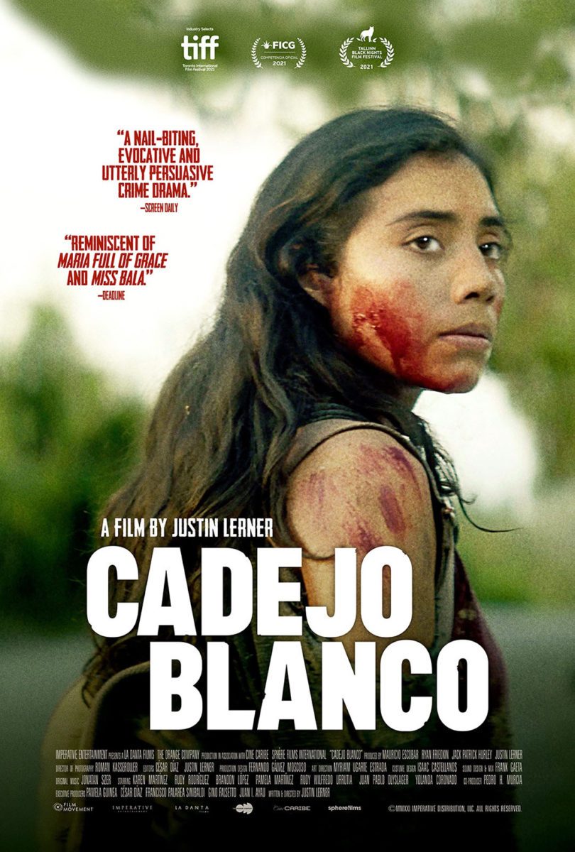
Once graphic representation changes to straight photography, though, some of that atmosphere is lost. Even the title relinquishes some of its impact due to the use of an outer glow or drop shadow making those notches too pronounced. Thankfully, it remains effective in large part because of Martínez’s determined stare. You still sense the duality of her character as the text at the top proves well integrated, but the white at bottom is so distracting that the whole feels somewhat cheap. The first looked tactile, “real.” This one feels digitally-sourced and glossy despite its grain.
One of These Days (limited, April 14) is similar in that it would have a completely different feel had the designers used a photograph instead of an illustration. The drawing helps us to see beyond the image and absorb the colors and textures instead. The bright hues give it an otherworldly sense of fantasy almost—the dream of winning this truck if only you can hang onto it the longest during a competition. It’s not therefore about the drama that ensues but the hope that goes in.
I love the rounded corners of the window frame too. Rather than just highlight the image like Showing Up, it makes the whole into a square on a film strip or slide show. We gaze and wait to hear the click as the next image arrives. And none of the text stops us from hovering because—similarly to Showing Up—it maintains balance with its color choices. It could have bombarded us with white on black like the second Cadejo Blanco, but it matches the peach of those amorphous shapes at the top left. The words become light enough to read, but muddy enough to become one with the whole.
Dry Ground Burning (limited, April 21) doesn’t have that issue due to it being a duotone. Red and white. One contrasts the other in stark ways that demand other factors to keep things smooth. Like Cadejo Blanco, this one utilizes a halftone for that purpose. Because it’s dot-based, however, it’s able to more precisely break apart its solid fields without losing clarity of understanding. Your eyes trick themselves into seeing gray where none exists, turning the face softer without denying its impactful expression.
That means the title in white draws attention without needing augmentation through shadows or size. It’s lack of dot coverage is enough to ensure it rises above the image to steal our vision while remaining small enough to never hold it longer than a blink.
Look down


While it may not be as immediate in its terror as riddertoft’s Speak No Evil, the poster for Pilgrims (limited, April 7) is just as dramatic. It’s another car in the dark, the light coming from its hood rather than that of the one looking to attack. And through that illumination we see the outline of a woman and, more importantly, the reflection of her eyes in the rearview mirror as they tensely wait to see what happens.
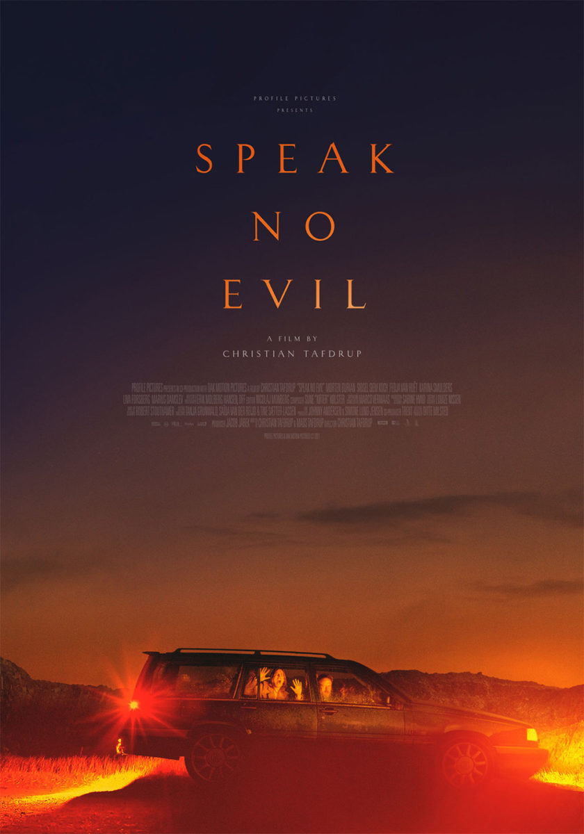
We, on the other hand, are chomping at the bit to know what’s already happened. Who is this person? Where is she? What is she looking at? There’s absolutely zero context provided and yet we can’t help ourselves from being drawn into the scene and its potential danger.
The text above is rendered secondary—its compressed sans creating lines that drift off the right side of the page just like her sight. The only break in the pattern is the title as it juts out to the left instead, the handwritten word adding a human element to the whole. It endears us to the moment and its uncertainty.
The poster for Neon’s How to Blow Up a Pipeline (limited, April 7) is similarly structured with its imagery weighing down the bottom. Unlike Pilgrims, we know what everyone is looking at: a homemade barrel bomb ready to explode. There’s a sense of urgency as a result. Will they get this massively heavy object in place without jostling it awake? Will they fulfill the mission they’ve set out to accomplish?
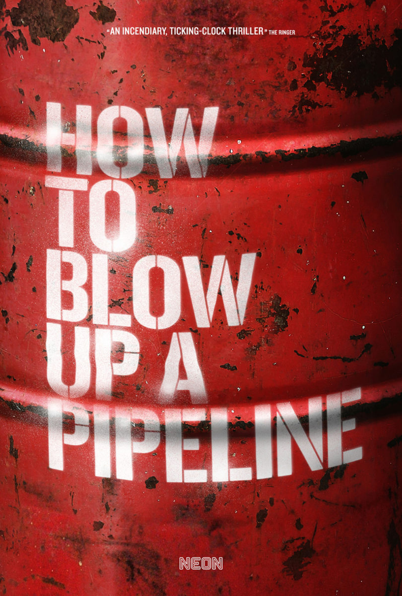
More than all that, however, is the way the whole is constructed. We are being led through a story from top to bottom. Each word of the title stenciled in red spray paint is bringing us closer to its realization in that red barrel sticking out against the otherwise muted earth tone grays below. The main eight actors’ names are nicely nestled in the excess space between “How” and “Blow” with the credit block and critic quote perfectly positioned to help bring our eyes from Lukas Gage over to Jayme Lawson.
The black smoke is expertly measured to outline the words and leave a bright white at right to help ensure we stick to the red without need of drop shadows. Every design issue that might arise is solved with a contextually relevant element from the film. This is one of the rare examples where the final sheet actually blows the teaser out of the water.
Speaking of water, I’m going to end the month with Human Flowers of Flesh (limited, April 14). Not with Brian Hung’s latest for Cinema Guild, however. I prefer Hanzer Liccini’s (Elias Hanzer & Lucas Liccini) instead.
The reason is simple: the type they’ve created just works so much better as a block of three lines rather than a stretch of two. The flourished serifs interlock into the gaps of the leading with ease and purpose to finish a puzzle of letters that help enhance the gradient of sandy beach beneath. Add the image of a swimmer and those words almost become a sun with rays of light coming down upon her. It’s gorgeous.
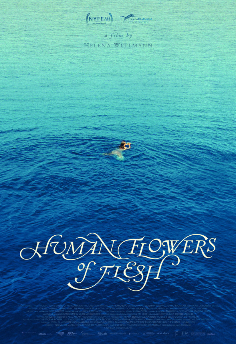
And that doesn’t mean Hung’s version isn’t. He does a nice job adjusting the type to work as two lines and his shrinking it to let the expanse of water take over is effective. Instead of the yellows of the sand we just bask in the cool color of blue as ripples and waves create dark and light separated by the swimmer’s curved wake.
I don’t love the way everything at the top fades with its own gradient to disappear into the water, but the scale and perspective of the whole is quite good. Something about that warm field of color contrasting the blue in the first just hits differently, though.