Gore Verbinski first attracted wide attention for directing The Ring – one of the few examples of a successful foreign horror remake. Now, after 15 years of directing blockbusters (and also The Weather Man), he’s returned to the stage of psychological thrillers with A Cure for Wellness, opening this weekend. We spoke with the director about the recurring motifs in his films, and particularly his latest, the design of the locations, how the film acts as a reverse Sleeping Beauty, and more.
The Film Stage: Water is a recurring motif or element in a lot of your films.
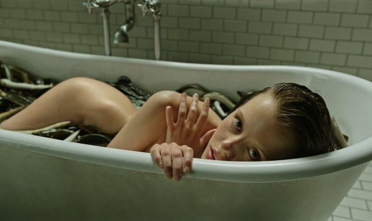
Gore Verbinski: Yeah, you’re referring to Rango and The Ring and Pirates… god knows what else. That is strange, isn’t it? It’s a beautiful metaphor for so many things — for birth and catharsis and drowning and baptism and purification. In A Cure for Wellness, it’s the idea that Volmer [Jason Isaac’s character] is diagnosing modern man, and offering this sort of cure, and it’s all about our fluids, and purification. He’s clearly obsessed with that idea.
Animal motifs, particularly eels and stags, figure here as well.
The deer is Lockhart [Dane DeHaan’s character]. When the deer is struck by the car, he keeps trying to walk. If Lockhart would just lie down, it would all go so much easier for him. But he’s not like the others in the clinic. He is younger — it’s going to take a stronger dose to put him down. As to the eels, it’s hardwired in our DNA to react to things that slither with revulsion. There are also Freudian implications, and the primal sense of fear — there’s something in the water! There’s something in the water, and now it’s inside us.
How did you extend that to the film’s style?
As Lockhart gets close to this place, he’s slipping out of the bounds of reality and into more of a dream logic. So it’s water as it occurs in our nightmares, in a non-waking state. That’s the thing we applied to photographing it. It’s almost a character in the film. It’s the silent scream, you know – and the louder you scream in this place, the more there’s somebody there with a nice warm bathrobe and a pair of slippers, looking at you with a concerned smile on their face.

The film mainly takes place in this old Swiss castle that’s been turned into a health clinic. What was the process of designing its look, and then bringing that vision to life?
The movie is about two worlds. There’s the world that Lockhart comes from, the modern world. And that’s what’s being observed by this other, ancient world — this castle above the clouds. It’s watched humanity progress through the industrial age and its obsession with computers and cellphones. It’s offering a diagnosis. The steam room is sort of the portal between the two, one world closing and the other opening up. As Lockhart drives to this place, his cellphone doesn’t work and his computer glitches and his watch stops. He’s flipping off the map, if you will.
Designing the clinic — for starts, there are a bunch of thumbnail drawings on paper. We scouted Austria, Switzerland, Germany, Romania, Prague, looking for a castle exterior that would be our location. We found it at this place near Tubingen, Germany. For the interior, on completely the other side of Germany, out of Berlin, we found an old abandoned hospital. It was actually used to treat Hitler after World War I, I believe for mustard gas.
And then we needed a swimming pool, which we found in a location with this old tile that kind of matched. We glued together all these different things to build the place itself. The clinic is sort of a tiramisu. Lockhart is coming from a dark world, and it’s important that he is entering the light when he first arrives — the Alps and the people in white robes in the top layer of this place. Then he descends, and he gets closer to the truth and loses his purchase on reality. It’s an ascension into light and then a descent back into darkness. For the lower levels, obviously some of it is underwater, so we had to build things on stage.
You go more into some overt visual stylization here. I’m thinking about an early shot of Lockhart’s mother painting a ballerina, where her magnifying glass obscures her head while blowing up her eye. What motivates such choices for you?
I wanted to create a kind of underpinning of sickness – that there’s some invisible force or cancer in the movie itself. The main character is in denial, but the cancer is not going away. In the example you give, I wanted to emphasize that she’s seeing. In her early stages of dementia, she’s aware of things that the scientist doesn’t even see. The tune of her ballerina is used to awaken others. That shot emphasizes what she’s saying right there, that she’s seeing something that he is not.
There’s a lot of that and reflection shots, which are designed to emphasize the two worlds. In many ways, you can think of this film as a reverse Sleeping Beauty. He’s being put to sleep, and yet he is able to rival this contagion. He’s a sort of pinprick that awakens others in the process.

A Cure for Wellness opens in theaters on Friday, February 17.

