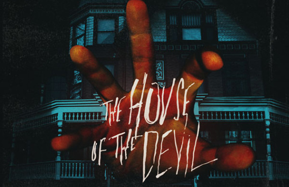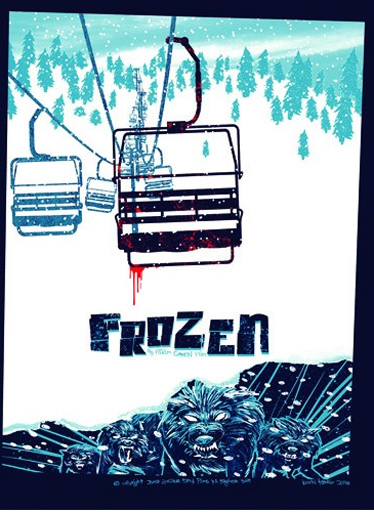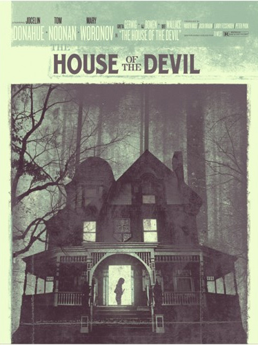
Here are two old school posters for two films (Adam Green’s Frozen and Ti West’s The House of the Devil) that are very much new school visually. The alchemy works well. [Bloody Disgusting].
Check them out:
And here’s The House of the Devil:
It’s nice to see this kind of poster art making a return. Last year offered a few gems of the genre, including this one for The Informant!
Unfortunately, these designs rarely appear out in the open, the PR department quick to rely on more by-the-numbers posters featuring the star of the film or, in the case of these horror-genre films, shock-and-awe advertising. Hopefully, this marks a change to come.
What do you think of these posters? Should they have a place in modern day P&A?


